
Manage dashboards and widgets#
Overview#
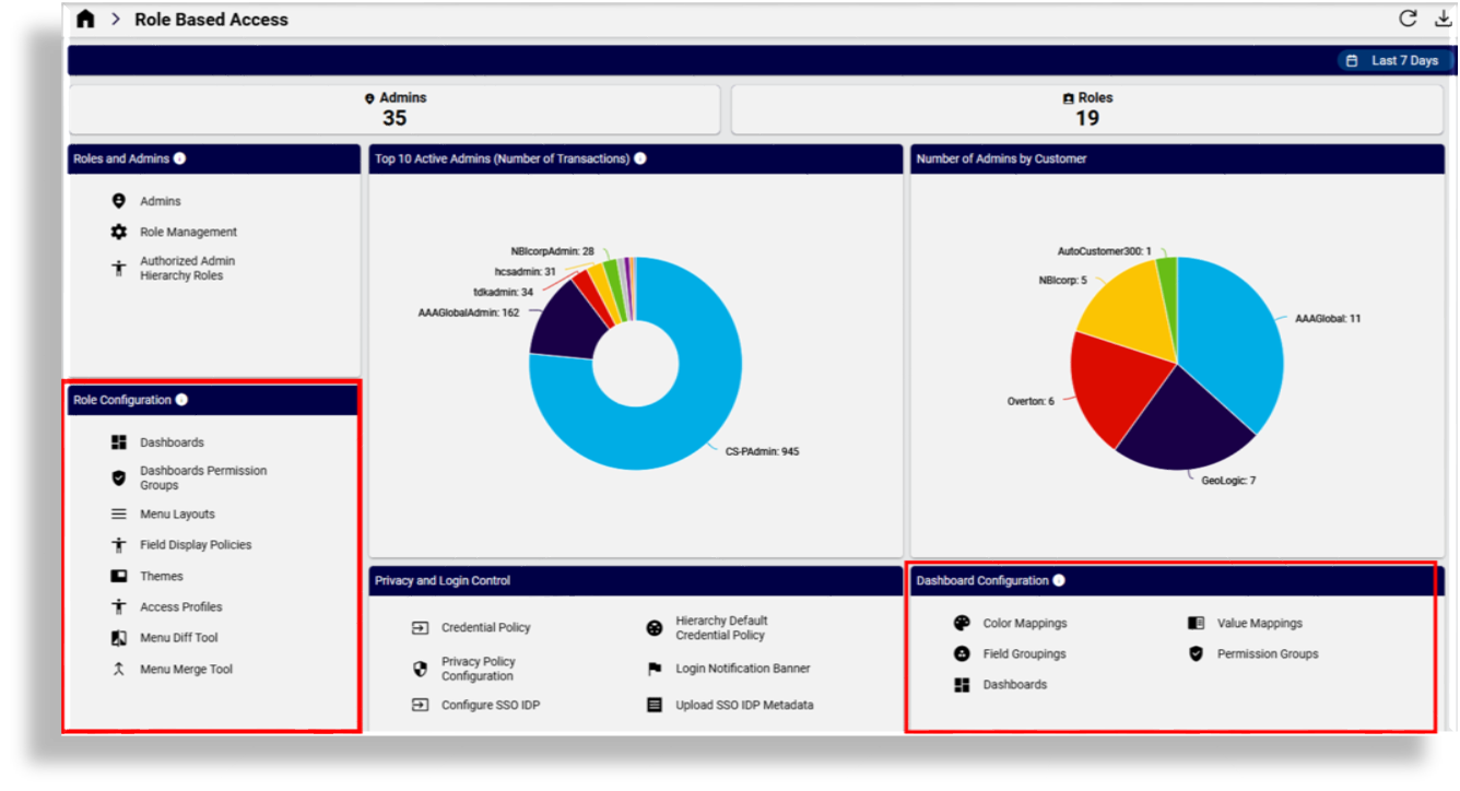
Administrators can manage dashboards via the Dashboards link on the Role Based Access dashboard.
Add or edit a dashboard#
Automate provides several configuration options for working with dashboards.
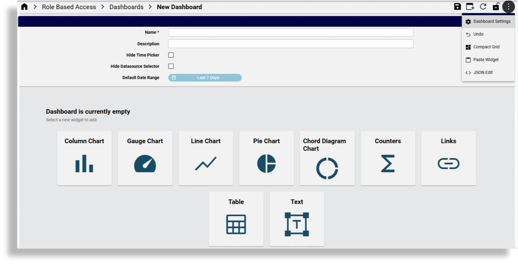
Add or edit
Name: Display name of the dashboard
Description: Provide a description for the dashboard for the Dashboards list view.
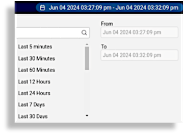
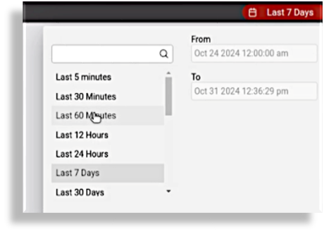
Hide Time Picker: By default, a time picker is available to filter dashboard data by start and end date. Any selected dates are reset when you log out. You can’t specify a date in the future. Select the checkbox to hide the time picker.
Hide Datasource Selector: This setting applies in the case where multiple instances of a dashboard data type is available. Not enabling the setting on a widget allows for selection of a data source instance and updates widget data based on the selected data source. Enabling the setting implies that the data source set on the widget is always used. Also used with “Insights Netflow” deployment option. For details, contact VOSS.
Default Date Range: Select this option to open the date range picker and to set up a default date range for the dashboard. This range will then apply to widgets on the dashboard that use the date range picker.
Clone: Use the toolbar Clone icon to create a copy of the dashboard you’re viewing. The cloned dashboard opens with the breadcrumb name appended with the text,
[CLONE], and contains all the widgets of the source dashboard. The cloned dashboard name is the same as the original source dashboard name and can be modified as required.Note
Dashboards with the same name can be available at different hierarchies. When such a dashboard is referenced, this first one found higher up from the administrator user’s login hierarchy is selected.
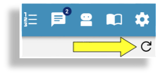
Refresh Dashboard: Used to update synced data on the dashboard to reflect any system data changes.
Note
Dashboard widgets each also provide a similar Refresh button when hovering over the top bar of the widget - similarly to refresh individual widget data.
Lock: Used to lock the arrangement of widgets
Dashboard Settings: Toggles (shows/hides) the dashboard name, description, and properties.
Undo: Reverts the dashboard to the state of the last unlock. So, if the lock has been used even once on the dashboard, the unlock will always return the dashboard to the state it was after it was unlocked, even if multiple changes were done since. If the dashboard was never locked, Undo will lock it, forcing the user to unlock and create a snapshot point. This snapshot is the same as the uploaded dashboard. Note that the Undo functionality is currently under review.
Export: Exports one or more instances. Refer to Bulk export of model data. Exported dashboards can then be modified and imported at a required hierarchy via the Import menu.
Compact Grid: Automatically optimizes the arrangement of widgets on the dashboard, given their current size.
Paste Widget: Pastes a widget you have selected, using the Copy Widget option on the widget menu, into the current dashboard. This allows you to copy widgets between dashboards.
JSON Edit: Used for editing the dashboard data in JSON. For details, refer to Manage items.
Export Dashboard Data: Used to export the data available in the widgets of a dashboard: in CSV or MS Excel format. The exported data contain header rows labelled with the friendly names of the data field names and is then available for off-line use.
Where multiple widgets are available on a dashboard, widget data is exported as either a CSV file or as a sheet in a MS Excel workbook. All the CSV files are archived in a
.zipfile. The export filenames follow the following convention:Export_<dashboard-name>_data_<all|displayed>_<timestamp>.<zip|xlsx>The available export options are determined by the Data Source of the widgets on the selected dashboard:
If there is a widget with Data Source as Automate present, only two export options will be available:
CSV - Displayed records
Excel - Displayed records
This means that exported data will reflect the displayed records as per current Time Picker interval.
If all widgets have Data Source set to Automate Analyzed , Netflow or Assurance, there will be four export options:
CSV - Displayed records
CSV - All records
Excel - Displayed records
Excel - All records
Selecting an “All records” option will include all available data, regardless of the selected Time Picker interval.
Add or edit widgets#
When a dashboard is added or updated, widgets can be added, removed or edited.
To add a widget, click the Add Widget toolbar icon; then, on the design form, either select the widget from the toolbar or from the provided list of icons:
To edit a widget on a dashboard, select the dashboard from the list and choose Edit from the widget’s menu. The widget menu provides a number of operations.
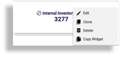
Edit:
Use the Edit icon from the widget menu to edit the current widget. refer to the details below on available edit options.
Clone:
Use the Clone icon from widget menu to clone the widget on the dashboard. The clone can then be edited as required.
Delete:
Use the Delete icon from the widget menu to remove the widget from the dashboard.
Copy Widget:
Use the Copy Widget icon to copy the current widget in order to paste it into a dashboard using the dashboard Paste Widget menu item.
Export data:
Where a widget offers data in a compatible format, the Export data on the widget menu allows for a MS-Excel or comma-separated value (CSV) export to a file, as in the Number Status example below:
Status,Count
Used-Utility,6
Cooling,35
Used,63
Reserved,106
Available,3850
Note
For widgets where the Resource is an Insights resource, the option to export All Records is not available.
For 24.2 installations where the “Insights Netflow” deployment option was selected, widget Data Source dropdown fields also show Netflow. For details, contact VOSS.
Note
When editing a dashboard, the widget order and position on the dashboard will follow the order and position as managed during the editing process.
Not all widget options and possible combinations are covered in this document. The widget refresh option can be used to inspect the impact of an option. For assistance in creating widgets, you can also contact VOSS support.
Where a widget resource references data over a time period (such as transactions), the widget interface provides a time picker control to indicate and change the interval for the data shown on the widget.
Dashboard sync and refresh#
A real-time sync process is running to maintain Automate and Insights databases in sync.
After upgrade to release 24.2, dashboard management is available after 30 minutes,
since the scheduled delta-sync process initially carries out a full sync and thereafter
an incremental resource sync.
See: Insights Analytics in the Platform Guide.
Important
Dashboard fields showing the item hierarchy (similar to Located At) are updated only when a delta sync runs. For example, if you’ve added users to the system and then moved them to a site, any charts, counters, or tables showing a count of users (at that site or at the system level), will only reflect the correct number of users once a delta sync runs and not when simply refreshing the dashboard or widget in a real-time sync. Until the delta sync runs, the hierarchy fields for these users display on dashboard charts, tables, or widget counters as with no (empty) hierarchy value. See Dashboard sync and refresh.
Dashboard export and scheduling#
Automate allows for dashboards - including dashboard data - to be exported to:
an email address
a target SFTP destination
Go to DashboardExport
Add an export instance on the input form:
Name of the dashboard export
Description of the dashboard export (optional)
Select one or more dashboards from Dashboards list
Indicate the Export format: MS Excel file or CSV file format
Add SFTP and/or SMTP (email) destinations:
Ensure a SFTP server is set up and fill in corresponding details.
- Add a SMTP Server
Choose to execute the export or add a schedule for the export.
Note
At least one destination is required, either SMTP/SFTP.
Dashboard export instances can only be modified by the user who created it or by the upper level user.
Dashboard export will be executed in the RBAC context of the user who created it (in accordance with the hierarchy at which the export instance is created).
Related topics
Value mapping#
The Value Mappings page defines a list of value mappings used when retrieving data for dashboard widgets. This allows a dashboard designer to substitute a stored value with a friendlier value that will be displayed to the user.
Note
Updating existing grouping configs has a refresh delay of 30 mins.
Value mappings allow for custom, alternative field values of resources to be displayed in chart widgets
by using the Value Mapping field. This optional value is applied during the design of a widget and
is typically used to present a more user-friendly field value in a chart widget, for example, to map the
value of Cisco Codec Mappings originally: 0 to mapped: No Media Established.
The Value Mappings page (data model: data/DashboardValueMapping) is available
to provider administrators and higher to add, delete and manage mappings.
The model contains the default individual mapping value: NO MAPPING.
The design of a mapping allows for the selection of an evaluation operator to apply to the original value as an input condition and then to provide the replaced value in accordance with the evaluation operator test result.
Evaluation operators that can be applied to the original field values are:
Regex
Greater than
Less than
Range (with “Max” and “Min” parameters)
Equals
Note
More than one original field value can be mapped to a single mapping key.
Examples:
If name:
Cisco Codec MappingsEquals0, then the mapping key isNo Media Established.Microsoft 365 service plan mappings by matching Microsoft Entra ID values:
If string ID Regex
(^SPB$)matches, then mapping key isMicrosoft 365 Business Premium.If string ID Regex
(^O365_BUSINESS_PREMIUM$)matches, then mapping key isMicrosoft 365 Business Standard.
Color mapping#
The Color Mappings page defines a list of color mappings used to style data in dashboard widgets.
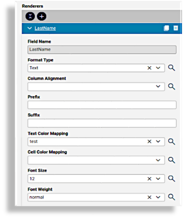
Automate provides options to allow for custom, alternative display colors and icons of Automate Analyze resources to be displayed in table widgets by modifying the Field Type of the resource and by creating instances of a dashboard color mapping. The mapping instance name is then selected in the Text Color Mapping and/or Cell Color Mapping dropdown lists under Table Options > Renderers when designing a table widget.
The Field Type of the field needs to be set to one of:
Text
Traffic Light: an icon
Refer to the Format Type of the field in the Table topic above.
This optional mapped value is applied during the design of a widget and is typically used to present a more user-friendly color or icon in a table widget, for example, to map a range of field values to have a specified color.
The design of a mapping allows for the selection of an evaluation operator to apply to the original value as an input condition and then to render the replaced color in accordance with the evaluation operator test result.
Evaluation operators that can be applied to the field values are:
Regex : for fields with text or numeric values
Greater than : for fields with numeric values
Less than for fields with numeric values
Range (with “Max” and “Min” parameters): for fields with numeric values
The Color Mappings page (data model: data/DashboardColorMapping) or Color Mappings
link on the MVS-RoleManagement-Dashboard
dashboard is available to provider administrators and higher to add, delete and manage mappings.
Examples:
If a Dashboard Color Mapping instance exists that matches the Regex
.*00.*, then render the text as color:#ff0011.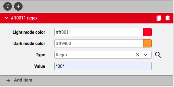
The Render section of a table widget has a field with Field Type set to “Text” and the Text Color Mapping dropdown selection is the created Dashboard Color Mapping.
The table then displays the text the matching text accordingly, acording the selected Dashboard Color Mode (Light/Dark) of the theme that is applied - see: Manage themes. The example below shows the
Lighttheme applied.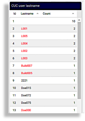
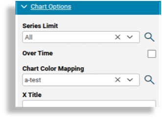
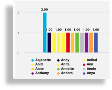
If a Dashboard Color Mapping instance exists that maps the Regex value
Ani, with the color:#fff200and this instance is applied (selected under Chart Options) to a chart showing user first names that start withAn, then names starting withAniwill be rendered in the chart mapping color (example below forLighttheme):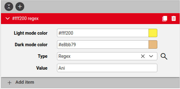
Field Groupings#
The Field Groupings page defines groups of similar data to facilitate common analysis and drill-down functions on a single dashboard.
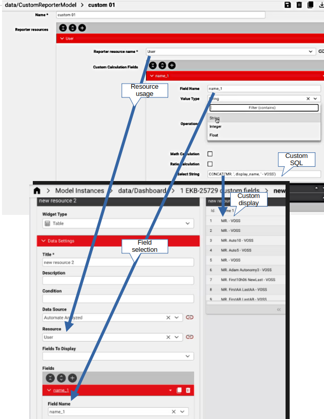
Custom Reporter Resource fields#
Automate provides an options to allow for the custom creation
of calculated fields for a reporter resource. The customizations
are added to a resource model called data/CustomResourceModel,
where they can be grouped by a name and the calculated fields can be
mapped to a selected resource in the reporter resources.
The screenshot below illustrates the creation of a custom field for
to be used as the name_1 field as well as its selection in
the design of a table widget.
Note
This feature is only accessible to administrators who have access to the
data/CustomResourceModelmodel.Since the custom creation of calculated fields for a reporter resource requires knowledge of how the data is stored in the database in order to write the SQL for the field, contact VOSS if access to and usage of this feature is required.
Since data added to the
data/CustomResourceModelmodel requires an additional migration or upgrade step, contact VOSS if access to and usage of this feature is required.