Chart widgets#
Overview#
The dashboard widgets support the following chart types:
Column Chart
Gauge Chart
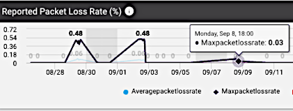
Line Chart
Pie Chart
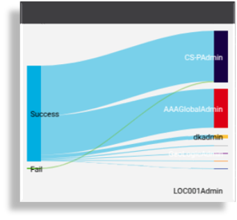
Chord Diagram Chart
When a chart widget is selected, it is also possible to switch to another widget format during the edit and design process.
The chart type can be updated from the Widget Type drop down. Changes are reflected in real-time during the design of a widget or by using the widget’s Refresh icon.
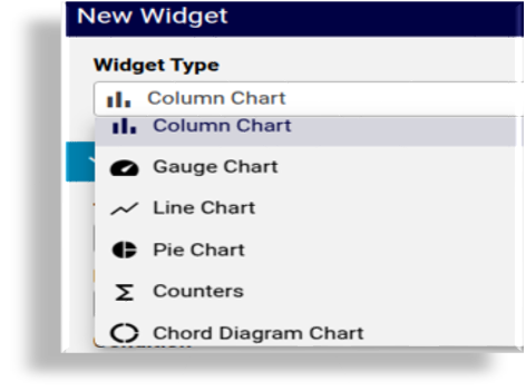
Chart widget data settings#
The table describes the common list of data settings for chart widgets:
Setting |
Description |
|---|---|
Title |
The text to display above the chart. |
Description |
This text displays as an informational pop-up when hovering over the circled i icon adjacent to the title. |
Condition |
The display of the widget on the dashboard can be controlled by entering a condition that resolves to boolean True or False, for example in accordance with enabled features, services, and devices, as in the Global Settings. The conditions are in the form of system macros. See for example the macros listed under the Links topic below. |
Data Source |
Charts can access the Automate Analyzed and Assurance sources. The Assurance data source is also available if an Arbitrator is configured. See Arbitrators. |
Data Source Instance |
Displays if Assurance is selected as the data source as multiple instances can be configured. A selection of these can then also be made if Allow Data Source Selection is enabled. |
Resource |
Depends on the selected data source, a drop-down list of
resource items available to be referenced in the chart. For
example, for Automate Analyzed: Note
Important For charts, Resource data is accessed from an Automate
Analyze database: reporter resources
( |
Setting |
Description |
|---|---|
Fields |
Depending on the selected Resource, one or more fields from the resource can be selected as items for the chart.
|
Setting |
Description |
|---|---|
Fields (continued) |
Note A different operation can be applied to the same field. In the example below, average, minimum, and maximum is applied to the transaction duration field: 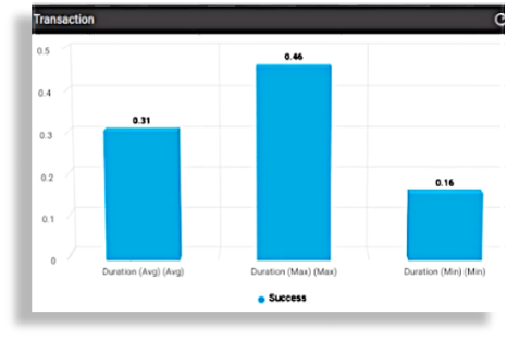
|
Setting |
Description |
|---|---|
Filters |
Data referenced in widgets can also be filtered by selecting:
|
Filter Value |
Value to be used by the selected Operation to carry out the filter. Such filters provide options to make use of a selection of the resource data in the widget. |
Sorts |
One or more Field Name entries can be added and used to carry out sorting by Sort Type: Ascending or Descending |
Chart Options |
Available Chart Options can vary according to the selected chart widget type. For a detailed reference of chart options, see: Chart options availability and definitions |
Drill-down options |
|
Dashboard chart background colors |
Managed by the theme Panel Color. See Theme element color references for the Admin portal |
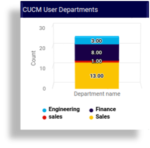
Chart widget example#
As an example, consider the following column chart values, with charts illustrating various data and chart settings:
Title:
CUCM User DepartmentsResource:
Cisco UCM UserField Name:
DepartmentOperation:
Grouping CountShows a column chart with counts of grouped
Cisco UCM Userdepartments in columns.Filter:
Field name:
departmentOperation:
Exclude Regex (Case sensitive)Filter Value:
SITE
Filter:
Field name:
departmentOperation:
Exclude Regex (Case sensitive)Filter Value:
LOC
Filter:
Field name:
departmentOperation:
!=Filter Value:
Sorts:
Field Name:
departmentSort Type:
Ascending
Chart Options:
Series Limit: All
Stack Type:
Normal
The examples below show the chart with settings on some of the properties as not set or set, in the example above:
Unfiltered, unsorted (related settings above are not set):
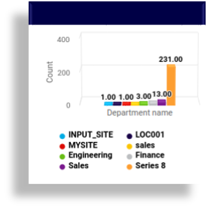
Filtered, sorted, stacked (related settings above are set):