Links widgets#
Overview#
Links on widgets provide shortcuts to data or external URLs. They can be customized with icons, display text, and conditional logic to control visibility.
Link widget configuration#
Type: Choose a data model from Automate to link to.
Link text and icon: Customize the display label and icon.
Condition: Use a system macro to set a condition that controls whether the link displays. The condition evaluates to either True or False based on enabled features. If the condition evaluates to false, the widget is hidden and the dashboard layout adjusts automatically.
Example macro syntax:
{{ macro.is_avaya_enabled }}
{{ macro.is_cisco_ccx_enabled }}
{{ macro.is_cisco_cucm_enabled }}
{{ macro.is_cisco_cucx_enabled }}
{{ macro.is_cisco_microsoft_enabled }}
{{ macro.is_cisco_webex_enabled }}
{{ macro.is_cisco_webex_teams_enabled }}
{{ macro.is_cisco_zoom_enabled }}
{{ macro.is_microsoft_enabled }}
{{ macro.is_pexip_enabled }}
{{ macro.is_session_border_control_enabled }}
{{ macro.is_voss_phones_enabled }}
{{ macro.is_zoom_enabled }}
Display As:
External Link: Requires a URL in the Href field.
Form and List: Display format of data when type is selected.
Dashboard: Links to another dashboard. Select the target dashboard from the drop-down.
Note
When linking to a dashboard, Href and Type are hidden. Note that a dashboard link cannot launch another dashboard.
Field Display Policy and Configuration Template: Can be applied based on the selected type.
Note
For long lists of links, use multiple Link widgets to avoid scroll bars.
See also the topic Fixed and Configurable Filters in Counters and Links.
Related topics
Filters in counters and links#
Links widgets contain fixed and configurable filters.
Fixed filters#
Set by high-level admins.
Always apply when the widget is used.
Results can be further refined by configurable filters.
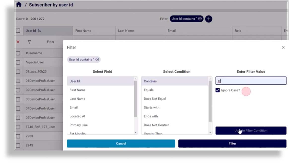
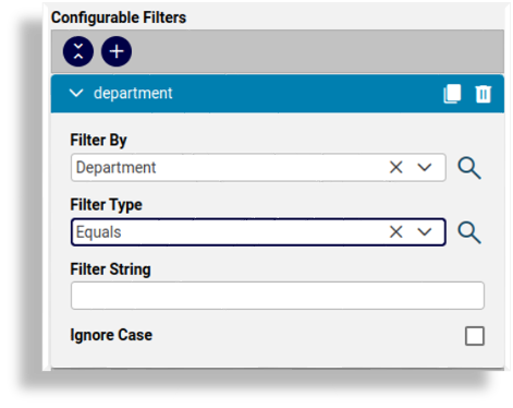
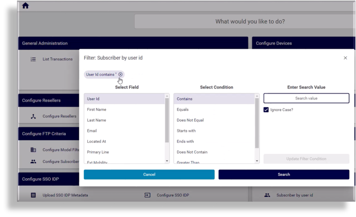
Configurable filters#
Add one or more configurable filters when setting up a widget:
Note
Adding multiple filters using the Add option results in a logical AND of the filter application.
Filter By: Select attributes from the chosen Type.
Filter Type: Choose the matching operator to apply when the attribute is matched to the Filter String value (Contains, Does Not Contain, Starts With, Ends With, Equals, Not Equal).
Filter String: Enter the value to match.
Ignore Case: Toggle case sensitivity of the Filter String value.
Once you apply the configurable filters, selecting the counter or link in the GUI launches a dialog where you can adjust the filters, including the filter string value (if applicable) before viewing the data.
Note
The list view footer will indicate active filters, which can be modified or removed. See Working with lists