
Custom Components
Overview
Custom components allow you to display GUI content (such as landing pages, lists, and forms) in the same layout as they appear in the Business Admin Portal.
Custom components are used to generate menu items and landing pages with the look and feel and functionality of the Business Admin Portal. This allows you to view content in the Admin Portal in what may be termed, ‘Business Admin Portal mode’. However, some functionality, such as forms that open when clicking a link to lines for example, display in standard, ‘Admin Portal mode’. Thus, depending on the type of resource you’re viewing, the system may switch between ‘Business Admin Portal mode’and ‘Admin Portal mode’.
Important
Custom components are only available in the VOSS Automate Admin Portal (not in the legacy Admin Portal).
At the time of writing (21.3), for menus or landing pages generated via custom components, it is not possible to assign a field display policy (FDP) to show or hide fields on the page that displays. By default, all fields display on pages associated with custom-component generated menu items or landing pages. The ability to assign FDPs for custom components is reserved for future development.
Related Topics
Model Types and Associated Custom Components
The table describes the custom components available for menu layouts and landing pages:
Note
On forms where you select a custom component, the Type field refers to the model type. A model type may be a associated with one or more custom components. Once you choose the model type, the Custom Component drop-down displays the custom components available for that model type. Leave the Type field blank if you wish to use a dashboard custom component.
You can use the value in the Route column (in the following table) to inspect the component appearance. Refer to the URL endpoints of Business Admin Portal menu items that match the Route value.
Important
At the time of writing (21.3), all custom components for edit functionality are reserved for future development. This includes all custom components where the custom component name or route includes the text, edit. For example, Add/Edit Extension Mobility (custom component) and /extension-mobility/edit-extension-mobility (route).
Type |
Custom Component |
Route |
|---|---|---|
view/AddPhone |
Add Phone |
/phone/add-phone |
view/AddSubscriberFromProfile |
Add Subscriber |
/subscribers/add-subscriber |
relation/PexipConference |
Add/Edit Conferencing |
/conferencing/form-conferencing Edit is reserved for future development. |
relation/SubscriberDeviceProfile |
Add/Edit Extension Mobility |
/extension-mobility/edit-extension-mobility Edit is reserved for future development. |
relation/HuntGroupRelation |
Add/Edit Hunt Group |
/hunt-group/edit-hunt-group Edit is reserved for future development. |
relation/Voicemail |
Add/Edit Voicemail |
/voicemail/edit-voicemail Edit is reserved for future development. |
relation/SparkUser |
Add/Edit Webex App |
/webex-teams/form-webex-teams Edit is reserved for future development. |
view/BulkAddUser |
Bulk Add Subscribers |
/subscribers/bulk-add-subscribers |
Call Pickup Group Dashboard |
/call-pickup-group |
|
Conferencing Dashboard |
/conferencing |
|
Contact Center Express Dashboard |
/contact-center |
Type |
Custom Component |
Route |
|---|---|---|
relation/LineRelation |
Edit Line |
/number-management/edit-line Edit is reserved for future development. |
relation/SubscriberPhone |
Edit Phone |
/phone/edit-phone Edit is reserved for future development. |
relation/HcsSiteREL |
Edit Site |
/site/edit-site Edit is reserved for future development. |
relation/Subscriber |
Edit Subscriber |
/subscribers/edit-subscriber Edit is reserved for future development. |
Extension Mobility Dashboard |
/extension-mobility |
|
Headset Dashboard |
/headsets |
|
Hunt Group Dashboard |
/hunt-group |
|
view/UserPhoneMoveUsers_VIEW |
Move Subscriber |
/subscribers/move-subscriber |
relation/MultiVendorSubscribers |
Multi-Vendor Subscribers List |
/subscribers/list-mv-subscribers |
Number Inventory Dashboard |
/number-management |
|
Phone Dashboard |
/phone |
|
Site Management Dashboard |
/site |
|
Subscriber Dashboard |
/subscribers |
Type |
Custom Component |
Route |
|---|---|---|
relation/Subscriber |
Subscribers List |
/subscribers/list-subscribers |
Tools Dashboard |
/tools |
|
Voicemail Dashboard |
/voicemail |
|
Webex App Dashboard |
/webex-teams |
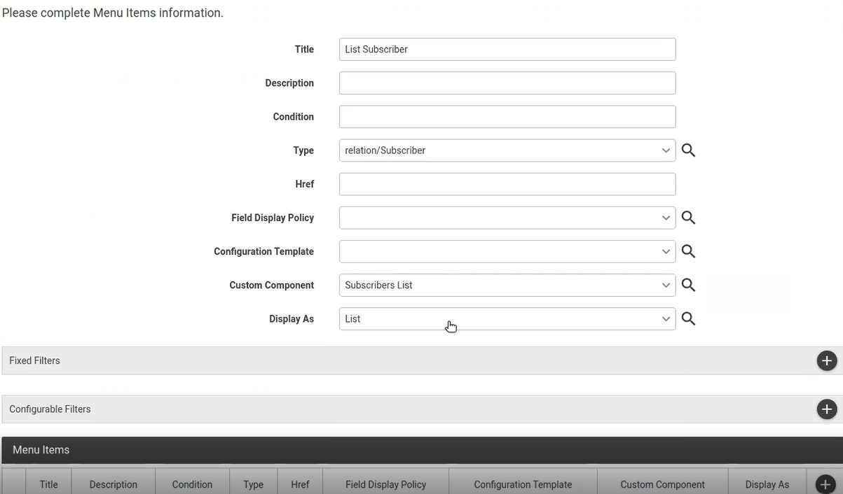
Custom Component Example
This section displays the output for a custom component used for the following scenario:
Model type: relation/Subscriber
Custom component name: Subscribers List
Menu title: List Subscriber
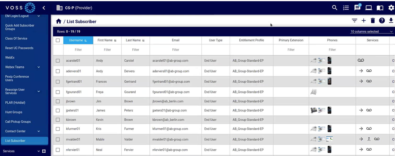
Menu item added via custom component
The image displays an example of a new menu item titled List Subscriber, which uses model type relation/Subscriber and custom component Subscribers List.
In this case, although you’re viewing a Subscriber list in the Admin Portal, notice the Business Admin Portal style graphic icons that display in the Phones column and in the Services column.
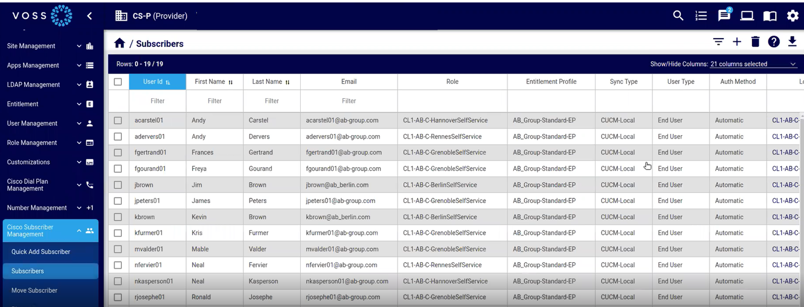
While a menu item added via a custom component displays the content of the list view with the look and feel and functionality of the Business Admin Portal, compare this with the following image, which displays the Subscriber list view of the standard Admin Portal.
Detail view of resource
The image displays the detail view of a resource accessed from the list view of a custom component generated menu item (List Subscriber), which retains the look and feel of the Business Admin Portal.
Note
An exception exists, where links on forms display the standard Admin Portal view of the resource. For example, clicking on the Line link from the subscriber detail view opens the resource in Admin Portal mode (that is, it no longer has the Business Admin Portal look and feel).
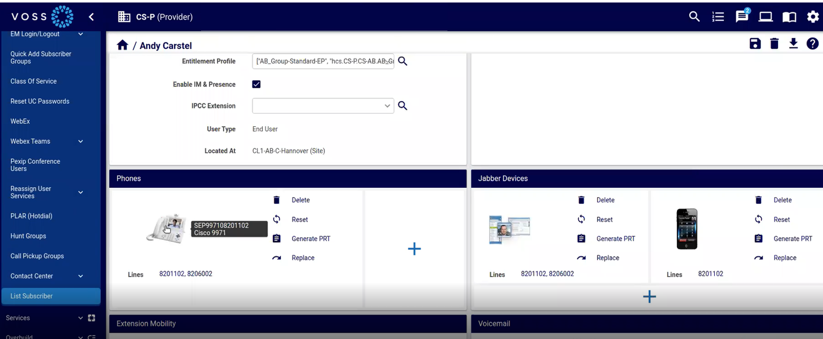
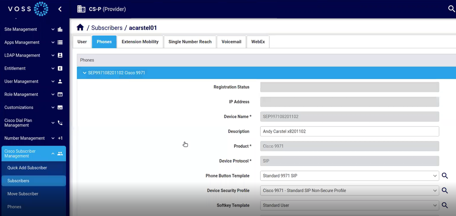
While the detail view of a resource from a custom component generated menu item has the look and feel of the Business Admin Portal, compare the detail view display in the standard Admin Portal.
The image displays the detail view of a subscriber selected from the standard Subscribers list view in the Admin Portal:
Add a Custom Component to a Menu Layout
This procedure adds a custom component to a menu layout.
Note
The steps are similar for adding custom components to landing pages.
Log in to the VOSS Automate Admin Portal.
Go to (default menus) Role Management > Menu Layouts.
Choose a menu layout in the list to open its editing screen.
Choose the menu group where you want to add a new menu item.
At Menu Items, click the Plus icon (+) to add a new row to the menus.
Fill out details for the new menu item.
Note
Title is the name of the new menu item.
The model type you choose defines the available options in the Custom Component field.
Note that any custom component names or routes that contain the text edit are reserved for future development. For custom components named Add/Edit, only add is supported.
Click OK.
Verify that the menu displays as required:
Log out of the VOSS Admin Portal, then log in with the user role for which you added the new menu item.
Navigate to the menu item, and select it to verify that it displays the relevant, associated page.