
Landing Pages
Overview
A landing page is the page you see when you log in, or when clicking the Home button from anywhere in the system, or when choosing a menu item that has been defined as a landing page.
A default landing page ships with the system, and is associated with pre-defined roles in the hierarchy, for example Provider, Customer, and Site administrators.
Note
This topic describes functionality as displayed in the Admin Portal. The look and feel of landing page and menu layout configuration options may differ in the classic Admin GUI.
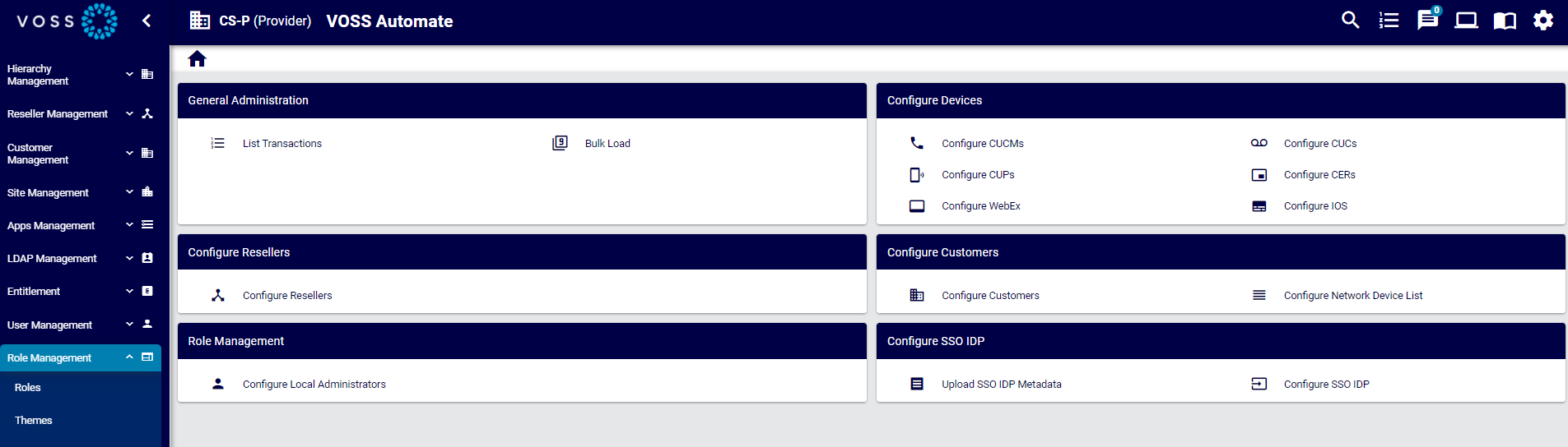
Customized Landing Pages
Landing pages may be customized for different user roles, and have several configuration options:
Add shortcut links to frequently used functionality
Enhance the look and feel on the user’s Admin Portal
Add images and links in vertical or horizontal patterns with unlimited boxes and shortcuts
Editable landing pages provide a way to set up direct links to areas in the system, which can be used as short-cuts by the administrators in line with their role.
Existing images can be used or new images can be added in line with branded look and feel.
You may clone (copy) existing landing pages and then create a new landing page based on pre-populated settings, or the landing page can be exported, edited externally, and then re-imported. Designers with access to the tag function can use tag versions to uniquely identify different landing pages, and to track and control changes.
The CSS of the Theme can be used to control the layout of the landing page.
Related Topics
Add or Edit a Landing Page
This procedure adds a new landing page or edits an existing landing page.
Log in to the Admin Portal as a Provider administrator, or higher.
Choose the hierarchy level for the landing page, for example, Customer.
Go to (default menu) Role Management > Landing Pages.
Choose an option:
To create a new landing page based on settings in an existing landing page (recommended), click on the relevant landing page to open its editing screen, then click Clone. Now modify the settings of the cloned landing page and save it as a new landing page.
To edit an existing landing page, click on the landing page in the list view to open its editing screen, update its settings, and save your changes.
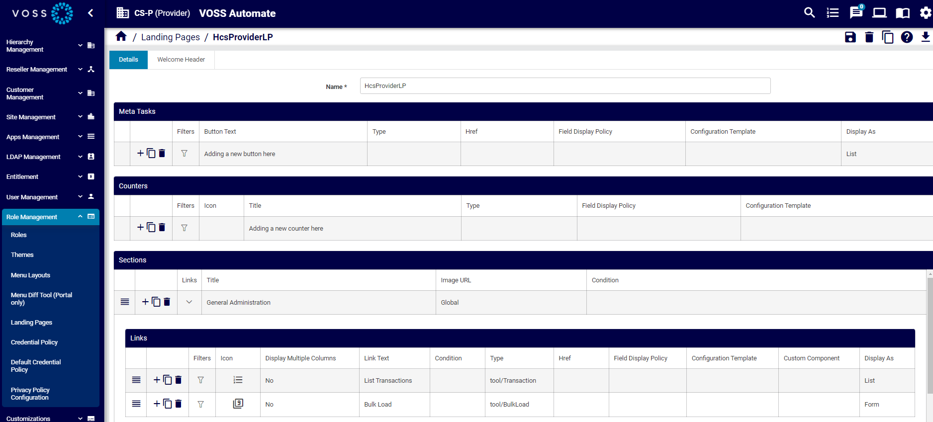
On the Details tab, configure the following options for the landing page:
Note
For configuration details, see Landing Pages Field Reference
Rows with nested items or links contain a chevron (>) instead of a Plus icon (+) so that you can see which items have child lists.
An asterisk indicates required values.
Add a name
Configure meta tasks (button text, model type, Href, FDP, CFT, display format, filters)
Configure counters (filters, icon, title, model type, FDP, CFT).
Configure sections, and links in sections.
On the Welcome Header, configure the following options:
Save the landing page.
Assign the landing page to the relevant roles.
Landing Pages Field Reference
This section describes landing page configuration options:
Note
You can view, add, and edit landing pages in the Admin Portal via (default menus) Role Management > Landing Pages. See Add or Edit a Landing Page
You can select the following tabs on the Landing Pages add/edit screen:
Details tab
Welcome Header tab
Details Tab
The Details tab defines the following options for the landing page:
Column |
Description |
|---|---|
Name |
The name of the landing page. |
Meta Tasks |
These rows display the shortcut buttons (one or more) at the top of the home page screen (directly below the line text, if configured). Click in the row to edit an existing shortcut button, or click the Plus icon (+) to add a new shortcut button. |
Counters |
These rows display the model-type instance counts (one or more) that display on the landing page. Click in a row to edit an existing counter, or click the Plus icon (+) to add a new counter. |
Sections |
These rows display the sections (one or more) that display as blocks on the landing page. Click on an item to edit it, or click the Plus (+) icon to add a new section. Use the hamburger icon to re-order the sections. |
Links |
Configures links in sections on landing pages. |
Common functionality
The table describes edit functionality typically available for landing page elements:
Column |
Description |
|---|---|
Reorder |
Click on the reorder icon in the relevant row to change the location of a landing page element. |
Add, clone, or delete row |
Click an icon to either add a row, clone (copy) a row, or to delete the row. |
Type |
The model type to associate with the landing page element. Blank when href field is populated. The model type shows the related FDPs (field display policies) and CFTs (configuration templates) that can be applied. |
Href |
Hrefs are generally recommended for external links. For backwards compatibility, hrefs
can be used for links within the application to link directly to a form. For example,
(example API URL for a list of items of type relation/SubscriberPhone) the Add Phone
page would have the following href (API URL):
In this case, you’ll need to use JSON-format landing page import, or bulk load, to add any associated field display policies (FDPs) and configuration templates for the menu item. The recommendation is not to use Hrefs to reference view/ type models. Href is a direct reference to a model type (the path), if applicable. If used, the Type field is empty. |
Field Display Policy |
The field display policy associated with the landing page element. |
Configuration Template |
The configuration template associated with the landing page element. |
Meta Tasks
The table describes Meta Tasks configuration options:
Column |
Description |
|---|---|
Button Text |
Text for the button. |
Counters
The table describes configuration options for Counters:
Column |
Description |
|---|---|
Icon |
The icon to be used for this counter. |
Title |
Mandatory. The title to be displayed for this counter, for example, Phones, Users. |
Sections
The table describes configuration options for Sections:
Column |
Description |
|---|---|
Links |
Displays a Links table where you can configure links in the section. |
Title |
Mandatory. The section title as it will show on the Landing page. |
Image URL |
Optional URL image to be displayed as section image. For example, let’s say a theme is uploaded with landing page images, and the theme folder has a subfolder with the following file: mytheme/img/landingpage/landing1.png In this case, the URL would be: /www/themes/mytheme/img/landingpage/landing1.png |
Condition |
Click in the cell to add or edit a macro that allows you to display/hide the section, based on a condition specified in a macro. If the macro evaluates to true, the section displays, else, when false, the section is hidden. The default is true (sections you add display by default). See the Advanced Configuration Guide for more information about using macros. |
Links
The table describes configuration options for Links in sections on a landing page:
Column |
Description |
|---|---|
Filters |
Click the filter icon in the relevant row to display a dialog where you can choose fixed and configurable filters for the link. Fixed filters cannot be removed. The following options are available for configurable filters for links:
|
Icon |
The icon to use for the link. Click in the cell to choose an icon. Icons display in the drop-down with a descriptive name. |
Display Multiple Columns |
Available only when Display As option is Inline List. Defines whether the link displays as multiple columns. When set to Yes (select the checkbox in the field), you can set column values in the filters for this link. When set to No, the filters do not have an option to specify columns. |
Link Text |
Mandatory. Text for the link. |
Column |
Description |
|---|---|
Condition |
Optional. Specify a macro as a condition to define whether the link displays on the landing page. If the macro evaluates to True (default), the link displays. See the Advanced Configuration Guide for more information about using macros as conditional criteria. |
Href |
If a direct reference to a model type is used for the menu item, the specified path. |
Custom Component |
Click in the cell to choose an Admin Portal custom components. Options in the drop-down depend on the model you choose in the Type field. For example, when choosing model type view/AddPhone, the custom component available for selection is Add Phone. The custom components allow you to display GUI content (such as landing pages, lists, and forms) in the same layout as they appear in the Business Admin Portal. Custom components are also available for multi vendor environments and for Microsoft-only environments. This feature is only available in the new VOSS Automate Admin Portal. |
Column |
Description |
|---|---|
Display As |
Click in the cell to choose how the menu item should display. The default is List. Options are: List, Landing Page, Form, External Link, Tree
{
  "type": "view/QuickSubscriber",
  "display": "form",
  "title": "Quick Add Subscriber"
}
|
Related Topics
Welcome Header Tab
The table describes the fields on the Welcome Header tab for landing page configuration:
Field |
Description |
|---|---|
Header Text |
A single line static welcome message displayed at the top of the landing page. |
Line Text |
Text for the welcome line displayed under the header. Use [userrole] as a placeholder to insert the current user’s role,
to serve as the header. For example: |