Manage themes#
Note
On upgrade to release 25.4:
The current default is set to the default in System Global Settings.
A migration script scans existing themes for the Use This Theme to style Login Page flag. For each interface type, if one theme has this flag set, the corresponding default theme setting in System Global Settings is updated - see below. If no flagged theme is found, the VOSS theme is used as the fallback according to current standards.
The legacy Use This Theme to style Login Page checkbox setting is removed after migration, and theme selection for roles remains optional. If theme selection is blank, the role inherits the global default theme.
For light and dark mode:
If the system (browser) setting is set to dark mode prior to upgrade and the default theme was the VOSS theme, the upgrade will enable the dark mode in the new
voss_platformdefault theme shipped as the default theme, which comes with dark mode pre-enabled. The VOSS default dark mode palette is applied initially and existing images are duplicated for both modes.For custom themes, users can add a dark mode to the migrated themes if required. Your existing theme colors are migrated as-is for light mode. If the system (browser) setting is set to dark mode and no dark mode is set, the theme will retain its current settings (light mode).
Currently, the default VOSS light mode theme is compliant for accessibility.
A few new additional colour palette settings will be available to fine tune their light mode or dark modes. By default, these settings will not be set on custom themes light-mode - users can decide if they wish to fine tune or add them.
Managing themes#
There are two ways to manage themes for the Admin Portal:
Directly within the GUI |
Custom branding options can be configured within the GUI |
From the command line |
Theme JSON files and associated images can be downloaded and
uploaded as |
To access theme management functionality in the GUI, go to the Themes page.
The following settings groups are available on the Themes page in the Admin Portal:
Theme Details
Login Page Details
Light Mode
Dark Mode (if enabled)
For details on the values on the Light Mode and Dark Mode color picker tables, see: Theme element color references for the Admin portal.
Note
Theme export restrictions
A theme residing at a hierarchy level above that of the current user cannot be exported. Such an export will raise an error.
Default theme settings#
Important
Only system-level administrators can set the default login themes.
Lower-level administrators cannot override the system-wide default login theme settings.
The system’s default login themes are managed centrally through System Global Settings in Administration Tools, rather than per-theme checkboxes. This provides secure, consistent control at the system level.
When a user logs in for the first time, the system default (in other words, the browser default) mode is selected for the login screen. Subsequent login will adhere to the user mode.
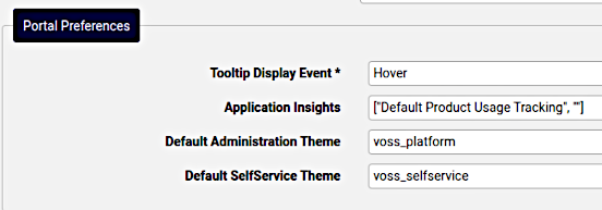
System Global Settings includes a Portal Preferences section with dropdown fields for:
Default Administration Theme: The theme used for the Administration interface login page
Default Self Service Theme: The theme used for the Self-service interface login page
The following defaults are provided:
voss_platformvoss_selfservice
The dropdown displays themes available from the current hierarchy level and below. Only one theme can be set as default for each interface type at any time.
This theme is automatically applied in the following scenarios:
When users access the Login page
When a role has no theme assigned
For role-based theme assignment, you can leave the theme selection blank, allowing the role to inherit the system default theme.
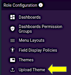
Upload a theme#
A theme can be uploaded at a particular hierarchy using the Upload Theme quick link on the Role Based Access dashboard. In this case, the theme will not display in the list view for administrators at lower levels of the hierarchy.
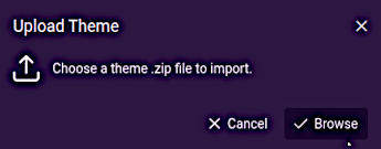
Note
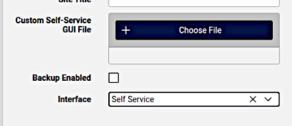
Self-service theme uploads using this upload tool will not be applied. Use the Choose File button on the Self-service theme input form for self-service theme uploads. Contact VOSS for details on the format and contents of the ZIP file to upload.
Applying a theme to the user interface#
When uploading or updating a theme, you can choose the Interface where the theme should apply, either the Admin Portal (default), or to the Self-service interface. If no interface is specified, the default applies.
The default login page themes for Administration and Self-service interfaces are controlled centrally via System Global Settings in Administration Tools. This ensures consistent, system-wide control of login page branding.
If a theme is flagged as the default in System Global Settings, that theme is always used for the login page. If no default is specified, the VOSS theme is used as the fallback.
On a per-role basis, theme selection remains optional — if blank, the role inherits the global default theme.
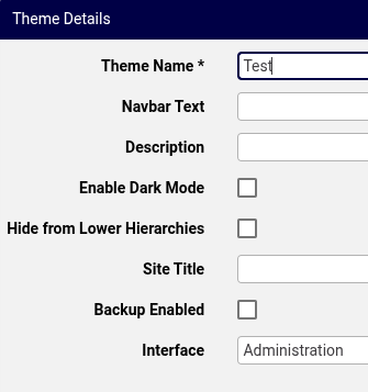
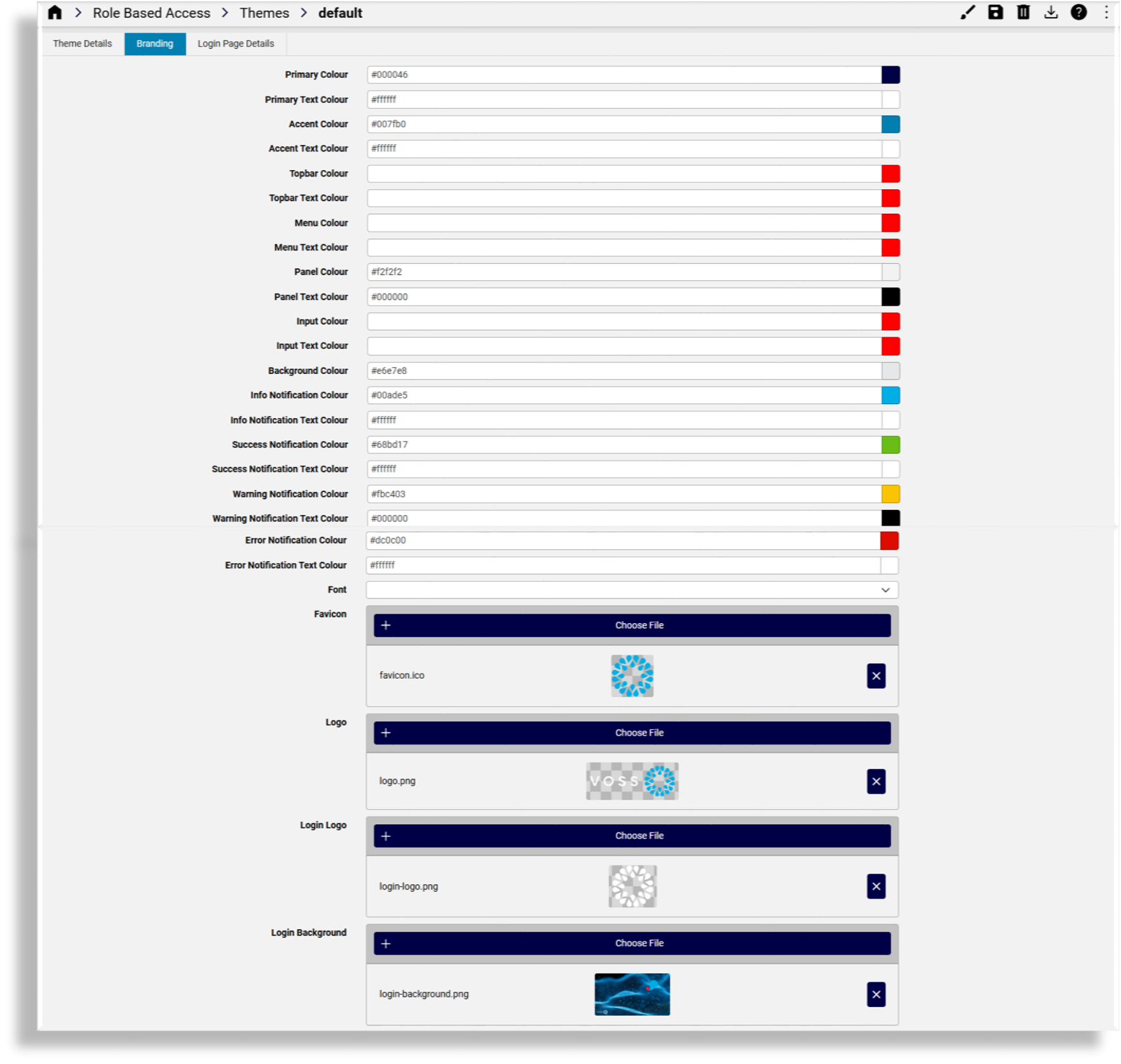
Theme details tab#
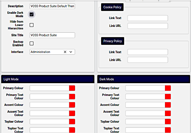
On the Theme Details tab of the Themes page you specify theme details:
Theme Name: Mandatory. The name of the theme. Valid characters are in the range of
a-zA-Z0-9_.Navbar Text: Text to display on the navigation bar, adjacent to the organization level.
Description: descriptive details for internal reference
Enable Dark Mode: for themes that support dark mode, enable this mode. The interface will display a color picker table for dark mode - see below.
Set as System Default: Whether to set this theme as the system default. The default theme is used as the fallback when no theme is specified for a role.
Hide from Lower Hierarchies: Whether to hide the theme from lower hierarchies.
Site Title: The title of the site, displays on the browser tab
Backup Enabled: Whether to enable a backup of the theme (images and other custom elements)
Interface: The interface where the theme is applied (Administration or Self-service)
Important
A Self-service theme can only be applied by selecting Interface as Self-service, uploading the required custom file and saving the theme.
sys-admin
Note
To set the default login page theme, system-level administrators can use System Global Settings in the Administration Tools menu. In the Portal Preferences, the dropdown fields Default Administration Theme and Default Self Service Theme control which theme is used for the login page.
Note that only system-level administrators can modify these settings.
Dark mode support#
Themes can optionally support dark mode, providing a dark variant of the interface for user preference or to match their operating system or browser settings.
Enabling dark mode
To enable dark mode for a theme:
Edit the theme in the Admin Portal
Enable the Enable Dark Mode checkbox
This will enable the display of a Dark Mode color picker table where the theme’s dark mode colors can be managed.
Both panels contain identical configuration options, allowing you to define distinct branding for each mode.
The admin UI dynamically shows or hides the dark mode panel based on whether Enable Dark Mode is enabled, and updates the labeling accordingly.
Configure the dark mode branding settings (colors and images)
- Preview the settings using the Preview Dark Mode and Preview Light Mode buttons in the
edit screen toolbar:
If a dark theme palette is not available, the portal uses the light theme palette. If an individual colour/image value is not supplied in the active palette, the portal does not copy it from the other mode - CSS-level defaults or token-specific fallbacks apply where defined.
Users can set the theme mode in two ways:
Users can dynamically select Light, Dark, or System theme preferences, where System refers to the current browser preference (that either follows the operating system setting, or else Light or Dark).
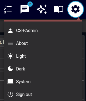
Dark mode is by default enabled through Account Settings (user preferences), not per theme.
Click your user profile icon in the top-right corner
Select Account Settings
Navigate to Appearance or Preferences
Choose your preferred mode:
Light: Always use light mode colors
Dark: Always use dark mode colors
System: Follow your browser settings (overrides operating system setting)
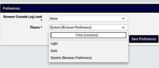
For consistent appearance, fill in all color and image fields explicitly for both light and dark modes.
Disabling dark mode
Note
When dark mode is disabled, the gear icon context menu and the account preferences settings do not display theme modes to select from, as only light mode is configurable.
When Enable Dark Mode is not enabled, the theme operates in light mode only. After upgrading, existing themes remain light-only until an administrator enables dark mode and configures the dark mode branding.
Only Theme Settings panel is shown (labeled as “Theme Settings” rather than “Light Mode Theme Settings”)
The theme operates in light mode only
Users see only the light option
Note
Dashboard widgets allow for custom color mapping, including dark mode mapping. These settings are not affected by the theme.
Related topics
Branding tab#
On the Branding tab you can customize a theme for your organization. You can change colors via the color picker or by typing in the color hex value. When no colors are chosen in this tab, the defaults apply.
Fonts
The Font dropdown allows for a selected font to override the global default Roboto font. The selected font is then applied to all text, including the login screen.
Uploading images
When uploading images for the theme:
Note file size and width x height pixel dimension size restrictions. A system message displays if the image is too large.
Only PNG files are supported for the Logo image. Other images can be PNG or JPEG.
For image filenames, you can use the following characters and character types:
ALPHA / DIGIT / "-" / "." / "_" / "~"/ "#"
Image details
Favicon: The favicon for the site. Shown on the tab and when the site is bookmarked.
Type: PNG image or with
.icoextensionMaximum dimensions: 256x256 pixels
Logo: This image is used for the logo in the top left of the menu bar.
Type: PNG image with a transparent background
Maximum file size: 0.5MB
Maximum dimensions: 600 pixels in width and 192 pixels in height
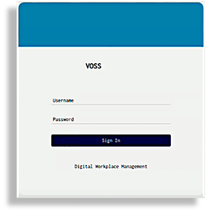
Login Logo: This image is used for the logo on the login page
Type: PNG image with a transparent background
Maximum file size: 0.5MB
Maximum dimensions: 600 pixels in width and 192 pixels in height
Login Background: This image is used for the login screen background
Type: PNG or JPEG image
Maximum file size: 5MB
Maximum dimensions are 1920 pixels in width and 1080 pixels in height
Menu Background: This image is used for the side menu background
Type: PNG or JPEG image.
Maximum file size: 2MB
Maximum dimensions: 240 pixels in width and 1040 pixels in height.
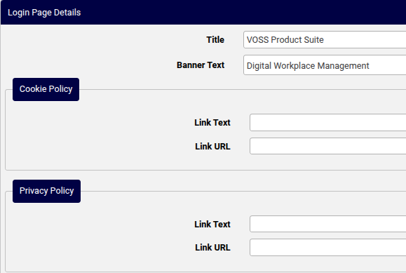
Login page details tab#
The Login Page Details tab defines the theme for the Login page, including the title and banner text, cookie policy and privacy policy details.
If you add banner text (limited to 2048 characters), this is used at the bottom of the Login page.
References to the cookie policy and privacy policy in the Banner Text field should be added as placeholders, which will then resolve to the Cookie Policy and Privacy Policy data entered. The placeholders are:
{{cookie_policy}}{{privacy_policy}}
Note
You can add multiple lines for the banner text, including paragraphs. Banner text displays exactly as you add it to this field. Cookie and security references show as links that open in a new browser tab.