Manage Themes (Admin Portal)#
Overview#
The Themes page in the Admin Portal can be used to create a theme that applies to the VOSS Automate Admin Portal.
Note
To access the Themes page in the Admin Portal, go to (default menus) Role Management > Themes.
You can select the following tabs on the Themes page in the Admin Portal:
Theme Details
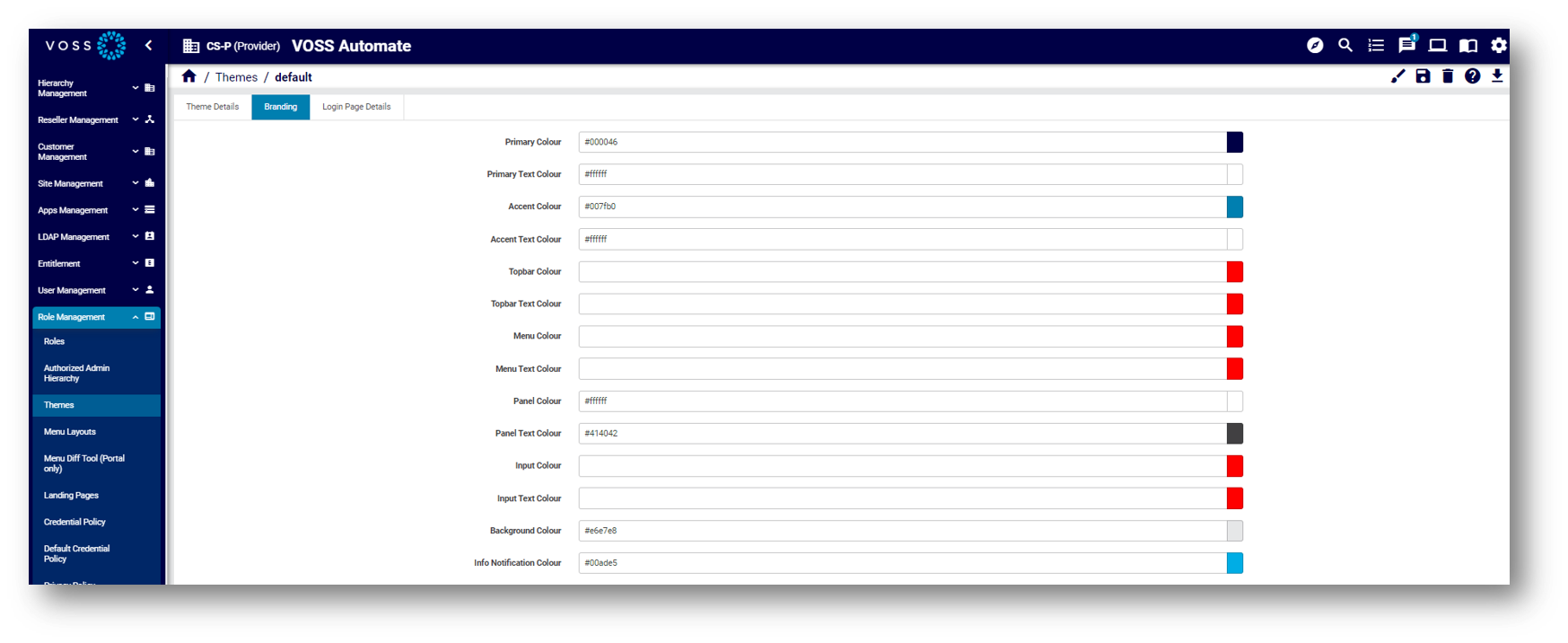
Branding
Login Page Details
Custom Themes#
You can create a custom theme to change the following properties of the Admin Portal:
Primary and accent colors
Logo image
Login screen background image
If the background image also contains logos, we recommend that these be placed on the bottom of the image.
Background image for menu
Browser tab title
Themes created in the Admin Portal:
Can’t be exported in full
Require the use of the legacy Admin Portal to include Login page text and if you need to create a non-admin interface (Self-service).
Custom Theme File#
If you’re configuring a theme for the Admin Portal (via the Admin Portal), you will need to upload a custom Admin Portal theme file.
When using a theme file, the theme will apply to the Legacy Admin Portal. If you customize the theme via the Branding tab settings, the updates apply only to the Admin Portal. You can overwrite these updates in the legacy Admin Portal.
If you don’t add a theme file, making changes to the theme via the Branding tab will apply to the legacy Admin Portal and the (new) Admin Portal. In this case you won’t be able to upload a file theme to update the theme.
Preview a Theme#
When creating a theme, you can use the toolbar Preview icon ![]() to see what your theme looks like
before assigning it to a user role. Once you assign a theme to a user role it is applied to the GUI.
to see what your theme looks like
before assigning it to a user role. Once you assign a theme to a user role it is applied to the GUI.
Theme Details Tab#
On the Theme Details tab of the Themes page you specify theme details:
Provide a theme name and a description
Note
Valid characters allowed for the theme name are in the range:
a-zA-Z0-9_.Specify navigation bar text
Define whether to use the theme to style the Login page
Define whether to hide the theme from lower hierarchies
Specify the site title
Upload a custom theme file, if applicable
Enable or disable backups
Define the GUI where the theme is applied

Branding Tab#
On the Branding tab (in the Admin Portal), you can change colors via the color picker or by typing in the color hex value. When no colors are chosen in this tab, the defaults apply.

When uploading images for the theme:
Note the file size and width x height pixel dimension size restrictions. A system message displays if the image is too large.
Only PNG files are supported for the Logo image. Other images can be PNG or JPEG.
The image for Menu Background does not apply to the VOSS Automate Admin Portal.
For image filenames, you can use the following characters and character types:
ALPHA / DIGIT / "-" / "." / "_" / "~"/ "#"
Image details:
Favicon: The favicon for the site. Shown on the tab and when the site is bookmarked.
Type: PNG image or with
.icoextension.Maximum dimensions: 256x256 pixels.
Logo: This image is used for the logo in the top left of the menu bar.
Type: PNG image with a transparent background.
Maximum file size: 0.5MB
Maximum dimensions: 600 pixels in width and 192 pixels in height.
Login Logo: This image is used for the logo on the login page.
Type: PNG image with a transparent background.
Maximum file size: 0.5MB
Maximum dimensions: 600 pixels in width and 192 pixels in height.
Login Background: This image is used for the login screen background.
Type: PNG or JPEG image.
Maximum file size: 5MB
Maximum dimensions are 1920 pixels in width and 1080 pixels in height.
Menu Background: This image is used for the side menu background.
Type: PNG or JPEG image.
Maximum file size: 2MB
Maximum dimensions: 240 pixels in width and 1040 pixels in height.
Login Page Details Tab#
The Login Page Details tab defines the theme for the Login page, including the title and banner text, cookie policy and privacy policy details.
If you add banner text (limited to 2048 characters), this is used at the bottom of the Login page.
References to the cookie policy and privacy policy in the Banner Text field should be added as placeholders, which will then resolve to the Cookie Policy and Privacy Policy data entered. The placeholders are:
{{cookie_policy}}{{privacy_policy}}
Note
You can add multiple lines for the banner text, including paragraphs. Banner text displays exactly as you add it to this field. Cookie and security references show as links that open in a new browser tab.

