Table widgets#
Overview#
Condition: The display of the widget on the dashboard can be controlled by entering a condition that resolves to boolean True or False, for example in accordance with enabled features, services, and devices as in the Global Settings. The conditions are in the form of system macros. See for example the macros listed under the Links topic.
Data Source: Automate, Automate Analyzed and Assurance sources can be accessed.
Available menus and fields upon Data Source selection:
Automate Analyzed
Resource options available in accordance with the Insights database
Automate provides an additional list of Resource instances that can be used to represent trends on a widget. For details, see Automate dashboard trends resources.
Fields: select fields from the resource to show in the table
Filters: filter field values from the table
Sorts: order the table (ascending, descending) by a selected field value
Automate: Model Type, Field Display Policy, Configuration Template
Assurance: if selected, options are available to choose a Data Source Instance, since multiple instances can be configured. A selection of these can then also be made if Allow Data Source Selection is enabled. For Arbitrator configuration, see: Arbitrators.
Table Options are available for both data sources.
Options to limit, show, hide or format table data and elements
Additional field display customization using Renderers for fields, including a Hide Column option (if the column is for example only used for filtering purposes).
Drilldown options: see Drill-down options and conditional syntax
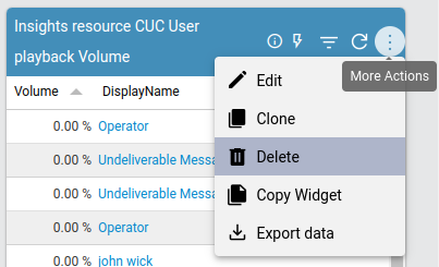
Besides standard menu options, a displayed table can also show additional menu options in accordance with enabled features such as:
Description (circled
iicon)Drill-down (lightning bolt)
Filter (funnel icon)
When a table widget is selected, it is also possible to switch to another widget format during the edit and design process. The Widget Type can be updated from the dropdown. Changes are reflected in real-time during the design of a widget or by using the widget’s Refresh icon.
Table widget example with Select Query and Partition By#
The example below shows a table widget configuration using an Automate Analyzed resource, with Select Query and Partition By operations on fields, as well as a Filter on one of the fields. Consider the following Data Settings:
Resource: Cisco UCM User
Fields:
Site. Operation: Select Query
firstName. Operation: Partition By
firstName. Operation: Select Query
Filters
firstName. Operation: Regex (Case sensitive), Filter Value:
^Be
In this case, sites and user first names are selected where first names are used to
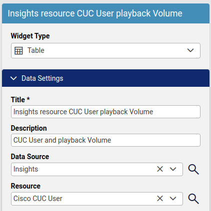
Table widget example with drill-down#
The example below shows a table widget configuration using an Automate Analyzed resource, the resultant output display and also a drill-down result.
Configuration#
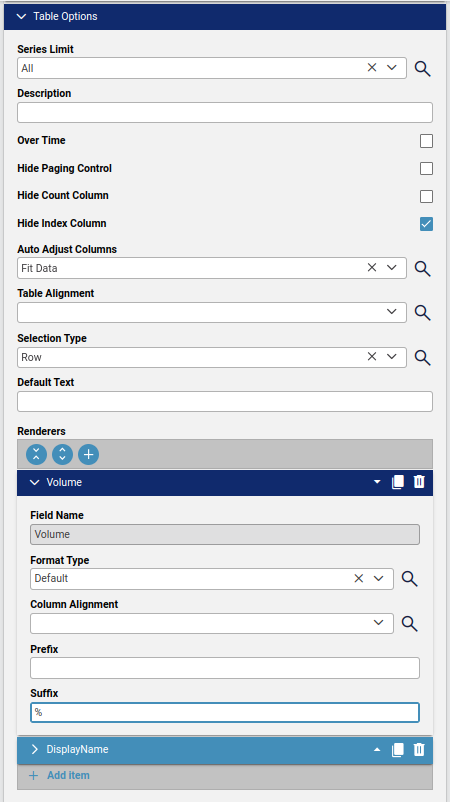
Resource: Cisco CUC User
Fields:
Playback volume (integer) is selected as a table column and similar values are grouped using Operation: Grouping Count
The user’s DisplayName is as a table column
Field Type: A read-only field indicating the data type of the selected Field Name. For example, if the Data Source is Arbitrator, a Resource instance may show the Field Type as
Calculated - Text.
Filters
DisplayName values containing regex
CFTare excluded with a filter.
Sorts: no sorting is done on any column.
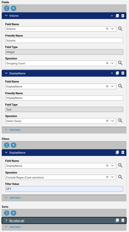
Table Options
Series Limit: left at default All so no restriction on the number of values to show.
Over Time: For table data containing timestamp columns, this option can be enabled to expose a Use Over Time Day Pagination checkbox and an Interval dropdown so that table paging of data can be grouped and the paging range can be shown according to the selected interval.
Hide Count Column: enabled so an additional column containing the Count is not shown.
Hide Index Column: enabled so an additional first column containing an index value (row number) is not shown.
Selection Type: left at default so that a table entry selection selects an entire row.
Renderers: the Volume field configured so that its integer value has Suffix:
%.
Other Renderers options:
A field on a table can also be modified if the Resource is Automate Analyze:
Format Type = Default: field type remains as defined (default)
Format Type = Text: field value rendered as text - allows for a default theme-related color mapping of text (Text Color Mapping) and table cell (Cell Color Mapping) to apply.
Contact VOSS if a custom color mapping is required.
The Font Size and Font Weight can also be set here if the Format Type of a field is Text.
Column Alignment: for text - to override the table alignment for the selected field.
Prefix and Suffix: for text and numbers - options to add a string prefix or suffix to the field value.
Format Type = Traffic Light: field value replaced by a “traffic light” colored icon - allows for default theme-related color mapping.
Format Type = Tick Cross: field value replaced by a “cross” (
X) colored icon - does not allow for color mapping.Format Type = Number: number-specific options are available:
Number Type:
Default: standard value: 2 decimals
Abbreviation: no decimal
Bandwidth and Throughput: additional options to specify Bit/Bite type
No Format: e.g. no thousands comma
Float Precision: for float numbers, the decimal precision (default = 2)
Factor: multiply the value by a factor (default = 1)
Hide Column: hide the field column on a table (e.g. if the field is used for calculation, other purposes)
Note
By default, a number of table colours are matched with the current GUI theme. For details on these colours, see the Branding tab section under Manage themes.
In particular:
Table backgrounds match Panel Colour
Table text colour match Panel Text Colour
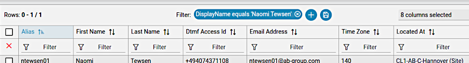
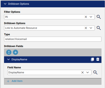
Drill-down options
Filter Options: set to IN so that a drill-down display contains DisplayName.
Drilldown Options: selecting a row - the choice will
Link to Automate Resourcespecified as TypeType: the Automate resource type: selected the related Automate resource:
relation/Voicemail.Drilldown Fields: the field to highlight in the table as a drill-down link: selected DisplayName.
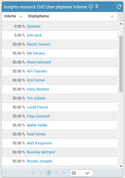
Output
The table shows 2 columns:
Volume values with
%suffixDisplayName with drill-down link
Drill-down result
Selecting a row link from the table shows the item as listed in the selected Drilldown Options.