Chord Diagram
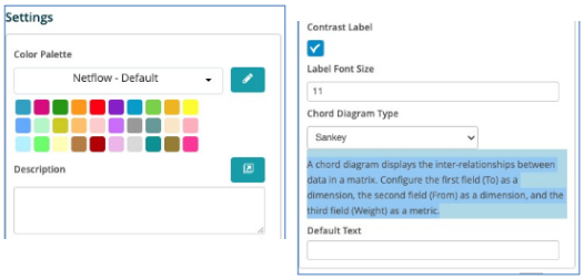
A chord diagram displays the inter-relationships between data in a matrix. Configure the first field (to) as a dimension, the second field (From) as a dimension and the third field (Weight) as a metric.
When clicking on the Chord Diagram the Settings options below are adjusted to that particular selection. You have the following choices:
Color Palette - This defines the colors to associate with data values, the columns/bars plus allows you to save that palette for use with additional widgets. See the options on how to define the palette below. (Color Palette Changes)
Description - Allows you to enter a description of the chart to be displayed along the top portion of the chart.
Contrast Label - Select this to provide better contrast on the font. Usually utilized with dark mode in the browser.
Label Font Size - Input the font size.
Chord Diagram Type - The two choices are Sankey, which shows the relationship horizontally or Dependency Wheel, which connects the relationship in a wheel design.