Table Charts
There are two table choices within the platform. When clicking on the Table Chart the Settings options below are adjusted to that particular selection.
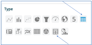
Table 1
Table 1 (Icon is indicated by the top row arrow).
You have the following choices:
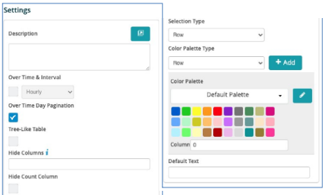
Description - Allows you to enter a description of the chart to be displayed along the top portion of the chart.
Over Time & Interval - By selecting this box the chart will display the data over the specified time and based on the interval toggled within the adjacent box, i.e. Minute, Hour, Daily, Weekly and Monthly.
Over Time Day Pagination - By selecting this box the table can be viewed page by page over the time interval.
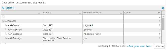
Tree-Like Table - If this box is selected then each row in the table will an arrow indicator that allows a parent / child relationship within the row. Clicking the arrow opens up the children below. Clicking again displays only the top / parent level.
Hide Columns - Allows you to hide columns that you may not want to show on the table. The column choice starts at 1 from left to right. Enter the number or numbers of columns you want to hide. Separate each by a comma.
Hide Count Column - There is a default “Count” column added to the end of the table. Selecting this field will hide that column.
Selection Type - Select Row or Cell. Cell will underline the field (similar to a URL) that is being used in the drill down selected at the bottom. Row is just a standard view.
Color Palette Type - Select Row or Cell. This allows a custom color (based on values, regex, ranges or comparisons) to be applied to either the cell or the row.
Color Palette Option - This allows you to select the specific color to apply, based on the selection above. The color palette is applied based on the calculation set up and applied to the column selected next to that field. (Starts with column 1).
Table 2
Table 2: Icon is indicated by the bottom row arrow).
You have the following choices:
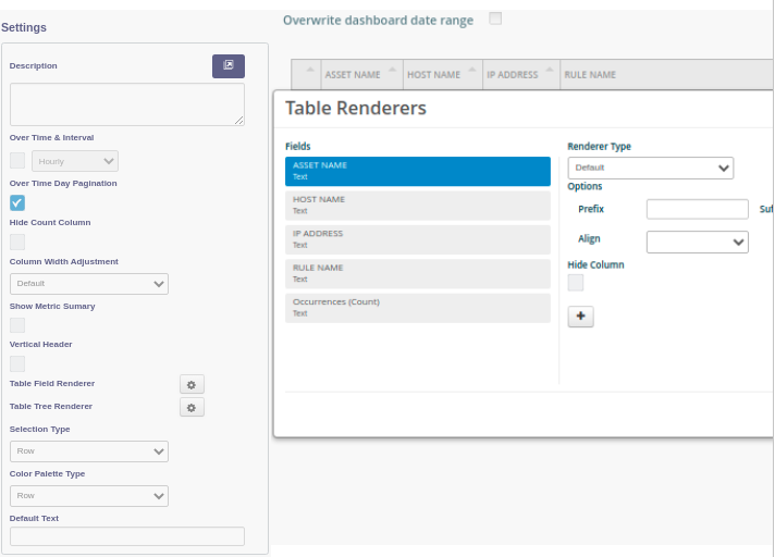
Description - Allows you to enter a description of the chart to be displayed along the top portion of the chart.
Over Time & Interval - By selecting this box the chart will display the data over the specified time and based on the interval toggled within the adjacent box, i.e. Minute, Hour, Daily, Weekly and Monthly.
Over Time Day Pagination - By selecting this box the table can be viewed page by page over the time interval.
Tree-Like Table - If this box is selected then each row in the table will an arrow indicator that allows a parent / child relationship within the row. Clicking the arrow opens up the children below. Clicking again displays only the top / parent level.
Hide Count Column - There is a default “Count” column added to the end of the table. Selecting this field will hide that column.
Column Width Adjustment - Column widths can fit contents or can be customized.
Show Metric Summary - Add a summary row to the bottom of the table.
Vertical Header - Selecting this box will place the text within the header of each column in a vertical position.
Table Renderers - By clicking the Edit button here it opens up a box with several options to design how you want to represent the data in the table. Included with this is the color palette as well. The fields are represented on the left-hand side. There are 4 Renderer types to choose from in that drop-down box:
Default - Just as it is present in the table
Text - Convert the data to text
Traffic Light - This is a colored ball that is driven by the values within the palette
Tick Cross - A symbol to represent the data type in the row)
The Tree Table Renderer configuration screen allows you to control how data is grouped per tree table.
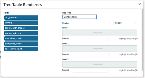
Each selection provides for additional choices that are logically assigned. Additionally, you can choose to put in a custom prefix or suffix for the data. An example is a $ or a metric such as Gbps.
Selection Type - Select Row or Cell. Cell will underline the field (similar to a URL) that is being used in the drill down selected at the bottom. Row is just a standard view.
Color Palette Type - Select Row or Cell. This allows a custom color (based on values, regex, ranges or comparisons) to be applied to either the cell or the row.
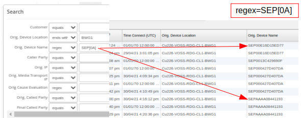
Search Box
Table charts also show a search box for displayed fields. Values can be searched for by a range of matching operators, including regex.
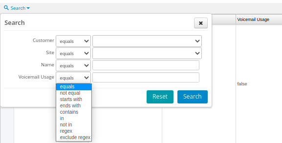
The example below illustrates the results of a combined “ends with” and regex SEP[0A] (contains SEP followed by either 0 or A):