Multi Chart
When clicking on the Multi Chart the Settings options below are adjusted to that particular selection. You have the following choices:
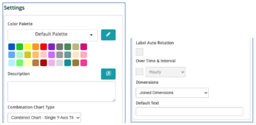
Color Palette - This defines the colors to associate with data values, the columns/bars plus allows you to save that palette for use with additional widgets. See the options on how to define the palette below. (Color Palette Changes)
Description - Allows you to enter a description of the chart to be displayed along the top portion of the chart.
Combination Chart Type - There are 3 choices to choose from.
Single Y-Axis Title - This places the data on a single axis.
Multi Y-Axis Titles - The titles and the data are represented across the Y Axis individually
Individual Charts - Each data point is graphed across the chart individually.
Over Time & Interval - By selecting this box the chart will display the data over the specified time and based on the interval toggled within the adjacent box, i.e. Minute, Hour, Daily, Weekly and Monthly.
Dimensions - This allows the dimension to be displayed with the metric on the chart label if applicable.