Column / Bar Chart
When clicking on the Column/Bar Chart, the Settings options below are adjusted to that particular selection. You have the following choices:
Color Palette - This defines the colors to associate with data values, the columns/bars plus allows you to save that palette for use with additional widgets. See the options on how to define the palette below. (Color Palette Changes)
Description - Allows you to enter a description of the chart to be displayed along the top portion of the chart.
Axis X Label - Labels the X Axis (Horizontal) for the chart, such as “Date”.
Axis Y Label - Labels the Y Axis (Vertical) for the chart, such as “milliseconds”.
Horizontal Chart - By selecting this check box, the chart will display the columns/bars horizontally across the chart.
Numeric Precision - Select the decimal precision for each point.
Scrollbar – Number of Columns – Input the number of columns (vertical or horizontal) that you want to represent on the chart. A scrollbar will appear that will allow you to scroll through the remainder of the data while only representing the number of columns selected.
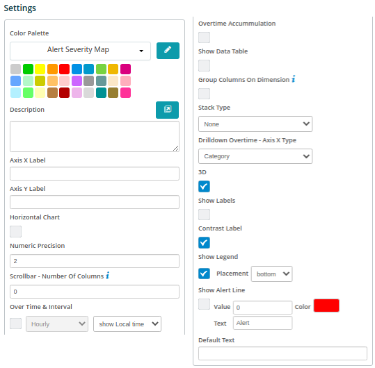
Over Time & Interval - By selecting this check box the chart will display the data over the specified time based on the interval toggled within the adjacent box, i.e. Minute, Hour, Daily, Weekly and Monthly.
Over Time Accumulation – Selecting this box will accumulate all of the values as they are represented in the chat versus each value.
Show Data Table - Selecting this will display data in a table below the chart.
Group Columns on Dimension – Selecting this will allow you to group the metrics on the dimensions being analyzed in the chart.
Stack Type – By selecting this box the chart will stack the values based on the type selected: Stack, StackPercentage or Drilldown.
Drilldown Overtime – Axis X Type: Select the X Axis drilldown for an overtime chart based on the “Category” or the “DateTime”.
3D - By selecting this check box the columns/bars will be displayed in a 3D representation.
Show Labels - By selecting this check box, each value that defines the chart will be labeled on the chart.
Contrast Label – Select this to provide better contrast on the font. Usually utilized with dark mode in the browser.
Show Legend - By selecting this check box, the Field Definition for the values being charted will be displayed in the selected position on the chart with the associated color representation.
Placement – Drop-down box providing options on where to place the legend on the chart.
Show Alert Line – This allows a value to be set to show a threshold or “Alert” line on the chart and have it represented in a different color.
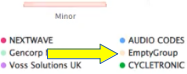
Empty Group Text - enter text to show if the group name is empty (instead of “EmptyGroup”).