Combo Chart
A combo chart allows you to combine multiple metrics with a dimension to be displayed on the chart.
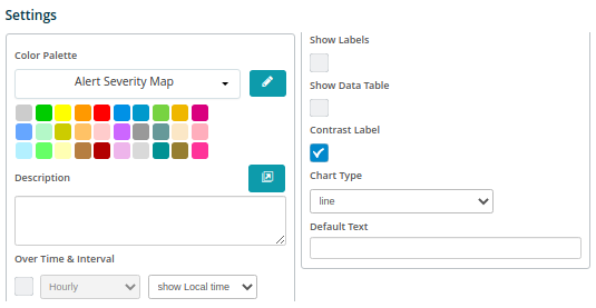
When clicking on the Combo Chart the Settings options below are adjusted to that particular selection. You have the following choices:
Color Palette - This defines the colors to associate with data values, the columns/bars plus allows you to save that palette for use with additional widgets. See the options on how to define the palette below. (Color Palette Changes)
Description - Allows you to enter a description of the chart to be displayed along the top portion of the chart.
Over Time & Interval - By selecting this box the chart will display the data over the specified time and based on the interval toggled within the adjacent box, i.e. Minute, Hour, Daily, Weekly and Monthly).
Show Labels - By selecting this box then each value that defines the chart will be labeled on the chart.
Show Data Table - Selecting this will display data in a table below the chart.
Contrast Label - Select this to provide better contrast on the font. Usually utilized with dark mode in the browser.
Chart Type - The choices are Line, Spline, Column, Bar, Area or Areaspline. Select what works best to represent the data on the chart.