Gauge Chart
When clicking on the Gauge Chart the Settings options below are adjusted to that particular selection. You have the following choices:
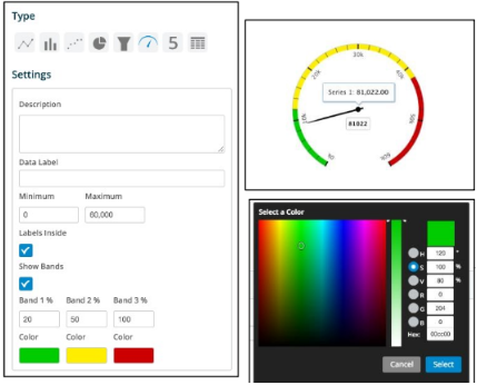
Description - Allows you to enter a description of the chart to be displayed along the top portion of the chart.
Data Label - Labels the middle of the gauge with value from field extraction.
Minimum and Maximum - Place the starting value (Minimum) and the ending value (Maximum) for the gauge needle to traverse, i.e. Start at 0 and End at 60,000
Labels Inside - By selecting this check box the value will be labeled with the definition based on the field extraction.
Show Bands - By selecting this check box then the gauge will have a maximum of 3 colored bands indicating certain severity levels. These are user defined thus a good, minor and major severity can be easily defined based on the data elements extracted. Simply place values for each color in the associated box to represent the percentage of the gauge band that color is to occupy. Tip: Make your major issue (Red) 100 thus simply modifying the good and minor automatically recalculates the major.
Modify each color band by simply clicking on the color swatch. A color box pops up where you can select the hue or enter specific values to change the color.