Pie / Doughnut Chart
When clicking on the Pie / Doughnut Chart the Settings options below are adjusted to that particular selection. You have the following choices:
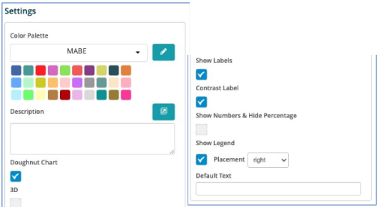
Color Palette - This defines the colors to associate with data values and the Pie/Doughnut plots plus allows you to save that palette for use with additional widgets. See the options on how to define the palette below. (Color Palette Changes)
Description - Allows you to enter a description of the chart to be displayed along the top portion of the chart.
Doughnut Chart - By selecting this check box the chart will turn into a Doughnut chart with the values plotted around an empty space in the middle versus wedges of a Pie.
3D - Show the chart in 3-D.
Show Labels - By selecting this check box then each value that defines the chart will be labeled on the chart.
Contrast Label - Select this to provide better contrast on the font. Usually utilized with dark mode in the browser.
Show Numbers & Hide Percentage - Allows the values / numbers to be shown on the chart versus the percentages.
Show Legend - By selecting this check box then the Field Definition for the values being charted will be displayed in the selected position on the chart with the associated color representation.