Field Display Policies#
Overview#
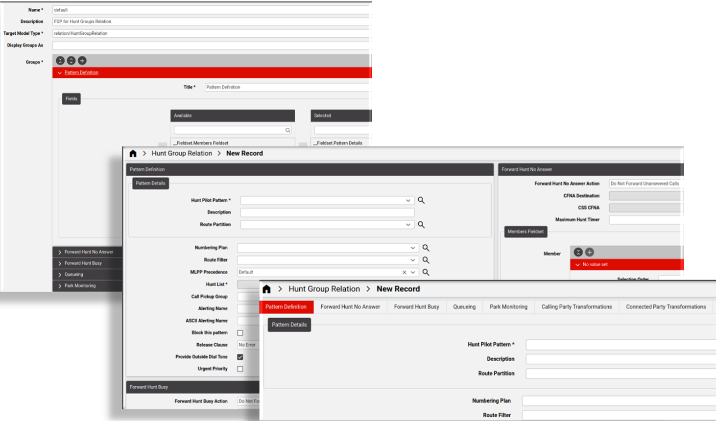
Field Display Policies (FDPs) define the layout and composition of fields, fieldsets, and groups on forms in the Automate Admin Portal GUI. To change these elements on the form, you can edit the FDP associated with the form, if allowed.
Note
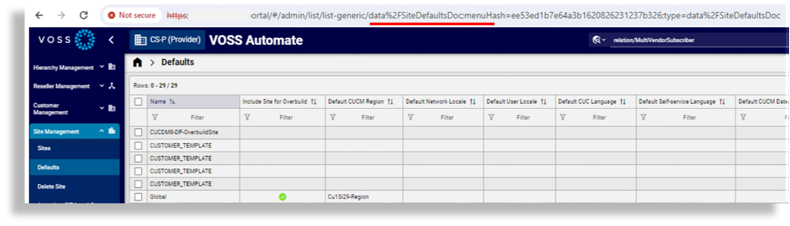
FDPs are assigned to the model associated with a form or page in the GUI. FDPs can be added to Data models, Relations, and Views. For example, data/SiteDefaultsDoc is the model associated with the summary list view page and with the edit form for the site defaults.
If you want to change the layout of the form, you can edit the FDP for this model, if allowed. The layout of forms associated with some models cannot be modified via their FDP, for example, for relation/LineRelation, relation/SubscriberPhone, tool/Transaction, or view/BulkAddUser.
Via the FDP, you can define whether to group or disable fields, add online help text to a field, add a label to a field, or move a field up or down on the form.
You can apply one or more FDPs to a particular item type to present different views of the same form. You can apply a FDP for a menu layout and role so that users with this role are presented with a view of the form (defined by the FDP) for their user role when they log in. For example, a system may have users at Provider, Customer, and Site administration hierarchy levels - all of whom may access the same items, but perhaps some item fields need to be hidden for admin users at some levels. Therefore, you can create and apply a specific FDP to a menu layout designed for admin users at these levels.
You can clone an existing FDP to quickly create one, then modify the clone as required, and choose this new FDP for the model on a user’s menu layout. In this way, the user’s view of the GUI can be modified for their level of access to the model, from the menu.
Note
The list view column header will also show the field title from the FDP if the field belongs to the list of summary attributes.
Field Display Policy Naming Convention
The name of a FDP must be unique at each hierarchy. You can however have FDPs with the same name at different hierarchies.
FDPs that have the name default will apply to their associated model, by default.
Display Groups As Tabs or Panels
The Field Display Policy configuration screen provides a Display As Groups setting that allows you to define the default layout of some forms, as either tabs or panels.
Tabs |
Each group of fields and/or fieldsets displays on a tab. The group title is the tab title. |
Panels |
Each group of fields and/or fieldsets displays as a panel in a 2-column list of panels on the GUI. The group name is the panel header. Note This option is only available in the Automate Admin Portal (not in Automate’s classic Admin GUI). |
Note
If no option is selected, the default is Panels, except for some models, which display groups as tabs by default. On some forms, depending on your user type and the model where the FDP is applied, you can click a toolbar icon in the GUI (or select from the action overflow menu) to switch between a panel or tab layout. The layout you choose is preserved when you log out and log in again.
The image shows an example of a form where groups display as Panels:
The Automate system default is Panels, except for the following models, which have as their default setting, Tabs:
view/GlobalSettingsdata/SiteDefaultsDocdata/ucprep_UC_Profilesrelation/DP_RELdata/HcsDpDialPlanSchemaDATdata/HcsDpDialPlanSchemaGroupDATtool/BulkLoadtool/DataImport
The table lists models where the layout of elements of add and/or edit form types can’t be modified via FDP. These form types also do not have the action element available on the GUI to switch the form view between tabs and panels.
Model Name |
Form Type |
Default |
|---|---|---|
|
edit |
Panels |
|
edit |
Panels |
|
add, edit |
Panels |
|
add, edit |
Panels |
|
edit |
Panels |
|
add |
|
|
edit |
|
|
add |
|
|
add |
|
|
add |
|
|
add |
Related Topics
Add and Edit Field Display Policies#
This procedure adds and edits a field display policy (FDP).
Log in as Provider administrator or higher.
Choose the relevant hierarchy.
Go to (default menus) Customizations > Field Display Policies to open the list of existing FDPs.
Do you want to …
Edit an existing FDP? Click on the relevant FDP in the list view to open the configuration form. Update the FDP as required, then save your changes.
Add a new FDP? Go to step 5.
To add a new FDP, from the list view, click the toolbar Plus icon (+) to open the configuration form for the new FDP you’re adding.
Configure the FDP:
Fill out a name for the new FDP, and optionally, a description.
If the FDP name is
default, it is applied by default to the target model type you choose on the form.FDPs at the same hierarchy must have a unique name. FDPs at different hierarchies can share the same name.
Choose the target model type to associate with the FDP.
Note
The target model type defines the fields available for use in the FDP.
At Display Groups As, choose how groups should display on forms. Options are Tabs or Panels.
Note
The default is Panels, except for a selection of models, where the default is Tabs. Within a tab or a panel, you can add a combination of fields and/or fieldsets (within one or more groups).
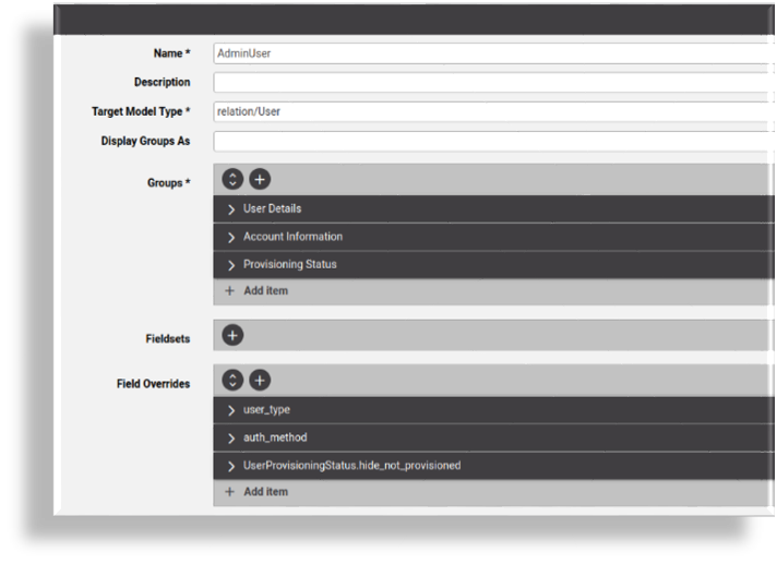
Add groups, one or more, required:
At Groups, click the Plus icon (+), then configure the group.
Note
Groups that describe a collection of attributes display together on the GUI. All fields in the FDP must belong to a group.
At the form level, groups all display either in panels or tabs, depending on the option selected in Display Groups As, and provided the model allows the option you choose.
You can copy or re-order (move up or down) groups, fields, and fieldsets.
The table describes the group configuration options:
Component
Description
Title
Mandatory. Fill out label text to display for the attribute on the new tab. If a group displays as a tab in the Admin Portal, the value defined for Title displays as the title of the tab.
Number of Columns
Fill out the number of columns for fields. The default is 1 (a single column). Fields in the Selected transfer box display in these columns.
Fields
Choose fields to add. Select then move fields from the Available field to the Selected field. The selected target model type defines the available fields. Use the Move Up/Move Down buttons to adjust the position of any field.
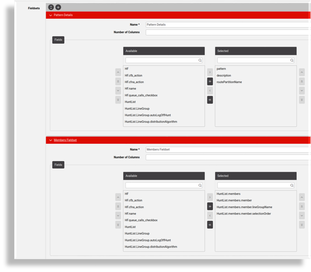
Add fieldsets, if required. Click the Plus icon (+) at Fieldsets, then configure the fieldset.
Note
Fieldset options (fields in the Available transfer box) show all field choices for the selected target model type. Fieldset names are added as choices within any group added to the FDP, and the fields display as a group in fieldsets in the panels.
The Name field is the name of the fieldset. First create fieldset, then add it to a group.
Add field overrides, if required. Click the Plus icon (+) at Field Overrides, then configure the field override.
The table describes configuration options for field overrides:
Component
Description
Field
Name of the model field to override. Options include those added to the Selected field for groups.
Title
New title to display for the field. If the FDP is called
defaultat a hierarchy, the list view column header also displays this title if the field belongs to the list of summary attributes.Help Text
New help text to display for the field. Leave blank to use the model attribute description.
Disabled
Sets the field as read-only.
Input Type
Overrides the input type of the field. Select an option to choose how the input field displays, for example, radio button, grid, multi select.
Click Save.
Once saved, the FDP can be applied by selecting it in a menu layout available to a role.
Clone a Field Display Policy#
This procedure creates a copy, or clone, of an existing field display policy (FDP) to create a new FDP, starting with the configuration of the FDP you’re cloning.
Login as Provider administrator or higher.
Choose the hierarchy.
Go to (default menus) Customizations > Field Display Policies to view a summary list of existing field display policies (FDPs).
Click on the FDP you want to clone.
Choose Actions > Clone.
Update the necessary fields for the cloned FDP.
Click Save.
You can apply the cloned FDP by choosing it in a menu layout available to a role.
Rules for Creating Field Display Policies#
When creating groups and selecting the field transfer boxes of a group, a number of rules apply.
Note
Regarding notation, if the fields belong to objects or arrays, the names in the transfer boxes are shown in dot notation. Refer to the target model type on-line help field reference to distinguish object types from array types.
To understand the rules, consider a selected Target Model Type with the fields as listed below. Where the name starts with “A”, the field is an array and where it starts with an “O” it is an object. The values “x”, “y”, “z” are also objects. The field “F” is neither object or array.
A, A.x, A.x.b, A.x.c, A.x.d, A.y.r, A.y.s, A.y.t
F
O, O.v, O.z, O.z.a, O.z.b, O.w.d
Inclusion Rules
The following inclusion rules apply:
If a parent object or array field is included, the parent and all its children will be displayed in the GUI.
Example: if O.z is selected, O.z is saved as the fields and the GUI will display O.z and also inner fields O.z.a and O.z.b.
If a specific selection and order of child elements are required, select these child elements and order them.
Example: if O.w.d, O.z.b, F are selected, these three fields are saved in that order in the FDP group fields and the GUI shows only the inner field O.w.d, followed by the inner field O.z.b and lastly the field F.
Inclusion of child fields in a group without the inclusion of the parent fields will display these child fields at the root level of the form.
Example: if O.w.d, O.z.b are selected, these fields are saved as is in the FDP group fields list and only the inner fields O.w.d and O.w.b are shown in the GUI.
Array children fields without their parent fields will be ignored by the GUI. Therefore, if the child fields of an array field are selected, the parent field should also be selected.
Example: if A.y.s, A.y.t are selected, A and A.y should be selected.
Array fields may not be split into different groups.
The parents of fields cannot be in one group and its children in another.
Example: O.z cannot be in Group 1 if O.z.a, O.z.b and O.w.d are in Group 2.
Fields of the same object and members of the same array type cannot belong to more than one group.
Example:
If A.y.s is selected for Group 1, then A.y.t cannot be selected for Group 2.
If O.z.a is selected for Group 1, then O.z.b cannot be selected for Group 2
You can split the first level children of object fields into different groups.
Example:
O.v can be in Group 1 while O.z is in Group 2.
For second level children: O.z.a can be in Group 1 and O.w.d can be in Group 2.
To hide a field do not move it to a Selected box.
Example: To hide O.z.b, select O.z.a, O.w.d.
Ordering Fields in a Field Display Policy#
You can move fields or fieldsets in a group (up or down on the form) by clicking the Move Up / Move Down buttons at the group level or in the transfer boxes.
Ordering child and parent fields depends on the presence of siblings, other parents, and children. If a child is selected in a group and not its parent, but a sibling of that parent is selected, then the sibling’s order will affect the order of the fields.
The logic of order resolution starts from parents to children, according to the rules below.
For example, we select fields in this order in Group 1:
C.z, A.x.b, A.x.c, B, A.y, A.x, C, C.w
Result:
Parent fields on their own are considered first, hence our initial order is B, C.
However, parent A is not selected; only the children. We determine where A was mentioned. In this case the children of parent field A were mentioned before the parent fields B or C. Hence children of A will eventually be ordered before B and C.
Next we consider the selected first level child fields: C.z, A.y, A.x, C.w. The order becomes: A.y, A.x, B, C, C.z, C.w
We now move down the levels: A.x.b, A.x.c.
Thus the final display order will be:
A.y, A.x, A.x.b, A.x.c, B, C.z, C.w
Further examples below illustrate the presence of parents, siblings and children on the selected order.
We add fields C.w, A, C, B, A.x, A.y.
Result: The order is: A, A.x, A.y, C, C.w, B.
We add fields A.x.b, A.x.c, A.y, A, B
Result: The order is: A, A.x, A.x.b, A.x.c, A.y, B.
Note
Note that A.x was added and that A.y is placed after A.x, since the children were ordered before A.y while A.x was never selected.