Landing Pages#
Overview#
Landing pages define the look and feel and layout of elements that display in the main part of the system screens.
Note
This topic describes functionality as displayed in the Admin Portal. The look and feel of landing page and menu layout configuration options may differ in the classic Admin GUI.
When selecting a menu item that has been set to be a landing page, the main part of the system screen will then be the landing page defined for that menu item. Also, when logging or when clicking the Home button from anywhere in the system, you will see the landing page defined as the Landing Page on the user’s role.
Note
Saved Searches are shown as the first landing page entry on the Home page.
Default landing pages ship with the system and are associated with pre-defined roles in the hierarchy, for example Provider, Customer, and Site administrators.
You can modify landing pages to set up direct links to areas in the system. The links can be used as short-cuts by the administrators, based on their role.
Note
When viewing lists or forms that link from landing pages, you can navigate back to the landing page via the breadcrumb.
Multi vendor subscriber (MVS) landing pages and menu layouts that contain links referencing an adaptation (add-on), have an asterisk (*) postfix in the link text.
Related Topics
Customizing Landing Pages#
You can make a clone (copy) of a landing page and then create a new landing page based on pre-populated settings. Alternatively, you can export a landing page, edit it externally, and then re-import it. Designers with access to the tag function can use tag versions to uniquely identify different landing pages, and to track and control changes.
Landing pages may be customized for different user roles, and include several configurable elements:
Counters
Widgets
Sections
Welcome header text
Add or Edit a Landing Page#
This procedure adds a new landing page and edits an existing landing page.
Log in to the Admin Portal as a Provider administrator, or higher.
Choose the hierarchy level for the landing page, for example, Customer.
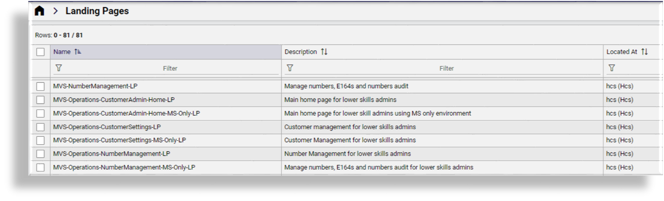
Go to (default menu) Role Management > Landing Pages to open the Landing Pages list view.
Choose an option:
Create a new landing page using the settings of an existing one
Recommended method.
Click on the relevant landing page to open its editing screen, then click Clone. Update the settings of the cloned landing page and save it as a new landing page. Go to the next step for details around configuring your new landing page.
Create a new landing page from scratch
Click the Plus (+) icon to add a new record. Go to the next step for details around configuring your new landing page.
Edit an existing landing page
Click on the landing page in the list view to open its editing screen, update settings, and save your changes.
On the Details tab, configure the options for the landing page:
Note
Rows with nested items or links contain a chevron (>) instead of a Plus icon (+) so that you can see which items have child lists.
Clicking the Delete icon in a row triggers a system message asking you to confirm that you want to remove the row. This allows you to review the change in case you clicked the Delete icon by mistake. Clicking the toolbar Save icon saves all changes to the landing page you’re configuring.
Add a Name and optionally a Description.
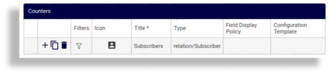
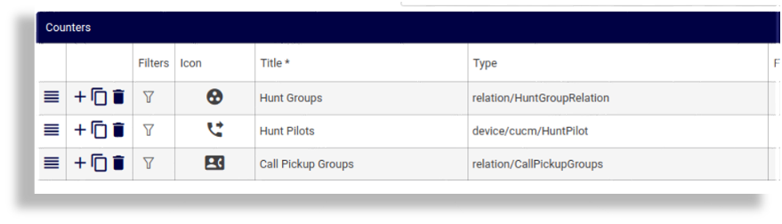
Configure Counters (filters, icon, title, model type, FDP, CFT).
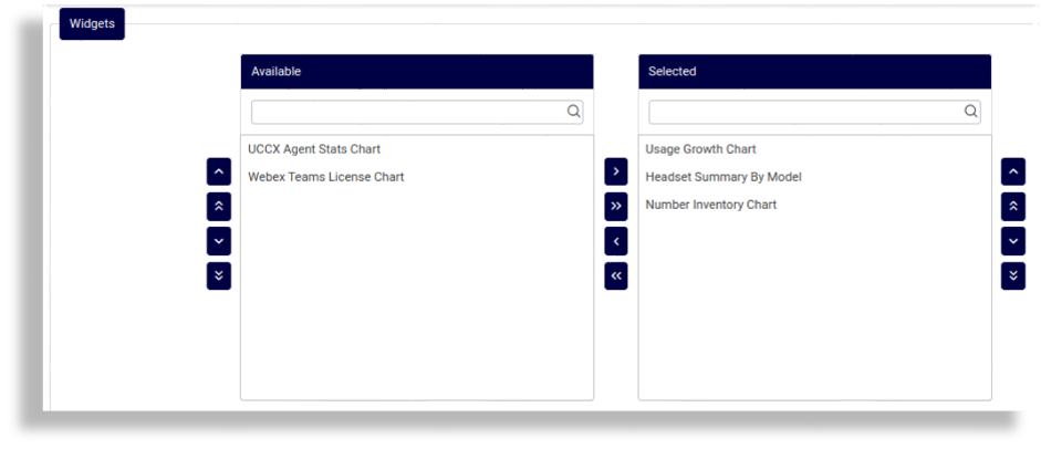
Configure Widgets (select from Available to Selected and order the selection).
Note
When configuring widgets, charts can be chosen to show:
Headset Summary By Model
Number Inventory Chart
UCCX Agent Stats Chart
Usage Growth Chart
Webex App License Chart
Webex Teams License Chart
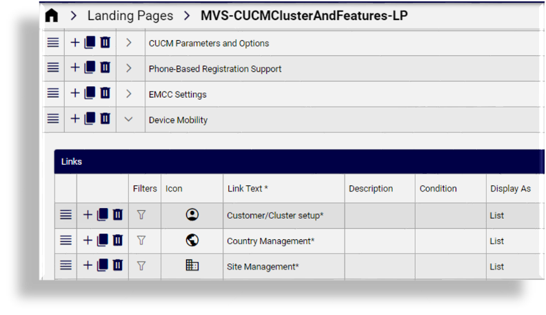
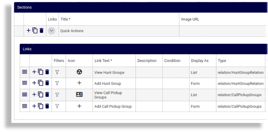
Configure Sections, and links in sections.
On the Welcome Header, configure the header text and line text for the landing page. See Welcome Header Tab.
Save the landing page.
Assign the landing page to the relevant roles or add to a menu layout.
Landing Pages - Configuration Options#
Landing pages are configured via (default menus) Role Management > Landing Pages.
The list view accessible via this path displays the landing pages available in your system, and includes the landing page name, a description, and the hierarchy.
You can click on a landing page in the list view to edit it. Landing pages have the following configuration options - you can either select a tab or, if you’re using the panel layout, fields display in the following main sections:
Details Tab#
On the Details tab (panel), you can configure basic options (name and description) and configure counters, sections, and widgets.
The table describes the configuration options for landing pages on the Details tab:
Column |
Description |
|---|---|
Name |
The name of the landing page. |
Description |
An optional description of the landing page. |
Counters |
These rows display the model-type instance counts (one or more) that display on the landing page. Click in a row to edit an existing counter, or click the Plus icon (+) to add a new counter. Use the hamburger icon to re-order the counters. Refer to further details in the tables below. |
Widgets |
A side-by-side transfer box is available to select and order widgets. Widgets typically show data in a chart or details format. Note The Headset Summary By Model widget cannot be arranged side-by-side with another widget since it spans the entire landing page. In order to group widgets on the landing page, ensure this widget is ordered as either the first or last in the Selected list. Refer to further details in the tables below. |
Sections |
These rows display the sections (one or more) that display as blocks on the landing page. Click on an item to edit it, or click the Plus (+) icon to add a new section. Use the hamburger icon to re-order the sections. Refer to further details in the tables below. |
Links |
Configures links in sections on landing pages. Items are arranged in two columns. Refer to further details in the tables below. |
Landing page counters, widgets, and sections
The table describes common edit functionality and data types typically available for the various landing page elements - Counters, Widgets and Sections:
Column |
Description |
|---|---|
Reorder |
Click on the reorder icon in the relevant row to change the location of a landing page element. |
Add, clone, or delete row |
Click an icon to either add a row, clone (copy) a row, or to delete the row. Clicking the Delete icon in a row triggers a system message asking you to confirm that you want to remove the row. This allows you to review the change in case you clicked the Delete icon by mistake. Clicking the toolbar Save icon saves all changes to the landing page you’re configuring. |
Type |
The model type to associate with the landing page element. Blank when href field is populated. The model type shows the related FDPs (field display policies) and CFTs (configuration templates) that can be applied. When type is |
Href |
Mandatory when the value for Display As is External Link. For backwards
compatibility, hrefs
can be used for links within the application to link directly to a form. For example,
(example API URL for a list of items of type relation/SubscriberPhone) the Add Phone
page would have the following href (API URL):
In this case, you’ll need to use JSON-format landing page import, or bulk load, to add
any associated field display policies (FDPs) and configuration templates for the menu
item. The recommendation is not to use hrefs to reference Href is a direct reference to a model type (the path), if applicable. If used, the Type field is empty. |
Field Display Policy |
The field display policy associated with the landing page element: Counters or Sections. |
Configuration Template |
The configuration template associated with the landing page element: Counters or Sections. |
Counters
The table describes configuration options for landing page counters:
Column |
Description |
|---|---|
Icon |
The icon to be used for this counter. |
Title |
Mandatory. The title to be displayed for this counter, for example, Phones, Users. |
Filters |
For Filters, fixed and configurable filters can be applied to the counters, so that the count is carried out in accordance with the filters. Fixed filters can’t be removed. Filters are relevant only for models where we have a list (not forms). The following options are available for filters once the Counter Type is selected:
|
Condition |
Click in the cell to add or edit a macro that allows you to display/hide the counter, based on a condition specified in a macro. If the macro evaluates to true, the counter displays, else, when false, the counter is hidden. The default is true (counters you add display by default). A condition may be needed if the counter, for example, relates to a feature that has to be enabled. Examples:
See the Advanced Configuration Guide for more information about using macros. |
Sections
The table describes landing page configuration options for sections:
Column |
Description |
|---|---|
Links |
Displays a Links table where you can configure links in the section. |
Title |
Mandatory. The section title as it will show on the Landing page. |
Image URL |
NB: This image is only displayed on the Select a landing page section image from the drop-down list. Optionally, an URL image to be displayed as section image. For example, let’s say a theme is uploaded with landing page images, and the theme folder has a subfolder with the following file: mytheme/img/landingpage/landing1.png In this case, the URL would be: /www/themes/mytheme/img/landingpage/landing1.png |
Condition |
Click in the cell to add or edit a macro that allows you to display/hide the section, based on a condition specified in a macro. If the macro evaluates to true, the section displays, else, when false, the section is hidden. The default is true (sections you add display by default). Examples:
See the Advanced Configuration Guide for more information about using macros. |
Links
The table describes configuration options for links in sections on a landing page:
Column |
Description |
|---|---|
Filters |
Click the filter icon in the relevant row to display a dialog where you can choose fixed and configurable filters for the link. Fixed filters can’t be removed and are applicable when Display As is ‘List’. Filters are relevant only for models where we have a list (not forms). The following options are available for configurable filters for links:
|
Icon |
The icon to use for the link. Click in the cell to choose an icon. Icons display in the drop-down with a descriptive name. |
Link Text |
Mandatory. Text for the link. |
Description |
Add a description of the link. |
Column |
Description |
|---|---|
Condition |
Optional. Specify a macro as a condition to define whether the link displays on the landing page. If the macro evaluates to True (default), the link displays. See the Advanced Configuration Guide for more information about using macros as conditional criteria. |
Href |
If a direct reference to a model type is used for the menu item, the specified path. |
Set as default Model Type |
This menu entry configuration is the default for this model type. Its selected Field Display Policy and Configuration Template will be used for the model in cases like search and when not navigating from a menu or landing page. |
Column |
Description |
|---|---|
Display As |
Click in the cell to choose how the menu item should display. The default is List. Options are: List, Landing Page, Form, External Link, Tree
|
Welcome Header Tab#
This tab configures the landing page header text and line text.
Header Text |
A single line static welcome message displayed at the top of the landing page. |
Line Text |
Text for the welcome line displayed under the header. Use [userrole] as a
placeholder to insert the current user’s role, to serve as the header.
For example: |
Landing Page Examples#
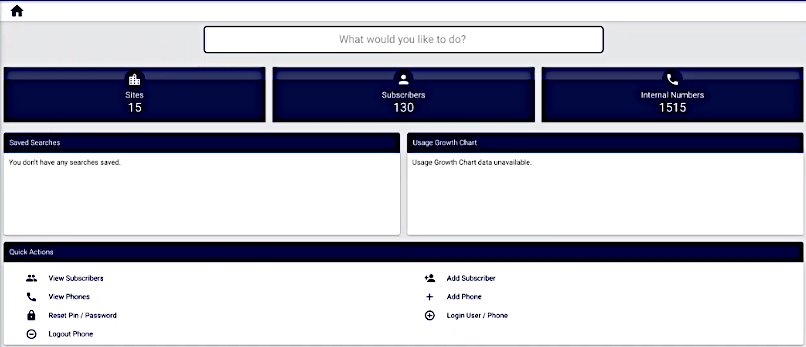
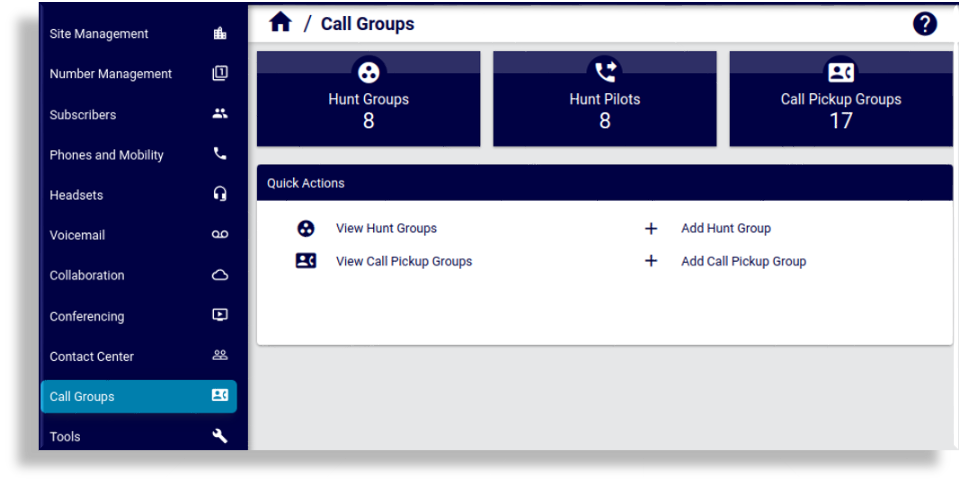
VOSS Automate provides a set of sample “Dashboard” landing pages that can be used or customized (cloned to a required hierarchy and modified) and referenced in a menu layout that can then for example be associated with an administrator user role.
The sample landing pages are designed to support both Cisco and Microsoft devices and services. Service, user or device counter, and a section titled Quick Actions are included that contain links to carry out common tasks.
Note
A user’s Access Profile - Permitted Operation options on a Permitted Type - will impact the availability of a related quick action entry on a landing page. See: Introduction to Access Profiles.
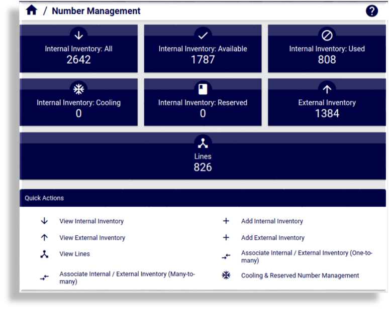
The image shows an example of the default “Dashboard Subscribers” landing page, for example associated with a Subscribers menu item:
Landing Pages for a Business Admin Role#
VOSS Automate provides a set of landing pages, menu layouts, and field display policies that are used in two sample menu layouts - for use or customization as a Business Administration Portal menu layout to be added to a user’s role.
Example landing pages - Business Admin Role#
Example - Call Groups setup and display
Example - display of Number Management landing page