
Less Files and Customizing Themes#
Overview#
The preferred way to edit a theme is to edit and compile the Less files (file-based theme). The file-based theme is in the form of a Cascading Style Sheet (CSS), which is exported, edited, and re-imported to the system.
Note
Less allows you to customize a theme with minimum technical knowledge. See, for example,
Twitter Bootstrap [http://getbootstrap.com/customize/>].
To find out more about Less, visit the official website [http://lesscss.org/].
This section describes the recommended practice for editing the theme .less files. It is however also possible to save the file, and open the CSS file in a text editor.
While all aspects of the exported CSS can be modified (for example, you can overwrite colors, sizes, fonts, and images), it is recommended that you use the default theme as a template for the basic design. This is to prevent usability and functional issues.
The CSS file is simple to export and edit. Headers in the CSS file are clearly marked, indicating the area of the Admin Portal where the design applies. The headers include these components:
Navbar
Shortcut menu
Hierarchy breadcrumbs
Quick search
Tree menu
Toolbar
List
Form
Directory Structure of Theme Files#
Once you have downloaded and extracted a theme into a directory folder, you should see the folders and files display with the following structure:
.
+-- build_dependencies
+-- img
+-- skin.css
+-- skin.less
+-- variables.css
+-- variables.less
Important
You must maintain this directory structure.
Working with Theme Files#
Any changes you make directly in the CSS files will have to be manually carried over after each change in the Less files.
You will need to edit the Less files and compile them to get the new CSS files.
Before you start
Download the theme file from VOSS Automate, and extract the theme into a directory.
You will need a Less compiler to compile the Less theme. You can find examples here:
Online:
[http://lesscss.org/usage/index.html#online-less-compilers>]On your desktop
[http://lesscss.org/usage/index.html#guis-for-less]IDE:
[http://lesscss.org/usage/index.html#editors-and-plugins]
Image Files#
Custom images for Login page backgrounds and logos are added to the img directory.
Images can be stored with the theme or referenced with the use of relative path names. Images must be identified with the correct file path name. It is recommended that you use relative paths; that is, a path relative to the CSS file location. For example, if you created an image sub-folder called ‘img’, use ‘img/myimage.png’. In this case, once you upload, the image is available to view at the following URL: http://<hostname>/www/themes/mytheme/img/myimage.png
Note
It is recommended that you do not use ‘/’ preceding the path name.
Less Files and CSS Files#
You can customize the following theme files:
|
Custom variables, overriding variables set elsewhere. When
you’re done, this file compiles as |
|
Main customization file. When you’re done, this file compiles
as |
The override hierarchy of variables and theme settings display as the first
lines of @import instructions in the skin.less files, for example:
// Loads default variables
@import (optional) "build_dependencies/themes/minimal/variables.less";
@import (optional) "../minimal/variables.less";
// Overrides some default variables
@import "variables.less";
@import (optional) "build_dependencies/css/coreAdministratorStyles.less";
@import (optional) "../../css/coreAdministratorStyles.less";
Imports lower down on the list override imports higher up on the list. The
(optional) parameter indicates the import is ignored if the file is not available.
Note
It is recommended that you do not remove any references to files in the following
directory: build_dependencies
Customizing variables.less#
Variables are used in skin.less and in other .less files
in the sub-directories of the build_dependencies directory.
Use variables.less to override any of these existing variable values.
New variables can also be added if required and used in skin.less.
Existing variables and values are in
build_dependencies/themes/minimal/variables.less.
Variable names have self-explanatory names and are grouped into Admin Portal categories, such as Login page, dashboard, or colors.
For example, in the default theme, show the following in variables.less:
@currentYear: ~`new Date().getFullYear()`;
@copyrightNotice: '\00A9 @{currentYear} VOSS. All Rights Reserved';
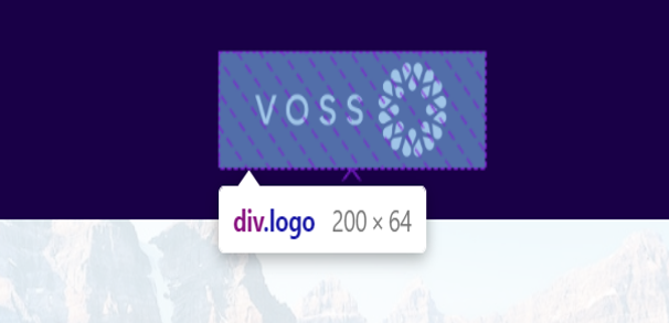
@loginLogoWidth: 200px;
@loginLogoHeight: 64px;
These variables are used in skin.less, and define:
The footer copyright notice, for example, in
skin.css, thecontentproperty:body.login_page:after { position: fixed; bottom: 0; content: '\00A9 2017 VOSS. All Rights Reserved'; left: 0; color: #eeca; z-index: 1; background-repeat: no-repeat; background-position: left; }The dashboard logo image size HTML attributes:
<img style="user-select: none;"
 src="http://localhost/www/themes/default/img/login_logo.png"
 width="200"
 height="64">
Customizing skin.less#
To customize skin.less files, override entries in the imported .less files, found
in the sub-directories of build_dependencies.
In the compiled .css file, override theme changes will then follow the original CSS entries.
It is recommended that you enable browser developer tools so that it’s possible to
identify matching HTML properties of portions of the Admin Portal, as well as the associated
Admin Portal styling in the skin.css file.
Example
Consider an entry in the default theme skin.less under the
heading Navbar. The Navbar theme settings apply to the navigation headers of the
application: the top and side menu bars. For more details on the navbar component, see:
Navbar.
.navbar .navbar-inner {
  background: @mainBackgroundColor;
}
In this case, the background color of the horizontal navbar is modified. The
value of @mainBackgroundColor is defined earlier, as #3280d2.
Use the browser developer tools to inspect how this override applies to the theme:
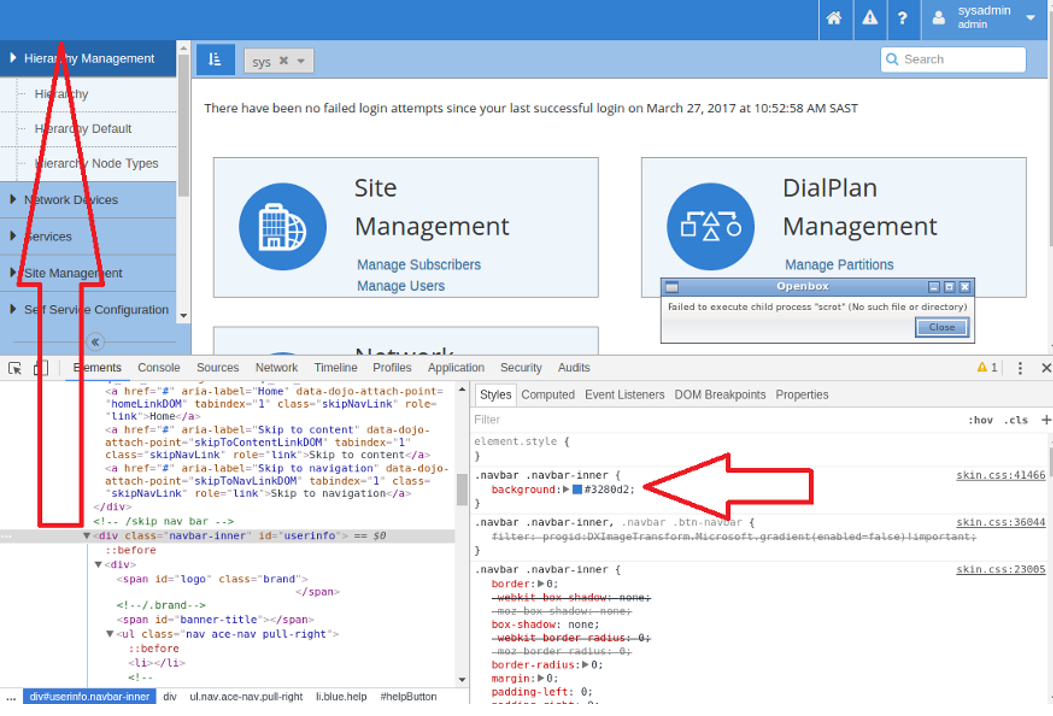
In the compiled skin.css file, the update in the snippet from the .less file above
will follow the main definition:
.navbar .navbar-inner {
  background: #3280d2;
}
The main definition shows all the values that apply to navbar-inner.
The value of background-color is overridden.
.navbar-inner {
    min-height: 40px;
    padding-right: 20px;
    padding-left: 20px;
    background-color: #fafafa;
    background-image: -moz-linear-gradient(top,#fff,#f2f2f2);
    background-image: -webkit-gradient(linear,0 0,0 100%,
      from(#fff),to(#f2f2f2));
    background-image: -webkit-linear-gradient(top,#fff,#f2f2f2);
    background-image: -o-linear-gradient(top,#fff,#f2f2f2);
    background-image: linear-gradient(to bottom,#fff,#f2f2f2);
    background-repeat: repeat-x;
    border: 1px solid #d4d4d4;
    -webkit-border-radius: 4px;
    -moz-border-radius: 4px;
    border-radius: 4px;
    filter: progid:DXImageTransform.Microsoft.gradient(
      startColorstr='#ffffffff',
      endColorstr='#fff2f2f2',GradientType=0);
    *zoom: 1;
    -webkit-box-shadow: 0 1px 4px rgba(0,0,0,0.065);
    -moz-box-shadow: 0 1px 4px rgba(0,0,0,0.065);
    box-shadow: 0 1px 4px rgba(0,0,0,0.065)
}
Similarly, other values in the CSS file for .navbar-inner can be overridden.
Example
If the alert notification pop-up style (for example with timeout notifications) should also be customized to match the custom style, you can add the following style (with suitable style colors):
.alert-info {
  color: #31708f;
  background-color: #d9edf7;
  border-color: #bce8f1;
}