Tables#
Overview#
The Dashboard system provides two table chart types for widgets, Table 1 and Table 2. You can select a table chart type when adding or editing the widget via the Widget Editor, on the Settings tab.
Configuration options for the tables depend on the table chart type you choose.
The image displays Table 2 charts (marked 1 and 2), and a Table 1 chart (marked 3):
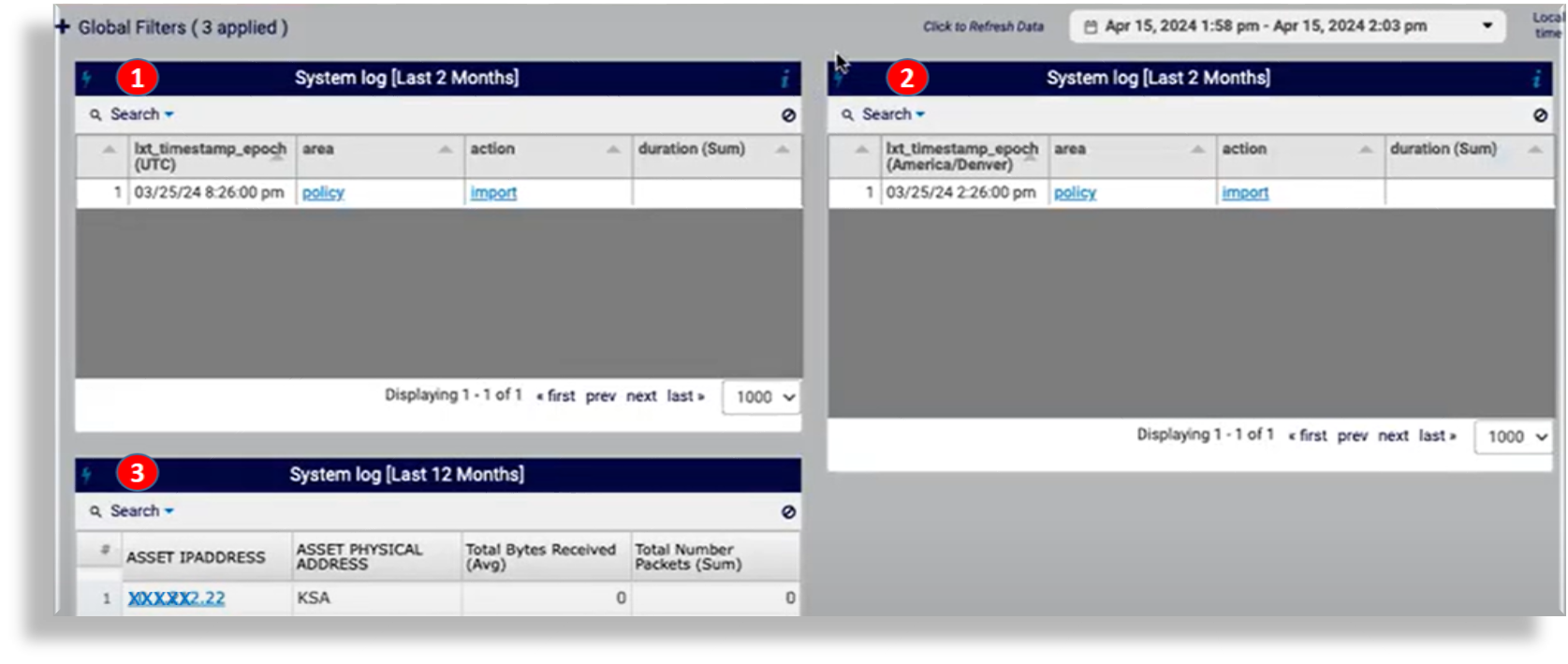
Note
In the Widget Editor (Settings tab), the Table 1 icon appears in the row above the Table 2 icon.
Related Topics
Configure Table Widgets#
The table describes the configuration options for table widget types (Table 1 and Table 2), accessible via the Settings tab in the Widget Editor:
Field |
Description |
|---|---|
Description |
The description that displays along the top of the table widget. |
Over Time & Interval |
Defines whether to display the data over the specified time and based on the interval toggled within the adjacent box, i.e. Minute, Hour, Daily, Weekly and Monthly. |
Over Time Day Pagination |
Allows you to view the table page by page, over the time interval. |
Tree-Like Table |
Table 1 only. Defines whether each row in the table has an arrow indicating parent / child relationships in a row. Clicking again displays only the parent level. |
Hide Columns |
Defines whether to hide columns in the table. Choose columns from 1, left to right. Fill out the number of columns to hide. Separate each by a comma. |
Hide Count Column |
A default “Count” column is added to the end of the table. Choose this option to hide the Count column. |
Column Width Adjustment |
Table 2. Column widths can fit contents or can be customized. |
Font Size |
Table 2. Adjust font size in the table. |
Show Metric Summary |
Table 2. Adds a summary row to the bottom of the table. |
Vertical Header |
Table 2. Defines whether to place the text within the header of each column in a vertical position. |
Table Renderers |
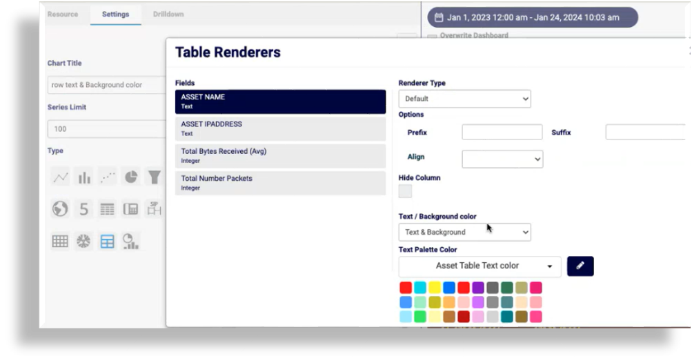
Table 2. Table Field Renderer and Table Tree Renderer. Click the Cog icon to open the configuration dialog for each of these, where you can design the data presentation format. The Table Renderer includes a color palette for the background, the text, or the text and background. For the Text & Background option, you can choose a different color for each of the text and background. Table Field Renderer Column names display below Fields. You can choose a renderer type, either of the following:
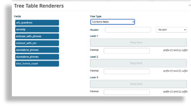
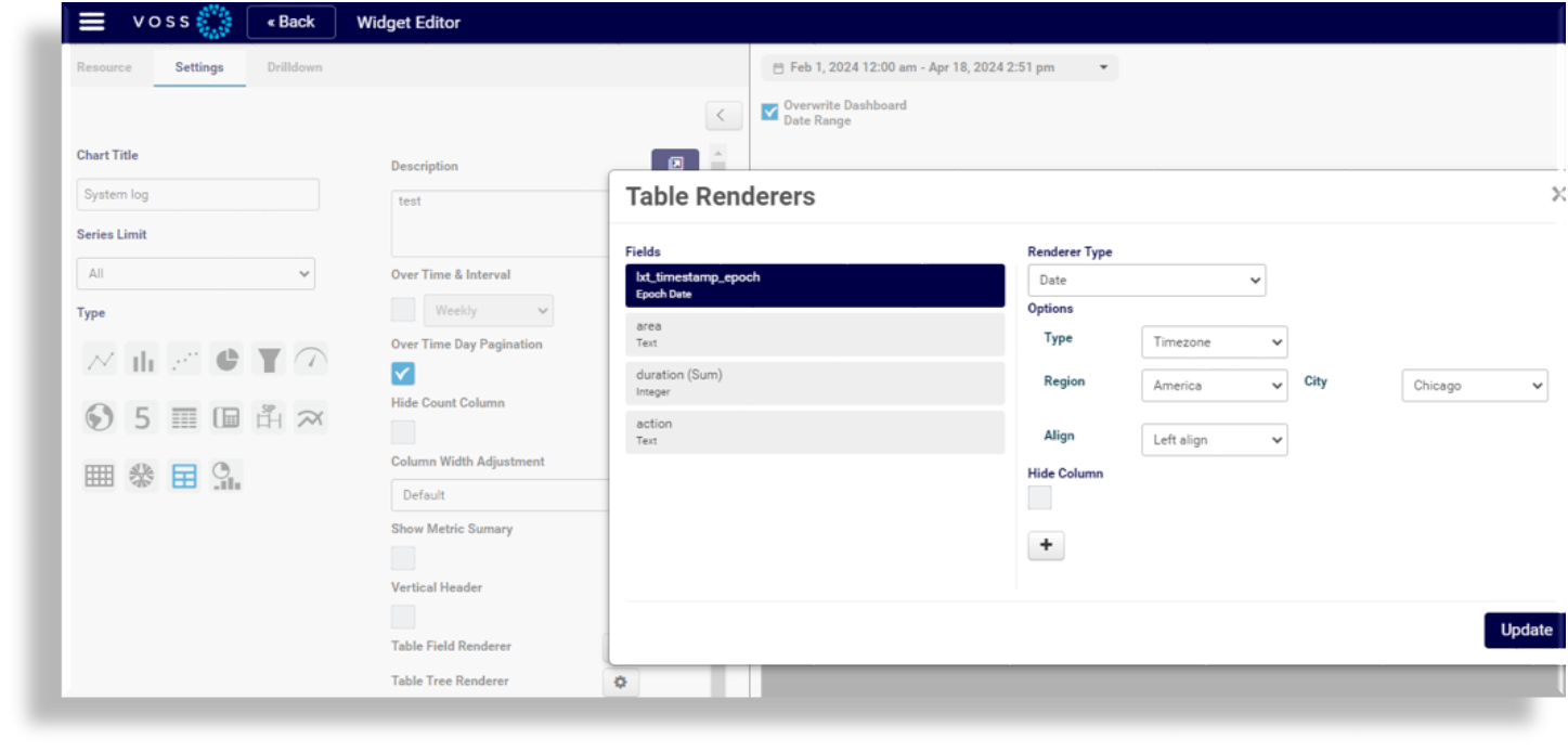
Tree Table Renderer The Tree Table Renderer dialog allows you to control how data is grouped per tree table. Each selection provides for additional choices that are logically assigned. Additionally, you can choose to put in a custom prefix or suffix for the data. An example is a $ or a metric such as Gbps. The Table 2 Table Renderer dialog also allows you to choose a date format for the display of dates in the widget, and for downloading widget data (CSV or Excel). You can choose to present dates as UTC, local time, epoch time, or for a selected timezone. |
Field |
Description |
|---|---|
Selection Type |
Choose Row or Cell. Cell underlines the field (similar to a URL) that is being used in the drill-down selected at the bottom. Row is a standard view. |
Color Palette Type |
Row or Cell. Allows a custom color (based on values, regex, ranges, or comparisons) to be applied to either the cell or to the row. |
Color Palette Option |
Choose the color to apply. The color palette is applied based on the calculation set up and applied to the column selected next to that field. (Starts with column 1). |
The image displays the configuration dialog for Table Tree Renderer:
The image displays the configuration dialog for Table Field Renderer:
The image displays the date format settings (Renderer Type field) in the Table Renderer dialog:
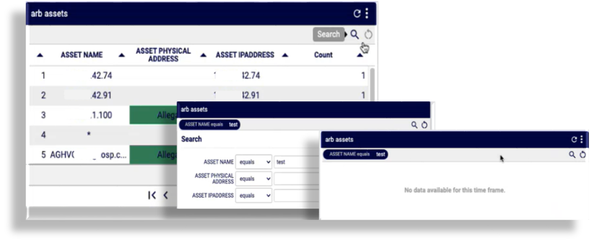
Search and Sort Table Widget Data#
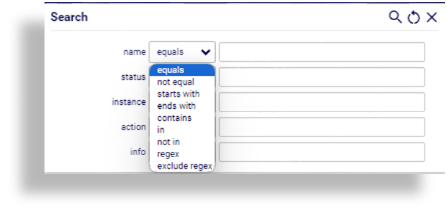
Table widget types include a Search box for displayed fields. You can search table data by a range of matching operators, including regex.
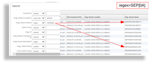
The following example illustrates the results of a combined “ends with” and regex SEP[0A] (contains SEP followed by either 0 or A):
Search and filter data in widget tables
Click the Search icon at the top right of the table to launch the Search box.
Fill out search criteria, click the Search icon, then view results.
Search criteria displays with search results.
You can click the Reset icon to clear search filters.
Sort table data in widget tables
Click a table header to sort table data. Click the Reset icon to clear the sort.
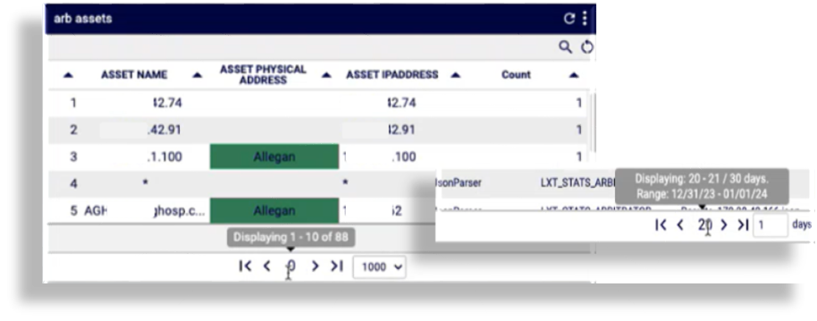
Paging in widget table data
For tables with two or more pages of data, you can click the left < or right > paging arrows to view
additional data, or click the first page |< or last page >| paging icons.
Hover over the paging icons to view a tooltip that tells you the page you’re on and the total number of pages. In
some tables, the paging tooltips include over time range information. In this case, clicking the
first page |< paging icon displays the page for the first date where data exists, which may not be
Page 1.