
Pie / Donut Chart#
Clicking the Pie / Donut chart icon at Type, in the Widget Editor Settings tab adjusts whatever data you’re viewing in the chart pane, to a Pie chart.
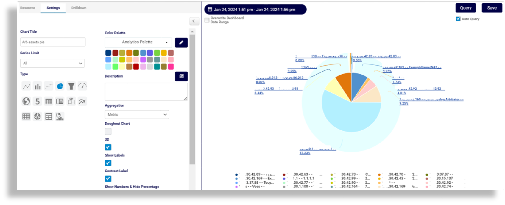
The table describes Pie chart editing options on the Settings tab:
Field |
Description |
|---|---|
Color Palette |
The colors to associate with data values and the pie/donut plots. You can save the palette to use with other widgets. For details around creating a custom color palette see Color Palette Changes |
Description |
Fill out a description for the chart, which will display along the top of the chart. |
Doughnut Chart |
Defines whether the chart changes to a doughnut chart with the values plotted around an empty space in the middle instead of wedges in a Pie chart. |
3D |
Displays the chart in 3-D. |
Show Labels |
Select this option to have each value as a label on the chart. |
Contrast Label |
Enhance contrast on the font, typically used for browser dark mode. |
Show Numbers & Hide Percentage |
Defines whether to show values/numbers on the chart instead of percentages. |
Show Legend |
Defines whether to display the field definition for values charted, in the selected position on the chart, with the associated color representation. |
Empty Group Text |
Fill out text to show if the group name is empty (instead of “EmptyGroup”). |
Related Topics