Chart widgets#
Overview#
The following chart types are supported by the widgets.
Column Chart
Gauge Chart
Line Chart
Pie Chart
Chord Diagram Chart
When a chart widget is selected, it is also possible to switch to another widget format during the edit and design process.
The chart type can be updated from the Widget Type drop down. Changes are reflected in real-time during the design of a widget or by using the widget’s Refresh icon.
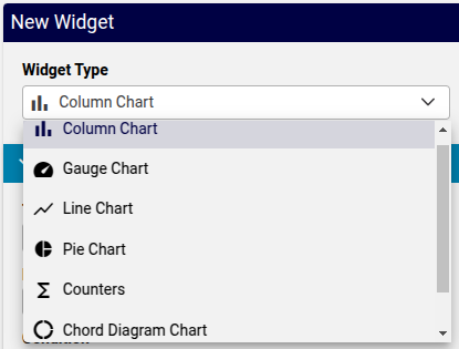
Chart widget data settings#
A common list of Data Settings are available for chart widgets:
Title: This text will display above the chart
Description: This text will show as a information pop-up when hovering over the circled i icon next to the Title.
Condition: The display of the widget on the dashboard can be controlled by entering a condition that resolves to boolean True or False, for example in accordance with enabled features, services, and devices as in the Global Settings. The conditions are in the form of system macros. See for example the macros listed under the Links topic below.
Data Source: Charts can access the Automate Analyzed and Assurance sources.
The Assurance data source is also available if an Arbitrator has been configured. See: Arbitrators. If Assurance is selected, options are available to choose a Data Source Instance, since multiple instances can be configured. A selection of these can then also be made if Allow Data Source Selection is enabled.
Resource: In accordance with the selected Data Source, a dropdown list of resource items are available to be referenced in the chart, for example, for Automate Analyzed:
Number Inventory,Cisco CUC User,Cisco UCM Phone,Microsoft O365 User.Note
Where the Data Source is Automate Analyzed, Automate provides an additional list of Resource instances that can be used to represent trends on a widget. For details, see Automate Dashboard Trends Resources.
In accordance with the selected hierarchy during dashboard management, the real-time display of data will update according to the current hierarchy, so that a widget that for example shows a count of users, will show values in accordance with the selected hierarchy.
Important
For charts, the Resource data is accessed from an Automate Analyze database: reporter resources (
data/ReporterResource). When creating charts for the first time prior to the first scheduled full sync, it will be necessary that a manual sync of the Automate Analyze database is carried out with the Automate database. This requires the execution of a Platform Command Line Interface command. Refer to the Dashboard Refresh section below.Fields: In accordance with the selected Resource, one or more fields from the resource can be selected as items for the chart.
Field Name: a dropdown of fields that belong to the Resource
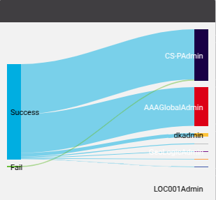
For example, for Chord Diagram Chart (Sankey type in example below), the Transactions resource status and username field names can be selected to show the transaction success/fail breakdown by user:
Friendly Name: a text field to provide the Field Name with a custom name
Field Type: a read-only field that indicates the data type of the selected Field Name
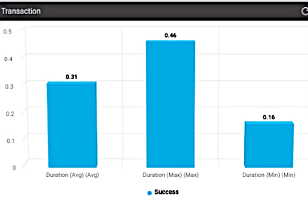
Operation: select the operation to be carried out on the Field Name. Refer to the example below showing:
Grouping Count.Note
A different operation can be applied to the same field. In the example below, average, minimum and maximum is applied to the transaction duration field:
Value Mapping: default is
NO MAPPING, otherwise a selected value mapping to display the value on the chart widget. See Manage value mapping.
Filters:
Data referenced in widgets can also be filtered by selecting a:
Field Name of the Resource
Operation to be used to filter the values of the field selected by Field Name.
The availability and function of the operators depends of the data type of the selected field name: text or integer. Select the required operation. For details on the filter options, see: Filter Options Availability and Definitions.
Filter Value: value to be used by the selected Operation to carry out the filter.
Such filters this provide options to make use of a selection of the resource data in the widget.
Sorts: One or more Field Name entries can be added and used to carry out sorting by Sort Type: Ascending or Descending
Chart Options:
Available Chart Options can vary according to the selected chart widget type. For a detailed reference of chart options, see: Chart Options Availability and Definitions.
Drilldown options: see Drilldown Options and Conditional Syntax
Dashboard chart background colours are managed by the theme Panel Colour - see: Theme element color references for the Admin Portal.
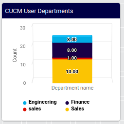
Chart widget example#
As an example, consider the following column chart values, with charts illustrating various data and chart settings:
Title:
CUCM User DepartmentsResource:
Cisco UCM UserField Name:
DepartmentOperation:
Grouping CountShows a column chart with counts of grouped
Cisco UCM Userdepartments in columns.Filter:
Field name:
departmentOperation:
Exclude Regex (Case sensitive)Filter Value:
SITE
Filter:
Field name:
departmentOperation:
Exclude Regex (Case sensitive)Filter Value:
LOC
Filter:
Field name:
departmentOperation:
!=Filter Value:
Sorts:
Field Name:
departmentSort Type:
Ascending
Chart Options:
Series Limit: All
Stack Type:
Normal
The examples below show the chart with settings on some of the properties as not set or set in the example above:
Unfiltered, unsorted (related settings above are not set):
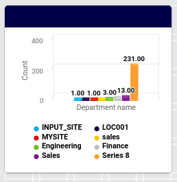
Filtered, sorted, stacked (related settings above are set):