Links Widgets#
Links are typically used to offer shortcuts to targets: data or URLs. The data is available from Automate models in the Type dropdown.
Link Text and Icon can be entered to display the link
Condition : a condition that evaluates to true or false, in VOSS macro syntax, for example, for enabled features:
{{ macro.is_avaya_enabled }}
{{ macro.is_cisco_ccx_enabled }}
{{ macro.is_cisco_cucm_enabled }}
{{ macro.is_cisco_cucx_enabled }}
{{ macro.is_cisco_microsoft_enabled }}
{{ macro.is_cisco_webex_enabled }}
{{ macro.is_cisco_webex_teams_enabled }}
{{ macro.is_cisco_zoom_enabled }}
{{ macro.is_microsoft_enabled }}
{{ macro.is_pexip_enabled }}
{{ macro.is_session_border_control_enabled }}
{{ macro.is_voss_phones_enabled }}
{{ macro.is_zoom_enabled }}
Where widgets are not shown in accordance with the Condition evaluation of the widget, the dashboard arrangement is updated accordingly to auto compact the visible widgets.
Display As:
External Link - then Href is an URL
Form and List - when Type is selected, this indicates the display format
Dashboard - when a dashboard is selected from the Dashboard dropdown, a link is available to open a target dashboard.
Field Display Policy and Configuration Template can be applied to the selected Type.
See also the topic Fixed and Configurable Filters in Counters and Links.
Note
A dashboard link cannot launch another dashboard.
For long lists of links, scrollbars show on the form to show all items within the widget. It is recommended to split such long lists into separate Link widgets in order to remove the need for scrollbars.
Fixed and Configurable Filters in Counters and Links#
Fixed Filters
High-level administrators can add and modify pre-defined Fixed Filters to Counters and Links. This option also shows on design input forms and presents the same interface options as Configurable Filters.
These filters will always apply when the widget is used. Fixed filter results can however be filtered further by Configurable Filters.
Configurable Filters
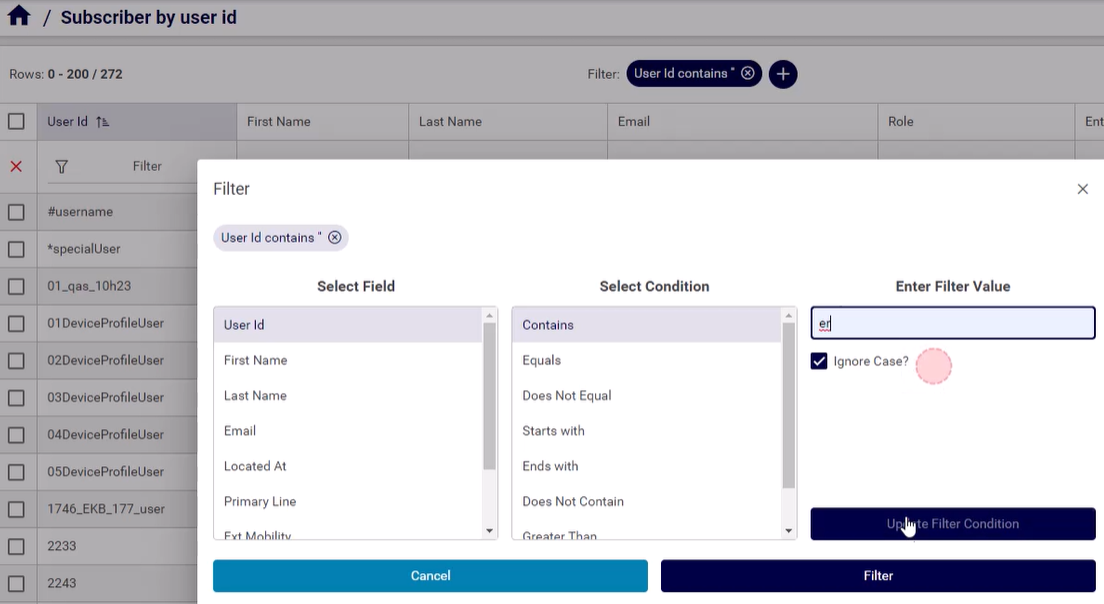
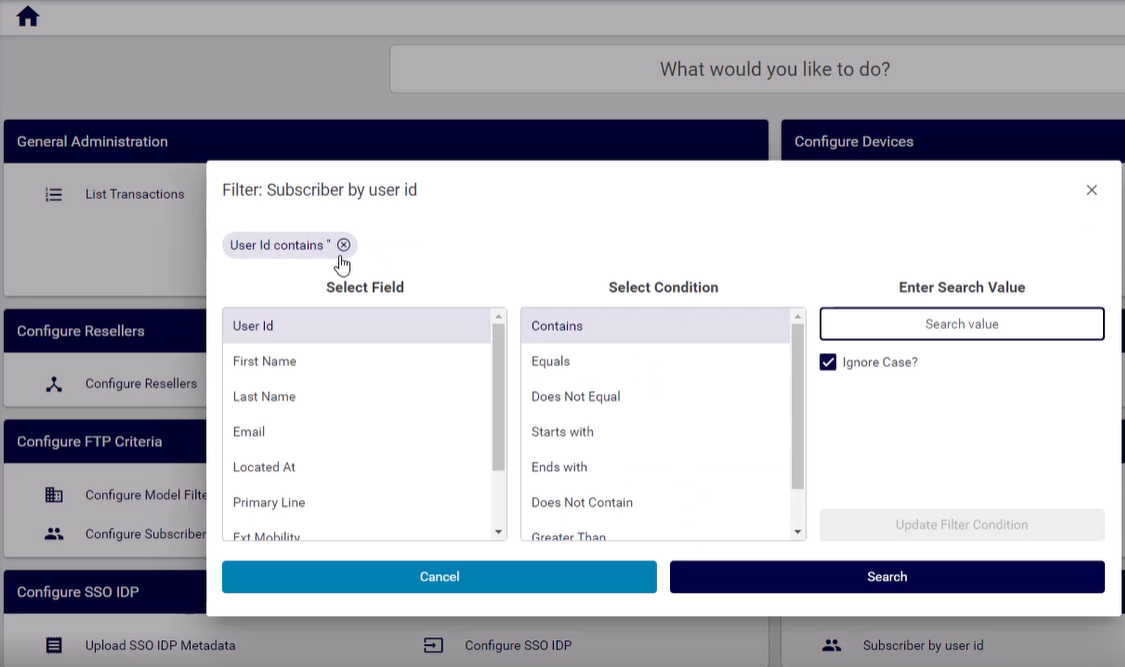
When configuring a widget open the filter configuration dialog, where you can add one or more configurable filters.
Adding more than one filter using the Add option results in a logical AND of the filter application.
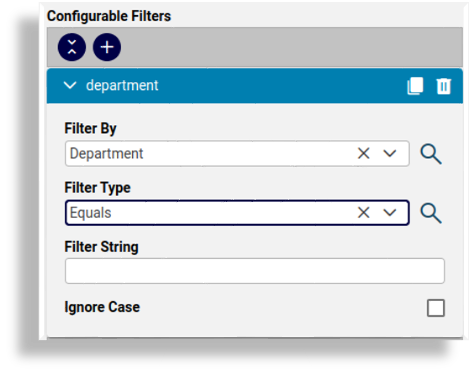
The table describes the Configurable Filters fields:
Filter By
Attributes of the selected Type can be selected from the drop-down list.
Filter Type
Select the matching operator to apply when the attribute is matched to the Filter String value:
Contains
Does Not Contain
Starts With
Ends With
Equals
Not Equal
Filter String
Select the value that the matching operator should match by.
Ignore Case
This checkbox defines whether to ignore the case of the Filter String value.
Once you’ve applied the configurable filters, selecting the counter or link in the GUI triggers a pop up Filter dialog before rendering the list view, where you can apply or modify the filter before displaying the page related to the counter or link.
If a Filter String value is entered on Configurable Filters, this value can also then be accepted or modified in the Filter dialog.
The list view of the results footer row indicates that a filter has now been applied to the list and this filter can then be further modified and removed from the list view as usual. See Working with Lists