Automate Dashboards#
Overview#
Dashboards are a collection of configurable widgets on a single page that can serve as a default landing page and can also be made available on a user menu. The widgets can allow for the easy access of frequently used tasks and for a quick view - as a counter, table or chart - of data in the system.
Note
Where dashboard widgets show data, the hierarchy at which the dashboard containing the widget is displayed, will filter data values and counts accordingly in the respective widgets.
Administrator users with roles referring to Access Profiles that allow for the creation and update of dashboards, can design and add dashboards to menus. For details, see: the Dashboard Permissions section in Access Profiles: Access Profile Permissions and Operations.
Landing Page Dashboards and Generic Solution Dashboards#
Landing Page Dashboards#
Upon upgrading to release 24.1, user landing pages have been converted to dashboards containing the matching landing page data. Users would thus see these dashboards as:
A home page
A menu item (VOSS Automate enhanced menus)
For details on these converted dashboards, see: Landing Page Conversion to Dashboards in Release 24.1.
Generic Solution Dashboards#
In addition to the dashboards converted from landing pages, VOSS Automate also provides an additional set of default dashboards that are available from default menus.
Note
For these generic solution dashboards and any new dashboards to show data prior to the sync schedule, an initial manual sync step is required - see: Dashboard Refresh.
Menu: Subscriber Overview - a dashboard with counter widgets showing subscriber counts.
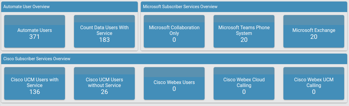
The sources of the counts are the following models:
Cisco:
relation/SubscriberMicrosoft:
relation/MicrosoftSubscriberWebex:
relation/SparkUser
Menu: Subscriber Service Details - a dashboard with tables showing multi-vendor subscriber services by vendor. Users in the tables can for example be filtered by hierarchy
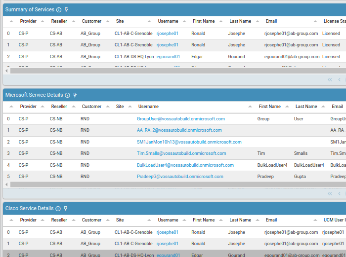
The following tables of subscribers are available:
Summary of Services: User and hierarchy details.
Microsoft Service Details: User and hierarchy details, Teams features, Line, Number, Voice enabled, Exchange User Principal Name.
Cisco Service Details: User and hierarchy details, Phone, Line, EM Profile details, SNR details, Voicemail details, Contact Center Agent details.
Cisco Webex Service Details: User and hierarchy details, Cisco Webex Email.
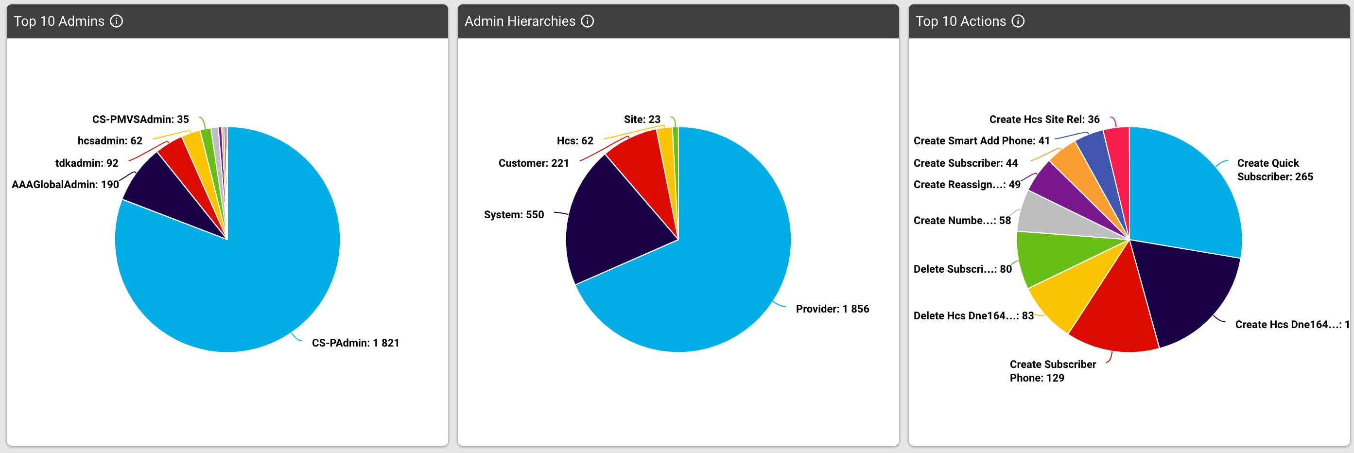
Menu: Transaction Overview - a transaction analysis dashboard with counter, chart and table widgets showing for example such transaction metrics per user, hierarchy, entity, as well as counts of data sync failures
Note
Some transaction data will only be available for transactions executed after upgrade to release 24.1, since new fields are introduced and are not populated for older transactions. (The default name for unpopulated data on charts show with a
Slice:label.)Trend chart date formats follow the current date format, i.e. either:
mm/ddordd/mm.
This dashboard therefore provides a good usage overview of the platform.
Managing Dashboards#
Administrators can manage dashboards from the Dashboards link that is a part of the Role Configuration on the Role Management dashboard.
Operations on Dashboards#
When adding or editing a dashboard, a number of menu items are available to carry out dashboard related tasks.
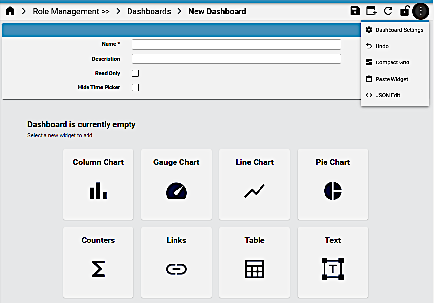
Add or Edit:
Name: the display name of the dashboard
Description: detailed description to describe the dashboard - available on the Dashboards list view.
Read Only:
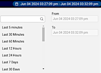
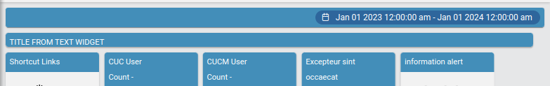
Hide Time Picker: by default, a Time Picker control is available to filter dashboard data by start and end date. Note that future dates cannot be specified by the Time Picker. Select this check box to hide the time picker.
Clone: Use the Clone icon from the dashboard toolbar. The cloned dashboard opens and contains all the widgets of the source dashboard. The cloned dashboard Name is the same as the original source dashboard name, but is appended with the text:
[CLONE].Note
Dashboards with the same name can be available at different hierarchies. When such a dashboard is referenced, this first one found higher up from the administrator user’s login hierarchy is selected.
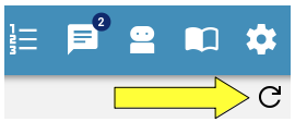
Refresh Dashboard: use to update synced data on the dashboard to reflect any system data changes.
Note
Dashboard widgets each also provide a similar Refresh button when hovering over the top bar of the widget - similarly to refresh individual widget data.
Lock: lock the arrangement of widgets
Dashboard Settings: a toggle menu item to show or hide the dashboard name, description and properties as listed above.
Undo: undo the last dashboard edit.
Export: Use the Export icon from the dashboard toolbar to export one or more instances - for details, see: Bulk Export of Model Data. Exported dashboards can then be modified and imported at a required hierarchy using the Import menu.
Compact Grid: automatically optimize the arrangement of widgets on the dashboard, give their current size.
Paste Widget: Use the Paste Widget icon from the dashboard toolbar menu to paste a widget selected with the Copy Widget option on the widget menu into the current dashboard. Widgets can therefore be copied between dashboards.
JSON Edit: Use the JSON Edit icon from the dashboard toolbar to edit the dashboard data in JSON. For details, see: Manage Items.
Operations on widgets#
When a dashboard is created or maintained, widgets can be added, removed or edited.
To add a widget, select Add (+) from the toolbar and then on the design form, either select the widget from the toolbar or from the provided list of icons:
To edit a widget on a dashboard, select the dashboard from the list and choose Edit from the widget’s menu. The widget menu provides a number of operations.
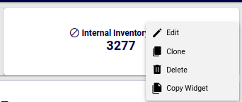
Edit:
Use the Edit icon from the widget menu to edit the current widget. refer to the details below on available edit options.
Clone:
Use the Clone icon from widget menu to clone the widget on the dashboard. The clone can then be edited as required.
Delete:
Use the Delete icon from the widget menu to remove the widget from the dashboard.
Copy Widget:
Use the Copy Widget icon to copy the current widget in order to paste it into a dashboard using the dashboard Paste Widget menu item.
Export data:
Where a widget offers data is a compatible format, the Export data on the widget menu allows for a comma-separated value (CSV) export to a file, as in the Number Status example below:
Status,Count
Used-Utility,6
Cooling,35
Used,63
Reserved,106
Available,3850
Note
Not all widget options and possible combinations are covered in this document. The widget refresh option can be used to inspect the impact of an option. For assistance in creating widgets, you can also contact VOSS support.
Chart Widgets#
The following chart types are supported by the widgets.
Column Chart
Gauge Chart
Line Chart
Pie Chart
When a chart widget is selected, it is also possible to switch to another widget format during the edit and design process.
The chart type can be updated from the Type drop down. Changes are reflected in real-time during the design of a widget or by using the widget’s Refresh icon.
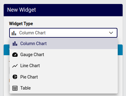
Chart Widget Data Settings
A common list of Data Settings are available for chart widgets:
Title: This text will display above the chart
Description: This text will show as a information pop-up when hovering over the circled i icon next to the Title.
Resource: Charts access the Insights resource. In accordance with configured devices and services, a dropdown list of resource items are available to be referenced in the chart, for example:
Number Inventory,Cisco CUC User,Cisco UCM Phone,Microsoft O365 User.Note
In accordance with the selected hierarchy during dashboard management, the real-time display of data will update according to the current hierarchy, so that a widget that for example shows a count of users, will show values in accordance with the selected hierarchy.
Important
For charts, the Resource data accessed from an Insights database: Insights reporter resources (
data/ReporterResource). When creating charts for the first time prior to the first scheduled full sync, it will be necessary that a manual sync of the Insights database is carried out with the Automate database. This requires the execution of a Platform Command Line Interface command. Refer to the Dashboard Refresh section below.Fields: In accordance with the selected Resource, one or more fields from the resource can be selected as items for the chart.
Field Name: a dropdown of fields that belong to the Resource
Friendly Name: a text field to provide the Field Name with a custom name
Field Type: a read-only field that indicates the data type of the selected Field Name
Operation: select the operation to be carried out on the Field Name. Refer to the example below showing:
Grouping Count.
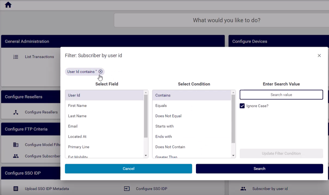
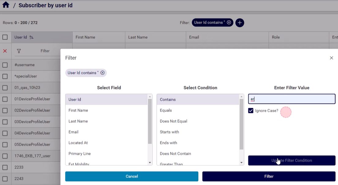
Filters:
Data referenced in widgets can also be filtered by selecting a:
Field Name of the Resource
Operation to be used to filter the values of the field selected by Field Name.
The availability and function of the operators depends of the data type of the selected field name: text or integer. Select the required operation. For details on the filter options, see: Reference: Filter Options Availability and Definitions.
Filter Value: value to be used by the selected Operation to carry out the filter.
Such filters this provide options to make use of a selection of the resource data in the widget.
Sorts: One or more Field Name entries can be added and used to carry out sorting by Sort Type: Ascending or Descending
Chart Options:
For a detailed reference of chart options, see: Reference: Chart Options Availability and Definitions.
Drilldown options: see Reference: Drilldown Options and Conditional Syntax
Chart Widget Example#
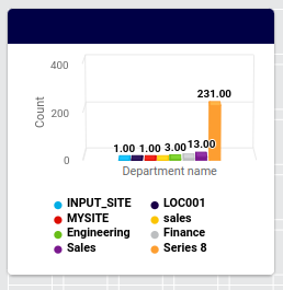
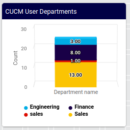
As an example, consider the following column chart values, with charts illustrating various data and chart settings:
Title:
CUCM User DepartmentsResource:
Cisco UCM UserField Name:
DepartmentOperation:
Grouping CountShows a column chart with counts of grouped
Cisco UCM Userdepartments in columns.Filter:
Field name:
departmentOperation:
Exclude Regex (Case sensitive)Filter Value:
SITE
Filter:
Field name:
departmentOperation:
Exclude Regex (Case sensitive)Filter Value:
LOC
Filter:
Field name:
departmentOperation:
!=Filter Value:
Sorts:
Field Name:
departmentSort Type:
Ascending
Chart Options:
Series Limit: All
Stack Type:
Normal
The examples below show the chart with settings on some of the properties as not set or set in the example above:
Unfiltered, unsorted (related settings above are not set):
Filtered, Sorted, Stacked (related settings above are set):
Counters#
Counters are typically used to provide a quick count of a resource, and have the option to display a list view of the values when selecting the counter.
Note
Counter values reflect the hierarchy at which the counter is viewed.
Data Source: Insights or Automate
Resource: only available for Insights
Fields: For Insights resources, fields can be selected in counters and an operation can be selected for these in order to modify the counter. For example, if a field has duplicate values and the operator on the field is Grouping Count, then multiple counters will be shown - grouping the duplicate fields into separate totals.
Type: for Automate resources, the selected model. A title, icon, Field Display Policy, Condition and Configuration Template can also be applied to the selection.
Filters: For Insights resources, field names can be selected and a matching operator selected to apply to the name in order to filter a counter value. For Automate resources, see the topic Fixed and Configurable Filters in Counters and Links - that will then be applied when the counter is selected to open the filtered list view.
Counter Settings: a limit on the value can be specified, prefix and suffix text can be inserted for the value, as well as default values for empty groups.
Links#
Links are typically used to offer shortcuts to targets: data or URLs. The data is available from Automate models in the Type dropdown.
Link Text and Icon can be entered to display the link
Condition : a condition that evaluates to true or false, in VOSS macro syntax, for example, for enabled features:
{{ macro.is_avaya_enabled }}
{{ macro.is_cisco_ccx_enabled }}
{{ macro.is_cisco_cucm_enabled }}
{{ macro.is_cisco_cucx_enabled }}
{{ macro.is_cisco_microsoft_enabled }}
{{ macro.is_cisco_webex_enabled }}
{{ macro.is_cisco_webex_teams_enabled }}
{{ macro.is_cisco_zoom_enabled }}
{{ macro.is_microsoft_enabled }}
{{ macro.is_pexip_enabled }}
{{ macro.is_session_border_control_enabled }}
{{ macro.is_voss_phones_enabled }}
{{ macro.is_zoom_enabled }}
Display As:
External Link - then Href is an URL
Form and List - when Type is selected, this indicates the display format
Field Display Policy and Configuration Template can be applied to the selected Type.
See also the topic Fixed and Configurable Filters in Counters and Links.
Note
A dashboard link cannot launch another dashboard.
For long lists of links, scrollbars show on the form to show all items within the widget. It is recommended to split such long lists into separate Link widgets in order to remove the need for scrollbars.
Fixed and Configurable Filters in Counters and Links#
Fixed Filters
High-level administrators can add and modify pre-defined Fixed Filters to Counters and Links. This option also shows on design input forms and presents the same interface options as Configurable Filters.
These filters will always apply when the widget is used. Fixed filter results can however be filtered further by Configurable Filters.
Configurable Filters
When configuring a widget open the filter configuration dialog, where you can add one or more configurable filters.
Adding more than one filter using the Add option results in a logical AND of the filter application.
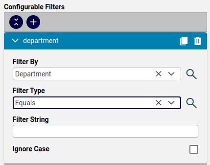
The table describes the Configurable Filters fields:
Filter By
Attributes of the selected Type can be selected from the drop-down list.
Filter Type
Select the matching operator to apply when the attribute is matched to the Filter String value:
Contains
Does Not Contain
Starts With
Ends With
Equals
Not Equal
Filter String
Select the value that the matching operator should match by.
Ignore Case
This checkbox defines whether to ignore the case of the Filter String value.
Once you’ve applied the configurable filters, selecting the counter or link in the GUI triggers a pop up Filter dialog before rendering the list view, where you can apply or modify the filter before displaying the page related to the counter or link.
If a Filter String value is entered on Configurable Filters, this value can also then be accepted or modified in the Filter dialog.
The list view of the results footer row indicates that a filter has now been applied to the list and this filter can then be further modified and removed from the list view as usual. See Working with Lists
Table#
Data Source: Insights or Automate
Available menus and fields upon Data Source selection:
Insights
Resource options available in accordance with the Insights database
Fields: select fields from the resource to show in the table
Filters: filter field values from the table
Sorts: order the table (ascending, descending) by a selected field value
Automate: Model Type, Field Display Policy, Configuration Template
Table Options are available for both data sources.
Options to limit, show, hide or format table data and elements
Additional field display customization using Renderers for fields
Drilldown options: see Reference: Drilldown Options and Conditional Syntax
Besides standard menu options, a displayed table can also show additional menu options in accordance with enabled features such as:
Description (circled
iicon)Drilldown (lightning bolt)
Filter (funnel icon)
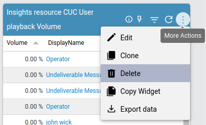
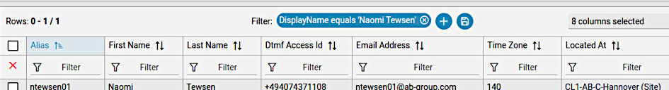
Table widget example#
The example below shows a table widget configuration using an Insights resource, the resultant output display and also a drilldown result.
Configuration
Resource: Cisco CUC User
Fields:
Playback volume (integer) is selected as a table column and similar values are grouped using Operation: Grouping Count
The user’s DisplayName is as a table column
Filters
DisplayName values containing regex
CFTare excluded with a filter.
Sorts: no sorting is done on any column.
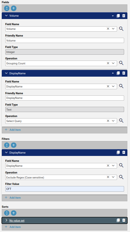
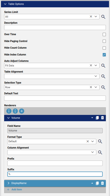
Table Options
Series Limit: left at default All so no restriction on the number of values to show.
Hide Index Column: enabled so an additional first column containing an index value (row number) is not shown.
Selection Type: left at default so that a table entry selection selects an entire row.
Renderers: the Volume field configured so that its integer value has Suffix:
%.
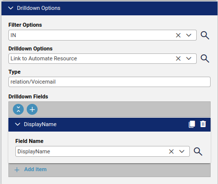
Drilldown Options
Filter Options: set to IN so that a drilldown display contains DisplayName.
Drilldown Options: selecting a row - the choice will
Link to Automate Resourcespecified as TypeType: the Automate resource type: selected the related Automate resource:
relation/Voicemail.Drilldown Fields: the field to highlight in the table as a drilldown link: selected DisplayName.
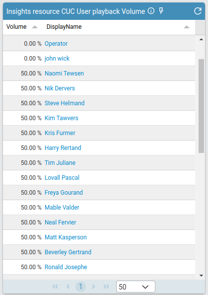
Output
The table shows 2 columns:
Volume values with
%suffixDisplayName with drilldown link
Drilldown result
Selecting a row link from the table shows the item as listed in the selected Drilldown Options.
Text#
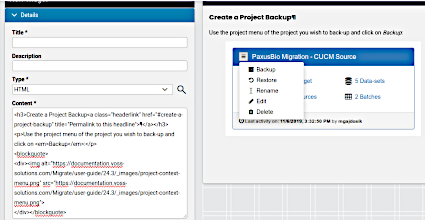
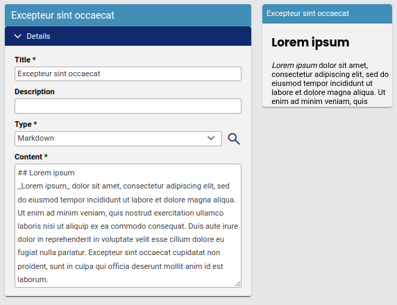
A widget is available to show text on a dashboard. The input format can be either HTML or Markdown.
Example Text widgets (HTML):
Example Text widgets (Markdown):
Text widgets can be used to create headings, for example:
Design:
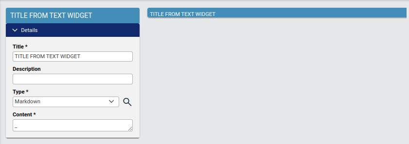
Display:
Dashboard Refresh#
A real-time sync process is running to maintain VOSS and Insights databases in sync. After upgrade to release 24.1, and if dashboard management is required prior to the first default scheduled sync, a manual first-time sync from the platform command line (CLI) is required prior to designing a new dashboard:
insights sync run full-sync
insights sync run full-transaction
See: Insights Analytics in the Platform Guide.
Reference: Filter Options Availability and Definitions#
The operators below are available as filter options for Insights resource field types:
Text
LIKE (Case Sensitive) - based on the pattern entered in the filter field, will return the data that matches the pattern from the extracted string. This function is case sensitive. An underscore (_) in the pattern indicates matches any single character while a percentage sign (%) indicates matches any sequence of zero or more characters.
NOT LIKE (Case Sensitive) - based on the pattern entered in the filter field, will return the data that does not match the pattern from the extracted string. This function is case sensitive. An underscore (_) in the pattern indicates matches any single character while a percentage sign (%) indicates matches any sequence of zero or more characters.
ILIKE (Case Insensitive) - based on the pattern entered in the filter field, will return the data that matches the pattern from the extracted string. It is not case sensitive. An underscore (_) in the pattern indicates matches any single character while a percentage sign (%) indicates matches any sequence of zero or more characters.
NOT ILIKE (Case Insensitive) - based on the pattern entered in the filter field, will return the data that does not match the pattern from the extracted string. This function is not case sensitive. An underscore (_) in the pattern indicates matches any single character while a percentage sign (%) indicates matches any sequence of zero or more characters.
Equals (=) - based on the pattern entered in the filter field, will return the data that is equal to the pattern from the extracted string.
Not Equal (!=) - based on the pattern entered in the filter field, will return the data that is not equal to the pattern from the extracted string.
IN - based on the pattern entered in the filter field, will return the data that exists within a comma separated list, i.e. 1, 2, 3, 4.
NOT IN - based on the pattern entered in the filter field, will return the data that does not exist within a comma separated list, i.e. 1, 2, 3, 4.
REGEX (Case Sensitive) - utilizes POSIX Regular Expressions to extract data. It is case sensitive.
REGEX (Case Insensitive) - utilizes POSIX Regular Expressions to extract data. It is not case sensitive.
EXCLUDE REGEX (Case Sensitive) - utilizes POSIX Regular Expressions to extract the data that does not match the pattern. It is case sensitive.
EXCLUDE REGEX (Case Insensitive) - utilizes POSIX Regular Expressions to extract the data that does not match the pattern. It is not case sensitive.
Integer
Less Than (<) - based on the value entered in the filter field, will return the data that is less than the value from the extracted string.
Greater Than (>) - based on the value entered in the filter field, will return the data that is greater than the value from the extracted string.
Less Than or Equal (<=) - based on the value entered in the filter field, will return the data that is less than or equal to the value from the extracted string.
Greater Than or Equal (>=) - based on the value entered in the filter field, will return the data that is greater than or equal to the value from the extracted string.
Equals (=) - based on the value entered in the filter field, will return the data that is equal to the value from the extracted string.
Not Equal (!=) - based on the value entered in the filter field, will return the data that is not equal to the value from the extracted string.
IN - based on the values entered in the filter field, will return the values that exists within a comma separated list, i.e. 1,2,3,4.
NOT IN - based on the values entered in the filter field, will return the values that does not exist within a comma separated list, i.e. 1,2,3,4.
REGEX (Case Sensitive / Insensitive) - utilizes POSIX Regular Expressions to extract data.
EXCLUDE REGEX (Case Sensitive / Insensitive) - utilizes POSIX Regular Expressions to extract the data that doesn’t match the pattern.
Reference: Chart Options Availability and Definitions#
Chart Option Definitions:
Series Limit: Maximum number of groups to display on a chart.
All: (default) show all values
<number>: show maximum <number> values
Description: Allows you to enter a description of the chart to be displayed along the top portion of the chart.
Over Time: By selecting this check box the chart will display the data over the specified time based on the Interval, i.e. Minute, Hour, Daily, Weekly and Monthly.
Interval: Used by Over Time: Minute, Hour, Daily, Weekly and Monthly.
X Title: Text label displayed along the bottom of the X axis of column and line charts.
Y Title: Text label displayed along the bottom of the Y axis of column and line charts.
Is Stacked: By selecting this check box the chart will stack values by Stack Type.
Stack Type: Only for column charts. By selecting this box the chart will stack the values based on the type selected:
None: (default) no stacking; individual columns for data
Normal: data stacked into a single column, color coded with values
Percentage: data stacked into a single column, color coded with percentages
Numeric Precision: Select the decimal precision displayed for each point.
Is Horizontal: By selecting this check box, the chart will display the columns/bars horizontally across the chart.
Is 3D: By selecting this check box, column charts and pie charts will be displayed in a 3D representation.
Show Labels: By selecting this check box, each value that defines the chart will be labeled on the chart.
Show Legend: By selecting this check box, the Field Definition for the values being charted will be displayed in the selected position on the chart with the associated color representation.
Gauge Label: Labels the middle of the gauge with value from field extraction.
Min and Max: Place the starting value (Min) and the ending value (Max) for the gauge needle to traverse, e.g. start at 0 and end at 60,000.
Label Inside: By selecting this check box the value will be labeled with the definition based on the field extraction.
Show Bands: By selecting this check box then the gauge will have a maximum of 3 colored bands indicating certain severity levels. These are user defined thus a good, minor and major severity can be easily defined based on the data elements extracted. Simply place values for each color in the associated box to represent the percentage of the gauge band that color is to occupy. Tip: Make your major issue (Red) 100 thus simply modifying the good and minor automatically recalculates the major.
Is Doughnut: A pie chart is displayed with a hole in the middle.
Show Numbers: A pie chart by default shows slices as a percentage. Use this option to instead show the values of the percentage.
Available Chart Options vary according to the chart type:
Chart Option |
Column Chart |
Gauge Chart |
Line Chart |
Pie Chart |
|---|---|---|---|---|
Series Limit |
X |
X |
X |
|
Description |
X |
X |
X |
|
Over Time |
X |
X |
||
Interval |
X |
X |
||
X Title |
X |
X |
||
Y Title |
X |
X |
||
Is Stacked |
X |
|||
Stack Type |
X |
|||
Numeric Precision |
X |
|||
Is Horizontal |
X |
|||
Is 3D |
X |
X |
||
Show Labels |
X |
X |
X |
|
Show Legend |
X |
X |
X |
|
Gauge Label |
X |
|||
Min |
X |
|||
Max |
X |
|||
Label Inside |
X |
|||
Show Bands |
X |
|||
Is Doughnut |
X |
|||
Show Numbers |
X |
Reference: Drilldown Options and Conditional Syntax#
Drilldown Options
Filter Options: apply to field value match of a selection of the chart or table data (IN, REGEX)
Drilldown Options: the behavior when selecting an item in a chart or table
None (default)
Filter Other Widgets: a selected drilldown item will update any other widget that also references the same data instance.
For example a drilldown on a CUC user table where this is enabled, will similarly impact widgets such as charts, counters and tables related to CUC users, so that these widgets will then reflect data from only the single user from the drilldown.
Link to Another Dashboard
Used to open another existing widget during drilldown. A Dashboards dropdown shows to select the other dashboard.
Launch Third-party URL
Launch an URL in the system portal. The format of the input is an endpoint relative to the portal:
https://<hostname>/portal/. For example, if the value entered is#/admin, then the drilldown will launch the admin landing page dashboard:https://<hostname>/portal/#/admin.Conditional Drilldown
Provides a Conditional Drilldown input box into which a JSON formatted condition can be entered. For details on the format, see Drilldown Conditional below.
Drilldown Fields:
Field Name: if multiple Field values were added for a Resource, select a field for the drilldown.
Drilldown Conditional
When selecting the Drilldown Conditional option, the condition needs to be entered in JSON format into the input box. This section provides syntax details and examples for this configuration.
If an item matching the condition is selected from the dashboard, the conditional drilldown is then carried out.
The JSON format is outlined below.
If
conditionsare all metthen carry out
actionselse Defaults (
"default...")Structure:
{ "conditions": [], "actions": [], "defaultDrilldown": 1, "defaultDashboardId": "", "defaultUrl": "", "defaultFilterFields": [] }conditions:conditions: list of conditions onrules.id: “integer” - zero-basedname: “text” - condition nametype: “OR” or “AND”conditions.type: “AND” means action will be taken when all conditions are met.conditions.type: “OR” means action will be taken when one condition is met.
rules:rules: list of rules:ruleid: “integer” - zero-basedfield: “integer” - zero-basedField order in the drilldown tab (0 base)
fieldType: “text”, “integer” or “float”operator: “==”, “!=”, “<=”, “>=”, “<”, “>” or “regex”fieldTypetextoperatorchoices: “==”, “!=”, “regex”fieldTypeinteger and floatoperatorchoices: “==”, “!=”, “<=”, “>=”, “<”, “>”
value: value of the field; according tofieldType: “text”, “integer” or “float”
actions:List of actions:
drilldown: “integer”Drilldown type:
1 (drilldown to other widgets)
2 (drilldown to other dashboard:
dashboardid)4 (drilldown to external link:
url)
dashboardid: “text”The ID is available as
dashboard_idURL parameter value when on a dashboard.url: “text”The value is a URL containing position variables for
filterFieldsreferences, whose values in turn are substituted into the URL. The position variables are one based, for example:"url": "https://{1}/ui/index.html?{2}"refers to the first and second
filterFieldslist entries, which in turn take the format"filterFields": [0,1]The value of the first
filterFieldsentry is therefore for example substituted into the URL variable{1}above.filterFields: list of fields (“integer” = index number)Field order in the drilldown tab (0 base)
Defaults:
defaultDrilldown: “integer”defaultDashboardid: “text”defaultUrl: “text”defaultFilterFields: list of fields (“integer” = index number)Field order in the drilldown tab (0 base)
Examples
Drilldown to other widgets
Explanation:
If 7th field (
"field": 6) data != 0 and 6th field ("field": 5) <= 0 thenrun action drilldown to other widgets (
"drilldown": 1)using filter values of first, second and 4th field (
"filterFields": [0,1,3]).
If the condition is not met, then
run default action which is drilldown to other widgets (
"defaultDrilldown": 1)using filter values of first and second field.
JSON:
{
  "conditions": [
    {
      "id": 0,
      "name": "first_condition",
      "type": "AND",
      "rules": [
        {
          "ruleid": 0,
          "field": 6,
          "fieldType": "integer",
          "operator": "!=",
          "value": "0"
        },
        {
          "ruleid": 1,
          "field": 5,
          "fieldType": "float",
          "operator": "<=",
          "value": "0"
        }
      ],
      "actions": [
        {
          "drilldown": 1,
          "dashboardid": "",
          "url": "",
          "filterFields": [
            0,
            1,
            3
          ]
        }
      ]
    }
  ],
  "defaultDrilldown": 1,
  "defaultDashboardId": "",
  "defaultUrl": "",
  "defaultFilterFields": [
    0,
    1
  ]
}
Drilldown to other dashboard
Explanation:
If second field data is “keller, texas” or 5th field is “TX” then
run action drilldown to other dashboard (
"drilldown": 2,"dashboardid":...)using filter values of first, second and 4th field.
If the condition is not met, then
run default action which is drilldown to other widgets
using filter values of first and second field.
JSON:
{
  "conditions": [
    {
      "id": 0,
      "name": "first_condition",
      "type": "OR",
      "rules": [
        {
          "ruleid": 0,
          "field": 1,
          "fieldType": "text",
          "operator": "==",
          "value": "keller, texas"
        },
        {
          "ruleid": 1,
          "field": 4,
          "fieldType": "text",
          "operator": "==",
          "value": "TX"
        }
      ],
      "actions": [
        {
          "drilldown": 2,
          "dashboardid": "M2OQQMVN3IWI1O2P1686581558847Y2FRT98M8V24GS",
          "url": "",
          "filterFields": [
            0,
            1,
            3
          ]
        }
      ]
    }
  ],
  "defaultDrilldown": 1,
  "defaultDashboardId": "",
  "defaultUrl": "",
  "defaultFilterFields": [
    0,
    1
  ]
}
Drilldown to external link
Explanation:
If second field data is “keller, texas” or 5th field is “TX” then
run action drilldown to other external link
using filter values of first and second field.
If the condition is not met, then
run default action which is drilldown to other widgets
using filter values of first and second field.
JSON:
{
  "conditions": [
    {
      "id": 0,
      "name": "first_condition",
      "type": "OR",
      "rules": [
        {
          "ruleid": 0,
          "field": 1,
          "fieldType": "text",
          "operator": "==",
          "value": "keller, texas"
        },
        {
          "ruleid": 1,
          "field": 4,
          "fieldType": "text",
          "operator": "==",
          "value": "TX"
        }
      ],
      "actions": [
        {
          "drilldown": 4,
          "dashboardid": "",
          "url": "https://{1}/ui/index.html?{2}",
          "filterFields": [
            0,
            1
          ]
        }
      ]
    }
  ],
  "defaultDrilldown": 1,
  "defaultDashboardId": "",
  "defaultUrl": "",
  "defaultFilterFields": [
    0,
    1
  ]
}
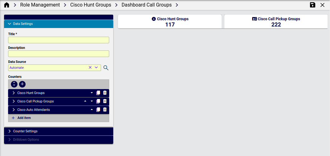
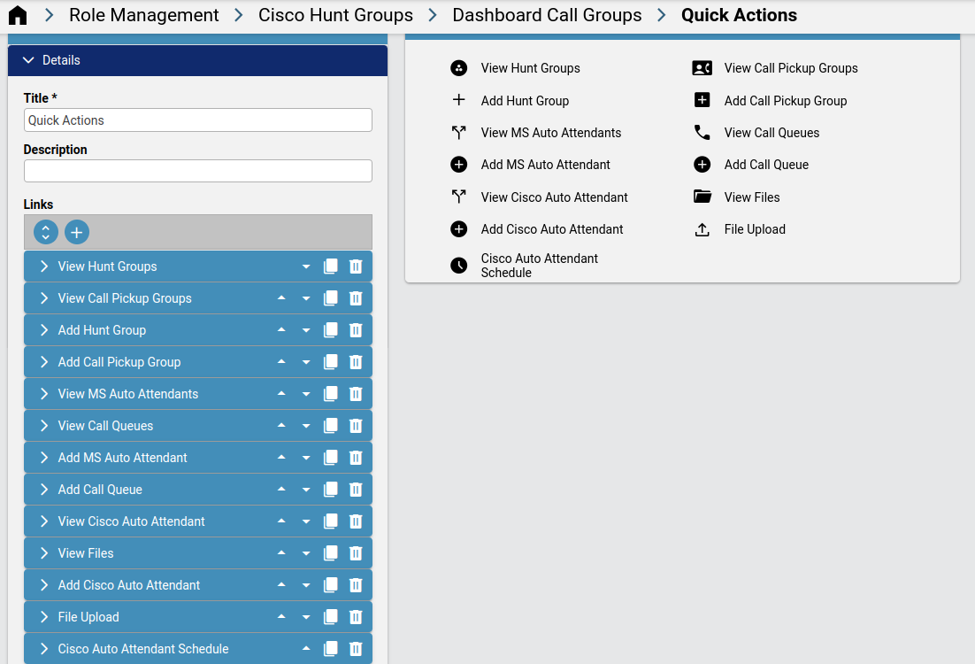
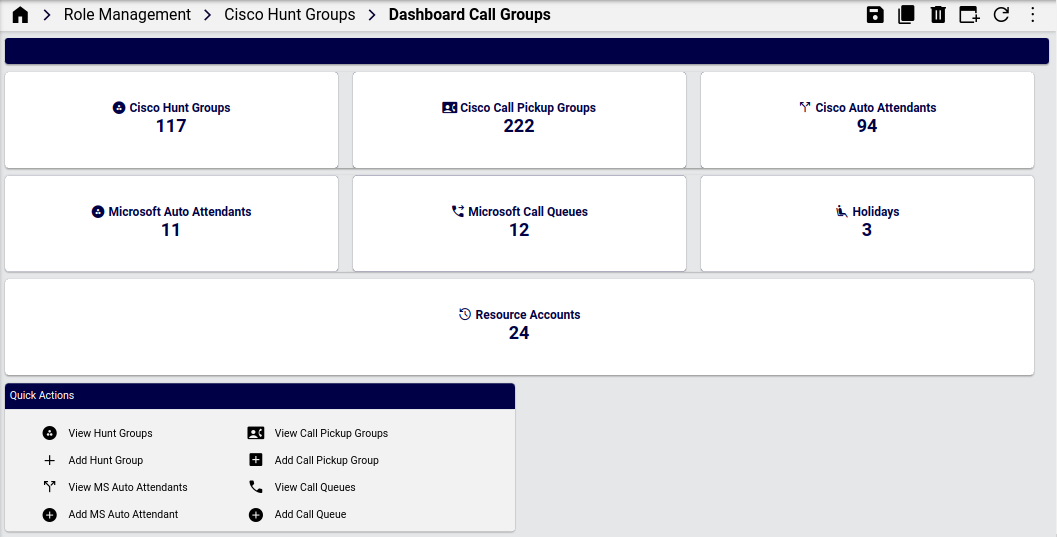
Dashboards for a Business Admin Role#
VOSS Automate provides a set of dashboards, menu layouts, and field display policies that are used in two sample menu layouts - for use or customization as a Business Administration Portal menu layout to be added to a user’s role.
Example dashboards - Business Admin Role#
Example - Call Groups setup and display
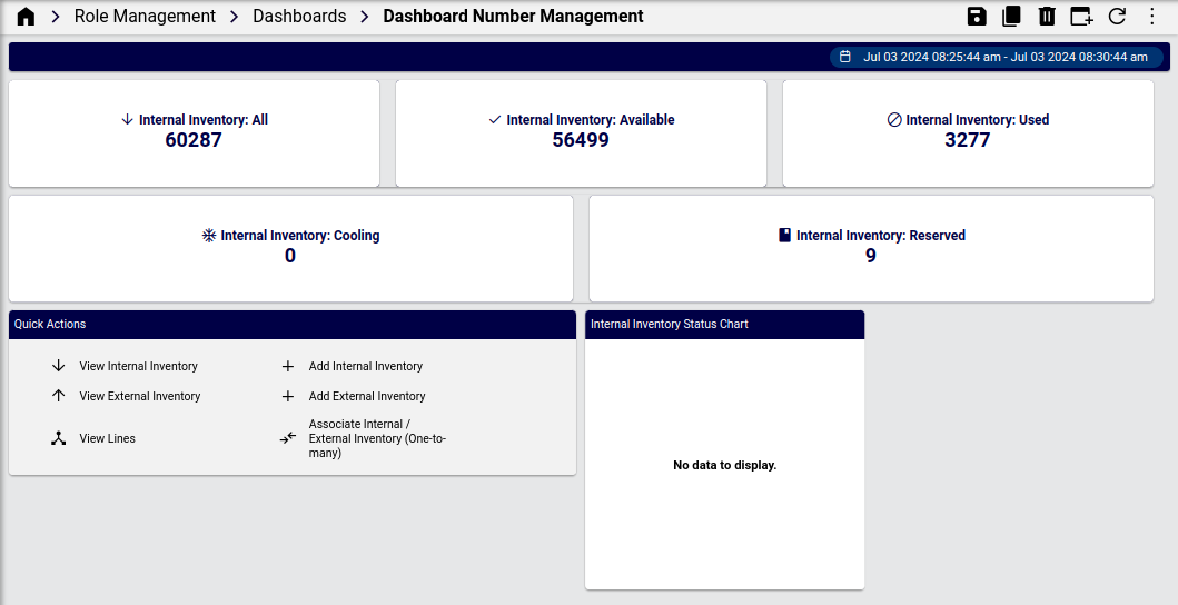
Example - display of Number Management dashboard