Features and Services Interfaces
The Business Administration Portal (BAP) allows you to easily view and manage the features or services located at any level of your organization.
Features and services that may be available on your side menu according to your role and that can be managed, include:
- Sites and Site Defaults (Site Management)
- Number Management, i.e. internal and external numbers (including number associations), and Lines (Number Inventory)
- Subscribers (Users) (Subscribers)
- Phones (Phones)
- Voicemail (Voicemail)
- Webex Teams (user and license management - Webex Teams Dashboard)
- Contact Center (agents, teams, skills and resource groups - Contact Center Management)
- Hunt Groups (members and groups - Hunt Groups Dashboard)
- Call Pickup Groups (members and groups - Call Pickup Groups Dashboard)
Manage a Feature or Service
Note
The Business Administration Portal (BAP) interface menus and functionality is defined as an interface type in VOSS-4-UC, along with the required role based access.
A default interface type is provided. Menus, features and functionality described here may not be available if your administrator has created a Business Admin Portal Custom Interface for you.
Field Display Policies for features on Business Admin Portal Custom Interface are available to manage the available cards on the detail feature dashboard.
Common feature management tasks such as listing, adding, deleting and editing can be carried out by navigating to the required organization selection and selecting the feature menu.
You may be prompted to select a organization level from the pop up. Otherwise, click Organization Selection and choose the organization level. See: Organization Navigation.
Menu Landing Page
Selecting the menu opens the Menu Landing Page.
The menu landing page dashboard provides an entry point to easily manage a feature or service.
The following types of controls may be available:
Counter Cards item counts in cards, for example the number of Sites, Internal Inventory, External Inventory, Lines, Subscribers, etc. Click on the cards to access to the list view for that item.

Quick Actions - a group of links to carry out feature management.
Some feature details can be managed from a pop up launched from a Quick Action or card link (for example, Delete) If available, the View hyperlink (for example View Sites, View Internal Inventory, and so on) also provides access to the list view for that item and its associated controls.
Select a feature Quick Action or Card link to manage the feature item, for example Add, Delete, Edit.
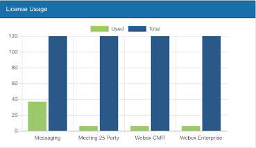
Graphs and Charts - only when data is available, visual displays provide you with a quick view of metrics of the feature, for example the License Usage for the Webex teams feature at an organization level.

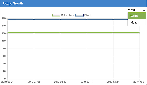
On Usage charts that illustrate time periods, for example Usage Growth, you can configure the chart to display in either weeks or months using a drop-down located in the top right-hand corner of the chart.

For details on a general feature management, see: User Interface Controls.
For details on a specific feature management, see: Feature Detail Dashboard and topics on the specific feature.
For the List View of a feature, see: List View Functionality.
Feature Detail Dashboard
This topic describes the common controls and functionality that you may find when you select an individual instance row in the list view. To see details on a specific feature or device, refer to the topics for it.
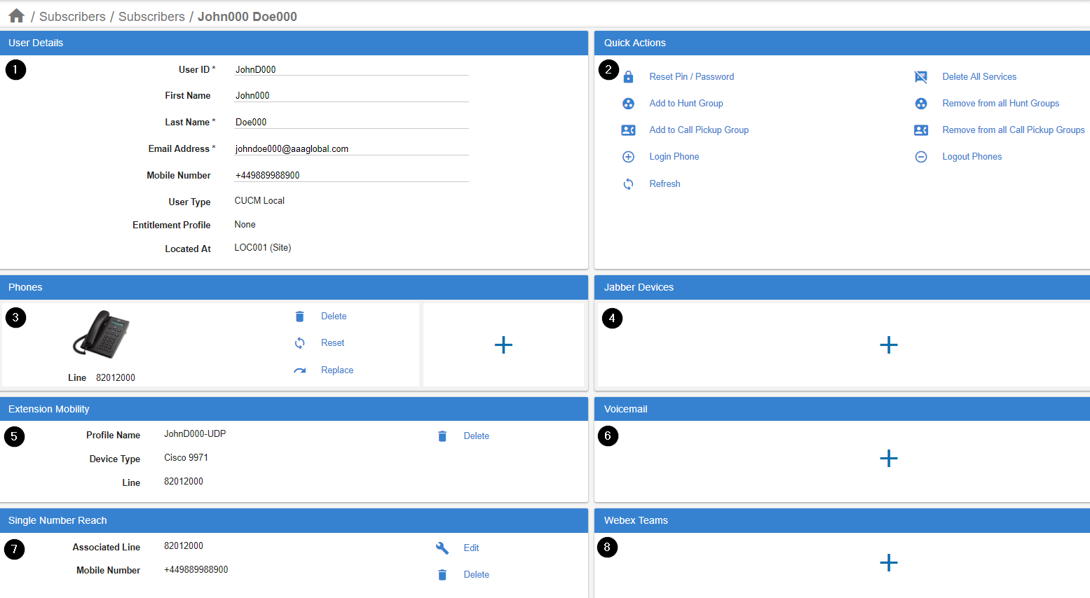
The dashboard interface shows components of a feature in a card layout, for example a card layout of Subscribers services, with:
- User Details
- Quick Actions
- Phones
- Jabber Devices
- Extension Mobility
- Voicemail
- Single Number Reach
- Webex Teams

The available cards may vary according to the custom interface and Field Display Policy applied to your role. Component Device or Service management cards as well as a Quick Action card with tasks to carry out on the instance are available to offer a single overview of the feature or device.
When editing an existing instance:
The navigation header row shows the organization level and instance name as endpoint.
When adding a new instance:
The navigation header organization endpoint shows as /New Record until the instance is named and saved.
Some cards allow you to edit contents inside it, for example a subscriber’s User Details. Other cards may be a table or a control that opens a pop-up input form. Hover over the input box or control on the form to see its tooltip if available. Fields on a form that cannot be edited, are greyed out and when you move off a mandatory input field without completing it, a “required” notification shows in red.
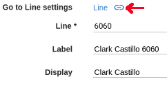
Some detail forms also show a hyperlink to further properties so that you can for example easily inspect Line details when inspecting a line on a Phone.

Note
When you add or update details on the Feature Detail Dashboard, or you are about to navigate away from it, a pop-up notice will remind you to save your changes before you navigate away from the feature detail dashboard.
Cards on the dashboard that allow you to add one or more devices or services may also show a “+”. Otherwise, where details allow for multiple properties, (for example Lines for a Phone), the card control can be presented as a table with controls so that rows can be copied, added or removed.

