Less files and Theme Customization
After downloading and extracting a theme into a directory, the contents shows the following directories and files:
.
+-- build_dependencies
+-- img
+-- skin.css
+-- skin.less
+-- variables.css
+-- variables.less
Three files are available for theme customization:
variables.less: custom variables overriding variables set elsewhere. To be compiled asvariables.csswhen done.skin.less: main customization file to be compiled toskin.csswhen done.
Custom images for login page backgrounds and logos are added to the img directory.
The override hierarchy of variables and theme settings is seen as the first
lines of skin.less as @import instructions, for example:
// Loads default variables
@import (optional) "build_dependencies/themes/minimal/variables.less";
@import (optional) "../minimal/variables.less";
// Overrides some default variables
@import "variables.less";
@import (optional) "build_dependencies/css/coreAdministratorStyles.less";
@import (optional) "../../css/coreAdministratorStyles.less";
Imports lower down on the list override those imports higher up on the list.
The (optional) parameter indicates the import is ignored if the file
is not available.
It is not advised to remove any references to files in the build_dependencies
directory.
Customizing variables.less
Variables are used in skin.less and in other .less files
in the sub-directories of the build_dependencies directory.
Use variables.less to override any of these existing variable values.
New variables can also be added if required and used in skin.less.
Existing variables and values are in
build_dependencies/themes/minimal/variables.less.
The variable names have self-explanatory names and are grouped into GUI categories,
such as login page, landing page or colors.
For example, in the default theme, show the following in variables.less:
@currentYear: ~`new Date().getFullYear()`;
@copyrightNotice: '\00A9  @{currentYear} VOSS. All Rights Reserved';

@loginLogoWidth: 161px;
@loginLogoHeight: 51px;
These variables are used in skin.less and determine:
- the footer copyright notice, for example, in
skin.css, thecontentproperty:
body.login_page:after {
  position: fixed;
  bottom: 0;
  content: '\00A9  2017 VOSS. All Rights Reserved';
  left: 0;
  color: #eeca;
  z-index: 1;
  background-repeat: no-repeat;
  background-position: left;
}
- the landing page logo image size HTML attributes:
<img style="user-select: none;"
 src="http://localhost/www/themes/default/img/login_logo.png"
 width="161"
 height="51">
Customizing skin.less
Customization is carried out by overriding the entries in the imported .less files present
in the sub-directories of build_dependencies. In the compiled .css file, the override
theme changes will then follow the original CSS entries.
It is recommended that the browser developer tools be enabled in order to identify
matching HTML properties of portions of the GUI, as well as the associated GUI styling in
the skin.css file.
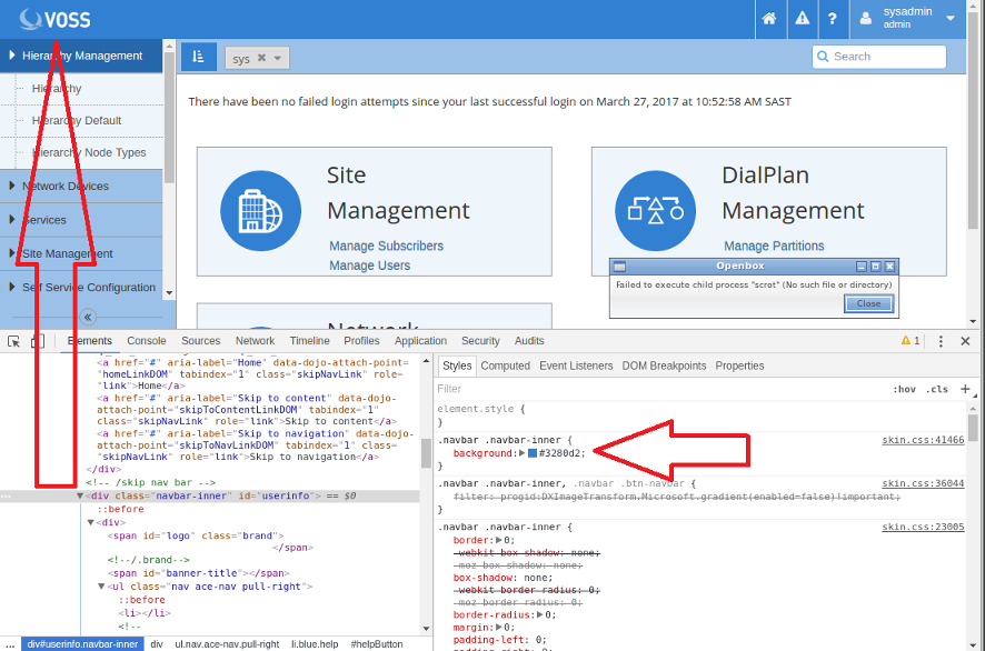
For example, consider an entry in the default theme skin.less under the
heading Navbar. The Navbar theme settings apply to the navigation headers of the
application: the top and side menu bars. For more details on the navbar component, see:
Navbar.
.navbar .navbar-inner {
  background: @mainBackgroundColor;
}
Here, the background color of the horizontal navbar is modified. the value of @mainBackgroundColor
is defined earlier as #3280d2.
The application of this override to the theme is shown by inspection in the browser developer tools:

In the compiled skin.css file, the update in the snippet from the less file above
will follow the main definition:
.navbar .navbar-inner {
  background: #3280d2;
}
The main definition shows all the values that apply to navbar-inner.
The value of background-color is overridden.
.navbar-inner {
    min-height: 40px;
    padding-right: 20px;
    padding-left: 20px;
    background-color: #fafafa;
    background-image: -moz-linear-gradient(top,#fff,#f2f2f2);
    background-image: -webkit-gradient(linear,0 0,0 100%,
      from(#fff),to(#f2f2f2));
    background-image: -webkit-linear-gradient(top,#fff,#f2f2f2);
    background-image: -o-linear-gradient(top,#fff,#f2f2f2);
    background-image: linear-gradient(to bottom,#fff,#f2f2f2);
    background-repeat: repeat-x;
    border: 1px solid #d4d4d4;
    -webkit-border-radius: 4px;
    -moz-border-radius: 4px;
    border-radius: 4px;
    filter: progid:DXImageTransform.Microsoft.gradient(
      startColorstr='#ffffffff',
      endColorstr='#fff2f2f2',GradientType=0);
    *zoom: 1;
    -webkit-box-shadow: 0 1px 4px rgba(0,0,0,0.065);
    -moz-box-shadow: 0 1px 4px rgba(0,0,0,0.065);
    box-shadow: 0 1px 4px rgba(0,0,0,0.065)
}
Similarly, other values in the CSS file for .navbar-inner can be overridden.
Another example: if the alert notification pop-up style (for example with timeout notifications) should also be customized to match the custom style, the following style can be added - with the suitable style colors:
.alert-info {
  color: #31708f;
  background-color: #d9edf7;
  border-color: #bce8f1;
}
