Common Tasks
The user interface allows administrators to perform common tasks using various menu paths and form controls (see below).
Cloning Items
Certain items, such as roles, credential policies, devices, phones, and so on can be cloned. Cloning provides a quick way to create new items that have very similar data to the cloned item.
On the GUI, a Clone option is available from the Action button on the button bar to carry out the task. This is available on the specific item page of certain items, and not on the list view.
The cloned item is created in the system only after the user clicks Save on the button bar.
If an item refers to other items, only the current item is cloned, and not the referenced items. For example, if a Phone on the system is cloned, the device models (Phone and Remote Destination) that are referred to in this item are not cloned.
The cloned key field(s), for example Name, must be edited with new values to ensure creation of a new item in the system. An error message, “Error, Duplicate Resource Found.” is displayed if a key field is not changed.
How to Clone an Item
- Choose the hierarchy level of the item to be cloned.
- Choose the required item that you want to clone.
- Click Action > Clone on the button bar.
- The page refreshes and the form displays the cloned item.
- Edit the required details, and click Save on the button bar when complete to create the new item.
Selecting Items
Items that have already been created can be deleted or modified as required. This can be performed either on single items or multiple items.
- For a single item in the list view, click the required single item that you want to delete or modify.
- For multiple items in the list view, select the check box for each item that you want to delete or modify. If the list view of items spans more than one page, items can be selected on each page as required.
- Click a button on the button bar or select a menu item from the Action drop-down to carry out the task on the selected items, where relevant.
Note
- Some options on the drop-down list, such as Export Bulk Load Template, Field Display Policy and Configuration Template apply to the type of item and are not affected by the item selection.
- Some options such as Bulk Modify depend on whether your administrator has given you the required permissions.
Bulk Delete and Modify
When more than one item is selected from the list view of items, the selected items can be deleted in bulk by using the Delete button on the button bar.
If your administrator has given you the required permissions, you can also bulk modify certain items, for example Roles. Select the check boxes of the items you want to modify and choose Bulk Modify from the Action drop-down. The input form for the item is opened. Values entered on this form are modified for all selected items when you choose Bulk Modify from the Action drop-down.
Ordering Lists
The list view of items allows for basic ordering by column.
- Click in the column header of a list. String columns are sorted alphabetically and numeric columns are sorted numerically.
- Click the column header name or up/down arrow to change the direction or the sort order of the column.
The ordering of a column is shown by the up/down arrow.
Note
- When sorting, a blank value appears as if the value was “None” in terms of alphabetical order.
- With no filter applied, sort will work on any column in the list view.
- With a filter applied to a single column, sort will work on the filtered column only.
- With a filter applied to more than one column, the sort functionality will not work.
- Leading spaces on a field in the list view are dropped when rendering the list view, so this may affect the sort order.
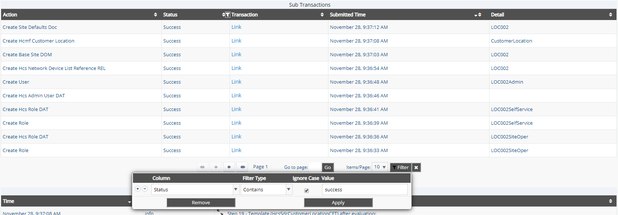
Filtering Lists
VOSS-4-UC allows you to filter lists in order to view only data based on specific criteria. This includes Transactions and their Sub Transaction and Log lists. For transactions, refer to Filtering Transactions.
A Filter button is available next to the Items/Page drop-down at the bottom of a list. A filter icon (with the same functionality) is also available next to each column on which you can filter. This is only visible when you mouse hover on the column headings. The Filter button on each page defaults to the first column on the page, whereas the filter icon next to the column defaults to that specific column. Click the button (or icon) to open the multi filter dialog.
A filter instance consists of a selected column, a filter operator and a value. Available filter operators are:
- Contains
- Does Not Contain
- Starts With
- Ends With
- Equals
- Not Equal
Note
- The Contains filter operator and the Ignore Case check box = Selected, are applied by default. Add more filter fields as required.
- The sorting of columns (ascending or descending) by clicking column headers while a filter is applied, is only supported for the Starts With operator.
- To filter for rows with no value in a selected Column, choose any Filter Type
option, select the Ignore Case check box and type
Nonein the Value. This works for all list views except Subscriber - The Located At column will only filter on the actual hierarchy name and not the displayed text next to it, for example “site”, “customer”, and so on.
Filter instance rows can be added or removed on the dialog to create a filter. The combination of instances create a single filter where all instance rows are applied, in other words, in a logical AND.
String values are case sensitive, unless the Ignore Case check box is selected. All the filter operators apply to strings.
For Boolean values in a column, the filter is applied using any filter operators, but only with values “True”, “true”, “False” or “false”.
Number values in a column also use Equals and Not Equal filter operators. For
floating point values, at least one decimal digit is required for filtering, for
example 2.0. Filtering can be applied to values with decimal values up to
7 decimals. For example, consider a list of values:
2.2000001
2.0000001
2.00000001
The filter: Not Equal to 2.00000001 displays only one value (2.2000001),
because the filter value has more than 7 decimals.
To apply the filter, press Enter or click the Apply button. This will hide the active filter dialog and show the filtered list. An X button shows next to the active Filter button.
For model lists, actions can then for example be carried out on a selection of items from the filtered list. The filter remains active until it is removed or until the user session on the GUI ends.
For all types of filters, the Filter button funnel icon is black when a filter is active, and white when no filter is present.
A funnel icon also shows in the list header to indicate that a filter is active and that the list is currently filtered. An X button shows next to the active Filter button.
If a filter is active on a list, click the Filter button to display the multi filter dialog again.
Close an unapplied filter dialog by clicking outside it. Unapplied filters are lost when the dialog is closed.
A filter remains active even when navigating away from the list. More than one filter can therefore be active on lists available in a session on the GUI.
Remove an active filter by clicking the Remove button on the multi filter dialog or by clicking the X button next to the active Filter button.
Important
Standard list view filters on model types will be removed and replaced by any Configurable Filters on landing page links or menu items for the corresponding model type when these are used. See: Configurable Filters in Menus and Landing Pages.
A filter example is shown in the figure below.
Updating on Pop-up Screens
User interface forms that open pop-up screens to add or delete items carry out the Add or Delete task when the OK button is clicked on the pop-up screen. In these instances, you do not have to click the Save button on the parent user interface form to complete the task.