Column / Bar Chart
When clicking on the Column/Bar Chart, the Settings options below are adjusted to that particular selection. You have the following choices:
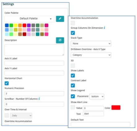
- Color Palette - This defines the colors to associate with data values, the columns/bars plus allows you to save that palette for use with additional widgets. See the options on how to define the palette below. (Color Palette Changes)
- Description - Allows you to enter a description of the chart to be displayed along the top portion of the chart.
- Axis X Label - Labels the X Axis (Horizontal) for the chart, such as "Date".
- Axis Y Label - Labels the Y Axis (Vertical) for the chart, such as "milliseconds".
- Horizontal Chart - By selecting this check box, the chart will display the columns/bars horizontally across the chart.
- Numeric Precision - Select the decimal precision for each point.
- Scrollbar – Number of Columns – Input the number of columns (vertical or horizontal) that you want to represent on the chart. A scrollbar will appear that will allow you to scroll through the remainder of the data while only representing the number of columns selected.
- Over Time & Interval - By selecting this check box the chart will display the data over the specified time based on the interval toggled within the adjacent box, i.e. Minute, Hour, Daily, Weekly and Monthly.
- Over Time Accumulation – Selecting this box will accumulate all of the values as they are represented in the chat versus each value.
- Show Data Table - Selecting this will display data in a table below the chart.
- Group Columns on Dimension – Selecting this will allow you to group the metrics on the dimensions being analyzed in the chart.
- Stack Type – By selecting this box the chart will stack the values based on the type selected: Stack, StackPercentage or Drilldown.
- Drilldown Overtime – Axis X Type: Select the X Axis drilldown for an overtime chart based on the "Category" or the "DateTime".
- 3D - By selecting this check box the columns/bars will be displayed in a 3D representation.
- Show Labels - By selecting this check box, each value that defines the chart will be labeled on the chart.
- Contrast Label – Select this to provide better contrast on the font. Usually utilized with dark mode in the browser.
- Show Legend - By selecting this check box, the Field Definition for the values being charted will be displayed in the selected position on the chart with the associated color representation.
- Placement – Drop-down box providing options on where to place the legend on the chart.
- Show Alert Line – This allows a value to be set to show a threshold or "Alert" line on the chart and have it represented in a different color.